数据可视化作图参考博客
统计特征函数
Pandas库中主要的统计特征函数如下表
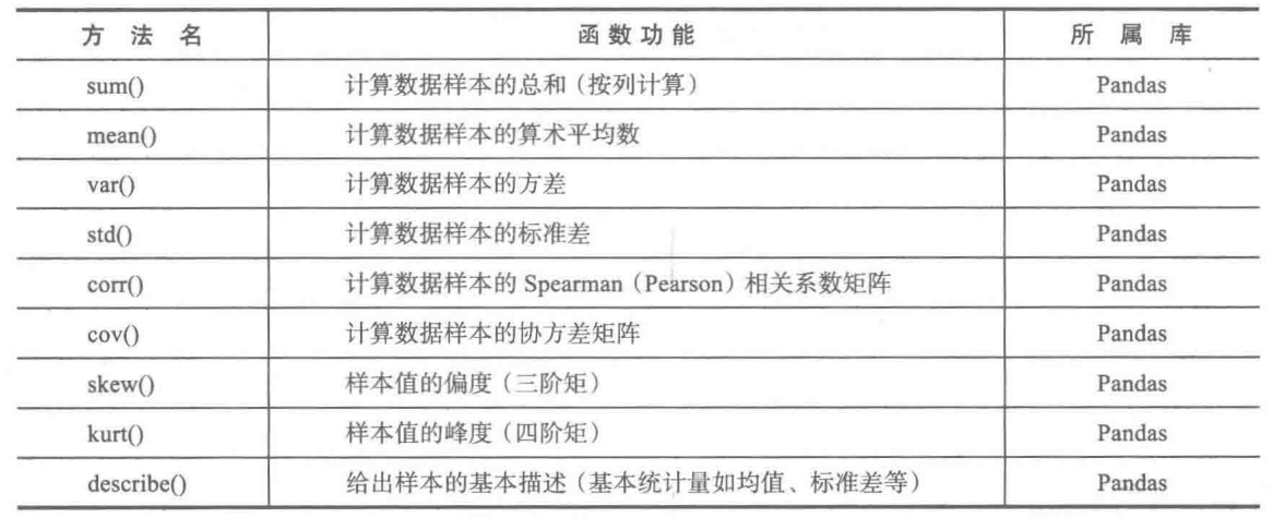

使用方法:D·函数名,D为Dataframe或者Series类型的对象,如:D·mean()。
Dataframe和Series类型数据结构的初始化:
Series可以看作带索引的一列
Dataframe可以看作带索引和列名的二维表
具体操作看这里
函数主要介绍:
上图中的函数作为Dataframe或者Series对象的方法来使用。函数参数axis_descr默认为0,代表按列计算,axis_descr=1代表按行计算。
-
corr()
-
D为Dataframe类型
D·corr(method=pearson)计算D的相关系数矩阵,method可取pearson(皮尔森系数为默认选项)、spearman(斯皮尔曼系数)、kendall(肯德尔系数) -
S1、S2为Series类型
S1·corr(S2)计算S1与S2的皮尔森相关系数。 -
skew()
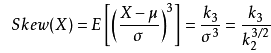
D·skew()按列计算每一列数据的偏度。偏度(skewness)是统计数据分布偏斜方向和程度的度量,定义偏度是样本的三阶标准化矩。
公式如下:
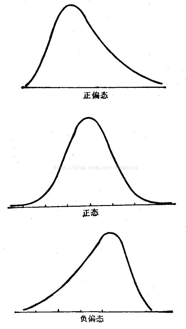
情况如下:
(1)偏度=0,正态分布
(2)偏度>0,右偏分布(正偏分布)
(3)偏度<0,左偏分布(负偏分布)
-
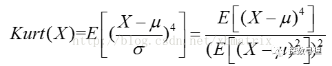
kurt()
D·kurt()按列计算每一列数据的峰度。峰度(kurtosis)用来衡量概率密度曲线在均值处的值的大小,定义峰度是样本的四阶标准化矩。
公式如下:
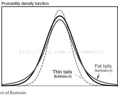
情况如下:
(1)峰度值=3,正态分布
(2)峰度值>3,厚尾
(3)峰度值<3,瘦尾
-
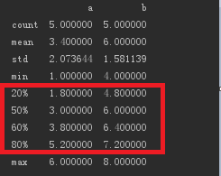
describe()
D·describe()默认计算每一列的的count、mean、std、min、1/4分位数、1/2分位数、3/4分位数、max。
D·describe(percentiles=[0.2, 0.5, 0.6, 0.8])计算20%、50%、60%、80%的分位数,结果如下:
-
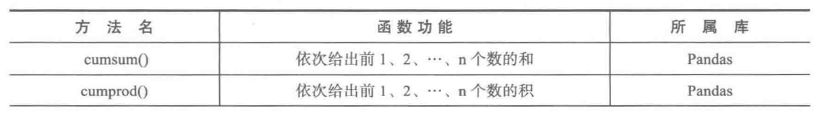
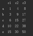
cumsum()
D的数据如下:
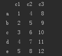
c1,c2,c3为列名,a,b,c,d,e为索引号
D.cumsum()对每一列都计算前n(n=1,2,3…列长)个数的和。结果如下:
-
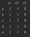
cummin()
D·cumsum()对每一列都计算前n(n=1,2,3…列长)个数中的最大值。结果如下:
使用方法:rolling_系列()是pandas的函数,而不是Dataframe或者Series的方法,使用格式为pd·rolling_* () 。
本人用的python3.6,pandas库中已经取消rolling_系列()
数据可视化作图
画图主要使用的库为Matplotlib和Pandas,主要函数如下:
因为画图中x轴与y轴的数据通常为数组格式的数据,所以先总结一下如何初始化数组:
初始化数组
- plot()绘制线性二维图、折线图
解决画图中中文和负号乱码问题:
# 解决中文和负号乱码问题
# rcParams的值可取font.family、font.size、font.style等
plt.rcParams['font.family'] = 'SimHei'
plt.rcParams['axes.unicode_minus'] = False
https://blog.csdn.net/skyli114/article/details/77508247
plot()函数参数讲解请看这里:
格式为plt.plot(x,y,format_string,**kwargs)
x代表x轴,可接受列表或数组
y代表y轴,可接受列表或数组
format_string为格式字符串
color:控制颜色,color=’green’
linestyle:线条风格,linestyle=’dashed’
marker:标记风格,marker = ‘o’
markerfacecolor:标记颜色,markerfacecolor = ‘blue’
markersize:标记尺寸,markersize = ‘20’
label: 线条标签,plt.legend将标签显示
https://blog.csdn.net/skyli114/article/details/77508136
figure()函数参数讲解:
格式为figure(num=None, figsize=None, dpi=None, facecolor=None, edgecolor=None, frameon=True)
num: 图像编号或名称,数字为编号 ,字符串为名称
figsize: 指定figure的宽和高,单位为英寸;
dpi参数指定绘图对象的分辨率,即每英寸多少个像素,缺省值为80, 1英寸等于2.5cm
facecolor: 背景颜色
edgecolor: 边框颜色
frameon: 是否显示边框
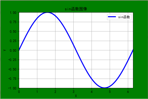
例子:
```
import matplotlib.pyplot as plt
import numpy as np
x = np.random.uniform(0, 2*np.pi, size=100)
x.sort()
x = np.arange(0, 2*np.pi+1, 0.1, dtype=np.float32)
y = np.sin(x)
print('x: n', x)
print('y: n', y)
# 定义绘图区域
plt.figure('sin函数图', (6, 4), facecolor='g')
plt.plot(x, y, 'b-', label='sin函数', linewidth=3.0)
# x轴标签
plt.xlabel('X')
# y轴标签
plt.ylabel("Y")
# plt.xlim(0, 2pai)设置x轴的范围
# plt.ylim(-1, 1)设置y轴的范围
plt.axis([0, 2 * np.pi, -1, 1])  # [0,2pai]:x轴坐标范围,[-1,1]:y轴坐标范围
# 背景网格
plt.grid()
# 标题
plt.title('sin函数图像')
plt.legend(loc='upper right')  # loc可选upper lower  left right
plt.show()
```
结果展示:
- subplot()绘制多个子图
plt.tight_layout()函数参数讲解:
 格式为plt.tight_layout(pad=1.08, h_pad=None, w_pad=None, rect=None)
 所有的参数都是可选的,调用该函数时可省略所有的参数。
 pad: 主窗口边缘和子图边缘间的间距,默认为1.08
 h_pad, w_pad: 子图边缘之间的间距,默认为pad_inches
 使用h_pad时,第一行的子图位置不变,h_pad越大,每一行之间的距离就越大
 使用w_pad时,第一列的子图位置不变,w_pad越大,每一列之间的距离就越大
plt.subplots_adjust()函数参数讲解:
格式为plt.subplots_adjust(left=None, bottom=None, right=None, top=None,wspace=None, hspace=None):
默认值如下:
      left  = 0.125  # the left side of the subplots of the figure
      right = 0.9    # the right side of the subplots of the figure
      bottom = 0.1   # the bottom of the subplots of the figure
      top = 0.9      # the top of the subplots of the figure
top=0.9表示主窗口中从上到下90%的区域用作画子图,10%的区域留给主标题显示
right=0.9表示主窗口中从右到左90%的区域用作画子图
解决多个子图存在时的后一行子图的标题与前一行子图的x轴标签重合问题:使用 plt.tight_layout()将h_pad调高一点
解决第一行子图的标题和主窗口的标题重合问题:
方法一:使用plt.tight_layout(),将pad调高一点
方法二:使用plt.subplots_adjust(),将top调小一点
当plt.tight_layout()和plt.subplots_adjust()一起使用时,plt.tight_layout()在前,plt.subplots_adjust()在后,因为plt.tight_layout()的参数pad有默认值会导致plt.tight_layout()设置的top值失效。
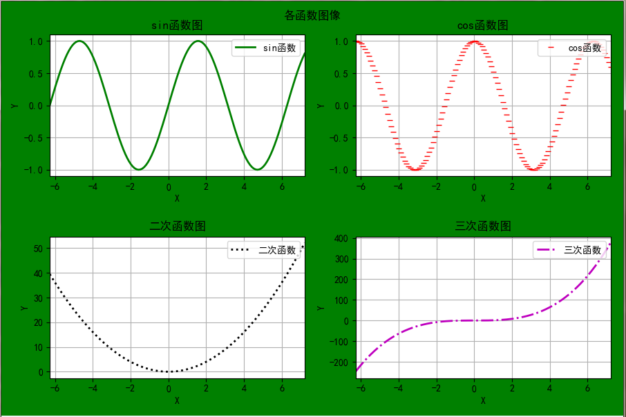
例子:
    import matplotlib.pyplot as plt
    import numpy as np

    funcs = ['np.sin(x)', 'np.cos(x)', 'x**2', 'x**3']
    titles = ['sin函数', 'cos函数', '二次函数', '三次函数']
    style = ['g-', 'r_', 'k:', 'm-.']
    x = np.arange(-2*np.pi, 2*np.pi+1, 0.1)
    print('x: n', x)
    # 定义绘图区域
    plt.figure('sin函数图', (12, 9), facecolor='g')
    for i in range(4):
        plt.subplot(2, 2, i+1)
        plt.plot(x, eval(funcs[i].strip()), str(style[i]), label=('%s' % titles[i]), linewidth=2.0)
        # x轴标签
        plt.xlabel('X')
        # y轴标签
        plt.ylabel("Y")
        # 背景网格
        plt.grid()
        # 设置x轴的距离
        plt.xlim(x.min(), x.max())
        # 添加图例
        plt.legend(loc='upper right')  # loc可选upper lower  left right
        # 标题
        plt.title(titles[i] + '图')

    plt.suptitle("各函数图像")
    # 加大子图间的上下距离
    plt.tight_layout(h_pad=2)
    # 主图中从上到下92%的区域画子图,8%留给主标题显示
    plt.subplots_adjust(top=0.92)
    plt.show()
结果展示:
- pie()绘制饼图
例子:
import matplotlib.pyplot as plt

# 解决中文和负号乱码问题
plt.rcParams['font.family'] = 'SimHei'
plt.rcParams['axes.unicode_minus'] = False

sizes = [15, 35, 40, 10]
lables = ['Game', '上课', '自习', 'TV']
colors = ['red', 'green', 'yellow', 'pink']
# 突出显示自习所占的比例
explode = [0, 0, 0.1, 0]
# autopct设置显示各比例的格式 startangle给定绘制饼图的起始角度
plt.pie(sizes, labels=lables, colors=colors, explode=explode, autopct='%.2f%%', shadow=False, startangle=90)
# 显示为圆
plt.axis('equal')   # 没有这句绘制出来的是椭圆
plt.show()
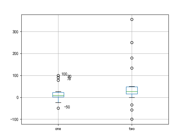
- boxplot()绘制箱型图
import matplotlib.pyplot as plt
import pandas as pd

# 解决中文和负号乱码问题
plt.rcParams['font.family'] = 'SimHei'
plt.rcParams['axes.unicode_minus'] = False

data_dict = {'one': [100, 90, 78, 1, 5, 7, 10, 15, 26, 23, 13, 9, 2, 22, 4, -8, -24, -50],
             'two': [-57, -35, 0, -100, 15, 21, 26, 28, 30, 34, 45, 50, 25, 17, 180, 355, 134, 250]}

print(len(data_dict['one']))
print(len(data_dict['two']))
data = pd.DataFrame(data_dict)
print('data: n', data)
plt.figure()
# 使用pandas中的boxplot()绘制箱型图
p = data.boxplot(return_type='dict')

# 异常值以圈的形式标记出来,但是不知道具体是哪个数据,所以还需要添加注释来显示异常数据
# fliers为异常值的标签
# p['fliers'][0]可以得到data中第一列数据绘制的箱型图中的异常数据
# p['fliers'][1]可以得到data中第二列数据绘制的箱型图中的异常数据,以此类推

# p['fliers'][0].get_xdata()得到第一列异常数据的x坐标,第一列x为1,第二列x为2,以此类推
x1 = p['fliers'][0].get_xdata()
x2 = p['fliers'][1].get_xdata()

# p['fliers'][0].get_ydata()得到第一列异常数据的y坐标, y就是每一列的异常数据的真实值
y1 = p['fliers'][0].get_ydata()
y2 = p['fliers'][1].get_ydata()

# 用plt.annotate()给异常数据添加注释
for i in range(len(x1)):
    if i > 0:
        # plt.annotate()中第一个参数代表要添加的注释,可以是文字也可以是数字(比如y[i])
        # xy代表需要添加注释的异常数据的位置,xytext代表注释所在的位置
        # 其中有些相近的点,注解会出现重叠,难以看清,需要一些技巧来控制。这时就要调节xytext了
        plt.annotate(y1[i], xy=(x1[i], y1[i]), xytext=(x1[i]+0.05 - 0.8/(y1[i]-y1[i-1]), y1[i]))
    else:
        plt.annotate(y1[i], xy=(x1[i], y1[i]), xytext=(x1[i]+0.08, y1[i]))

plt.show()  # 展示箱线图
结果展示:
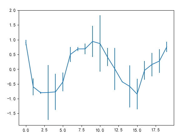
- plot(yerr = error)绘制误差棒图
例子:
import matplotlib.pyplot as plt
import pandas as pd
import numpy as np

# 解决中文和负号乱码问题
plt.rcParams['font.family'] = 'SimHei'
plt.rcParams['axes.unicode_minus'] = False

# 误差数组
error = np.random.rand(20)
x = np.random.uniform(-2*np.pi, 2*np.pi, 20)
x.sort()
print('error: n', error)

y = pd.Series(np.cos(x))
print('y: n', y)

plt.figure()
# 绘制误差棒图
# 将y的真实值加减对应的误差值,得到y的上下误差点,然后将上下误差点用竖线连接起来
y.plot(yerr=error)
plt.show()
结果展示:
最后
以上就是执着大地最近收集整理的关于数据挖掘笔记(2)-统计特征函数和数据可视化作图的全部内容,更多相关数据挖掘笔记(2)-统计特征函数和数据可视化作图内容请搜索靠谱客的其他文章。


![Pytorch 深度学习实践-02-[Linear Model]](https://www.shuijiaxian.com/files_image/reation/bcimg22.png)


发表评论 取消回复