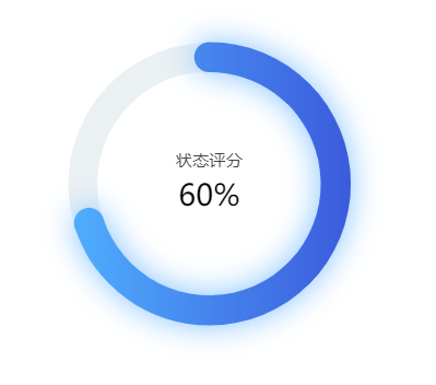
效果图:
option代码:
option: {
        title: {
          text: '状态评分',
          subtext: 60 + '%',
          x: 'center',
          y: '40%',
          textStyle: {
            fontWeight: '400',
            fontSize: 14
          },
          subtextStyle: {
            color: 'black',
            fontSize: 25
          }
        },
        tooltip: {
          formatter: function(params) {
            if (params.name == '稼动率') {
              return params.name + ':' + params.percent + ' %'
            } else {
              return ''
            }
          }
        },
        legend: {
          show: false,
          itemGap: 12,
          data: ['占比', '剩余']
        },
        angleAxis: {
          max: 100, // 满分
          clockwise: true, // 逆时针
          // 隐藏刻度线
          axisLine: {
            show: false
          },
          axisTick: {
            show: false
          },
          axisLabel: {
            show: false
          },
          splitLine: {
            show: false
          }
        },
        radiusAxis: {
          type: 'category',
          // 隐藏刻度线
          axisLine: {
            show: false
          },
          axisTick: {
            show: false
          },
          axisLabel: {
            show: false
          },
          splitLine: {
            show: false
          }
        },
        polar: {
          center: ['50%', '50%'],
          radius: '140%' // 图形大小
        },
        series: [{
          type: 'bar',
          data: [{
            name: '稼动率',
            value: 70,
            itemStyle: {
              color: { // 颜色渐变
                colorStops: [{
                  offset: 0,
                  color: '#4FADFD' // 0% 处的颜色
                }, {
                  offset: 1,
                  color: '#3b5bdc' // 100% 处的颜色1
                }]
              },
              label: {
                show: false
              },
              labelLine: {
                show: false
              },
              borderRadius: 20,
              shadowBlur: 25, //为蓝色段的数据环添加阴影效果
              shadowColor: '#81c1fe' //设置阴影的颜色
            }
          }],
          coordinateSystem: 'polar',
          roundCap: true,
          barWidth: 25,
          barGap: '-100%', // 两环重叠
          radius: ['49%', '52%'],
          z: 2
        }, { // 灰色环
          type: 'bar',
          data: [{
            value: 100,
            itemStyle: {
              color: '#ebf0f3'// 外框颜色
            },
            emphasis: { // 鼠标hover上去后的圆环颜色
              itemStyle: {
                color: '#ebf0f3'// 移入后的颜色
              }
            }
          }],
          coordinateSystem: 'polar',
          roundCap: true,
          barWidth: 24,
          barGap: '-98%', // 两环重叠
          radius: ['49%', '52%'],
          z: 1
        }]
}
最后
以上就是丰富月饼最近收集整理的关于vue+eCharts---标题居中的圆环图实例2的全部内容,更多相关vue+eCharts---标题居中内容请搜索靠谱客的其他文章。
本图文内容来源于网友提供,作为学习参考使用,或来自网络收集整理,版权属于原作者所有。


发表评论 取消回复