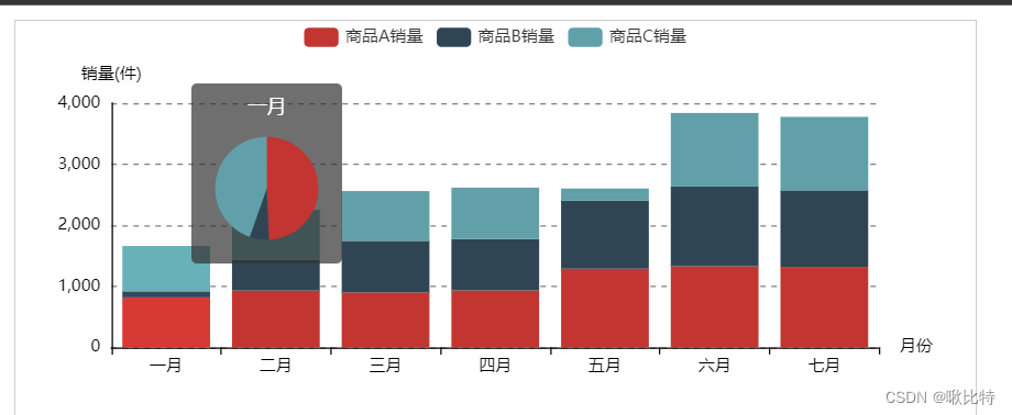
堆叠图的tooltip嵌套饼图
参考博客:https://cloud.tencent.com/developer/article/1976350
效果图
代码
option_div14 = {
    xAxis: {
        type: 'category', //种类:类别
        data: ['一月', '二月', '三月', '四月', '五月', '六月', '七月'],
        name: '月份',
        nameTextStyle: { //坐标轴名称样式
            color: "#fff",
            fontSize: 12
        },
        axisLine: { //轴线
            show: true,
            lineStyle: {
                color: "#fff",
                width: 1, //线宽
                type: 'solid', //线的形状:'solid'、'dashed'、'dotted'
                opacity: 1 //透明度:0~1
            }, //轴线的样式

        },
        axisTick: { //刻度线
            show: true,
            inside: false, //刻度线是否朝内
            length: 5, //刻度线长度
            lineStyle: { //刻度线样式
                color: "#fff",
                width: 1, //线宽
            }
        },
        axisLabel: { //坐标轴刻度标签
            show: true,
            color: "#fff",
            fontSize: 12,
            rotate: 0, //旋转角度,范围:-90~90
        },
    },
    yAxis: {
        type: 'value',
        name: '销量(件)',
        nameTextStyle: { //坐标轴名称样式
            color: "#fff",
            fontSize: 12
        },
        axisLine: { //轴线
            show: true,
            lineStyle: {
                color: "#fff",
                width: 1, //线宽
                type: 'solid', //线的形状:'solid'、'dashed'、'dotted'
                opacity: 1 //透明度:0~1
            }, //轴线的样式

        },
        axisTick: { //刻度线
            show: false,
            inside: false, //刻度线是否朝内
            length: 5, //刻度线长度
            lineStyle: { //刻度线样式
                color: "#fff",
                width: 1, //线宽
            }
        },
        axisLabel: { //坐标轴刻度标签
            show: true,
            color: "#fff",
            fontSize: 12,
            rotate: 0, //旋转角度,范围:-90~90
        },
        splitLine: { //分割线
            show: true,
            lineStyle: { //分割线样式
                color: ['#fff'],
                type: 'dashed', //线的形状:'solid'、'dashed'、'dotted'
                opacity: .5
            }
        }
    },
    legend:{

    },
    tooltip: {
        trigger: 'axis', //axis:坐标轴触发,主要在柱状图,折线图等会使用类目轴的图表中使用。item:数据项图形触发,主要在散点图,饼图等无类目轴的图表中使用。
        formatter: params => {
            // 根据触发提示框的数据,准备饼图数据
            let pieData = [];
            for (let i in params) {
                pieData.push({
                    name: params[i].seriesName,
                    value: params[i].value,
                    color: params[i].color
                });
            }

            // 将饼图数据存入饼图 option.series.data
            pieOption.series.data = pieData;
            return `${params[0].axisValue}<br/><div id="tooltipPie" style="width: 100px;height:100px;"></div>`;
        },
        axisPointer: { //坐标轴指示器配置项。
            type: 'none' //'line' 直线指示器、'shadow' 阴影指示器、'none' 无指示器、'cross' 十字准星指示器。其实是种简写,表示启用两个正交的轴的 axisPointer。
        }
    },
    series: [{
            name: '商品A销量',
            data: [820, 932, 901, 934, 1290, 1330, 1320],
            type: 'bar', //数据形态:柱状图
            smooth: true, //是否平滑曲线
            symbol: 'emptyCircle', //标记的图形,支持本地图片,官方样式:'circle', 'rect', 'roundRect', 'triangle', 'diamond', 'pin', 'arrow', 'none'
            lineStyle: { //线条样式
                color: "#f00"
            },
            stack: '商品',

        },
        {
            name: '商品B销量',
            data: [100, 500, 845, 842, 1113, 1305, 1253],
            type: 'bar', //数据形态:柱状图
            smooth: true, //是否平滑曲线
            symbol: 'emptyCircle', //标记的图形,支持本地图片,官方样式:'circle', 'rect', 'roundRect', 'triangle', 'diamond', 'pin', 'arrow', 'none'
            lineStyle: { //线条样式
                color: "#0f0"
            },
            stack: '商品',

        },
        {
            name: '商品C销量',
            data: [742, 822, 815, 842, 200, 1205, 1203],
            type: 'bar', //数据形态:柱状图
            smooth: true, //是否平滑曲线
            symbol: 'emptyCircle', //标记的图形,支持本地图片,官方样式:'circle', 'rect', 'roundRect', 'triangle', 'diamond', 'pin', 'arrow', 'none'
            lineStyle: { //线条样式
                color: "#0f0"
            },
            stack: '商品',
        }
    ]
};

// 准备一个饼图的 option
let pieOption = {
    series: {
        type: "pie",
        labelLine: {
            show: false
        },
        label: {
            show: false
        }
    },
    animation: false
};
setInterval(function(){
    if (document.getElementById('tooltipPie') !== null && document.getElementById('tooltipPie').innerHTML === '') {
        if (typeof tooltipChart !== 'undefined') {
            return tooltipChart.setOption(pieOption);
        }
        var tooltipChart = echarts.init(document.getElementById("tooltipPie"));
        tooltipChart.setOption(pieOption);
    }
},10);
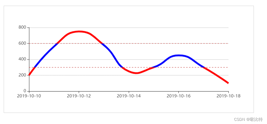
折线图超出上下限变色
参考博客:https://www.jianshu.com/p/01e2d1fe1257
效果图
代码
var upLimit = 600;  // 上限
var lowlimit = 300; // 下限

option_div15 = {
  tooltip: {
    trigger: 'axis',
    boundaryGap: false
  },
  xAxis: {
    type: 'category',
    boundaryGap: false
  },
  yAxis: {
    type: 'value'
    // boundaryGap: [0, '30%']
  },
  visualMap: [
    {
      type: 'piecewise',
      show: false,
      dimension: 1,
      seriesIndex: 0,
      pieces: [
        {
          // 不指定 min,表示 min 为无限大(-Infinity)。
          max: lowlimit, // 没有设置最小值,表明当前范围 [-Infinity, max] 变色
          color: 'red'
        },
        {
          // 不指定 max,表示 max 为无限大(Infinity)。
          min: upLimit, // 没有设置最大值,表明当前范围 [min, Infinity] 变色
          color: 'red'
        }
      ],
      outOfRange: { // 在选中范围外 的视觉元素,这里设置在正常范围内的图形颜色
        color: 'blue'
      }
    }
  ],
  series: [
    {
      type: 'line',
      smooth: true,
      symbol: 'none',
      lineStyle: {
        // color: '#5470C6', // 这里不能设置颜色,不然会以这个为准,设置的范围变色将不起作用
        width: 5
      },
      markLine: {
        symbol: 'none',
        label: {
          show: false
        },
        data: [
          {
            yAxis: upLimit
          },
          {
            yAxis: lowlimit
          }
        ]
      },
      // areaStyle: {},
      data: [
        ['2019-10-10', 200],
        ['2019-10-11', 560],
        ['2019-10-12', 750],
        ['2019-10-13', 580],
        ['2019-10-14', 250],
        ['2019-10-15', 300],
        ['2019-10-16', 450],
        ['2019-10-17', 300],
        ['2019-10-18', 100]
      ]
    }
  ]
};
最后
以上就是天真书本最近收集整理的关于Echart堆叠图的tooltip嵌套饼图以及折线图超出上下限变色的全部内容,更多相关Echart堆叠图内容请搜索靠谱客的其他文章。
本图文内容来源于网友提供,作为学习参考使用,或来自网络收集整理,版权属于原作者所有。


发表评论 取消回复