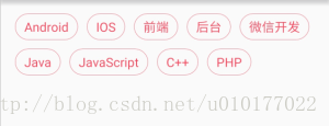
无论是在移动端的App,还是在前端的网页,我们经常会看到下面这种标签的列表效果:
标签从左到右摆放,一行显示不下时自动换行。这样的效果用Android源生的控件很不好实现,所以往往需要我们自己去自定义控件。我在开发中就遇到过几次要实现这样的标签列表效果,所以就自己写了个控件,放到我的GitHub,方便以后使用。有兴趣的同学也欢迎访问我的GitHub、查看源码实现和使用该控件。下面我将为大家介绍该控件的具体实现和使用。
要实现这样一个标签列表其实并不难,列表中的item可以直接用TextView来实现,我们只需要关心列表控件的大小和标签的摆放就可以了。也就是说我们需要做的只要两件事:测量布局(onMeasure)和摆放标签(onLayout)。这是自定义ViewGroup的基本步骤,相信对自定义View有所了解的同学都不会陌生。下面我们就来看看具体的代码实现。
控件的测量:
    @Override
    protected void onMeasure(int widthMeasureSpec, int heightMeasureSpec) {

        int count = getChildCount();
        int maxWidth = MeasureSpec.getSize(widthMeasureSpec) - getPaddingLeft() - getPaddingRight();

        int contentHeight = 0; //记录内容的高度
        int lineWidth = 0; //记录行的宽度
        int maxLineWidth = 0; //记录最宽的行宽
        int maxItemHeight = 0; //记录一行中item高度最大的高度
        boolean begin = true; //是否是行的开头

        //循环测量item并计算控件的内容宽高
        for (int i = 0; i < count; i++) {
            View view = getChildAt(i);
            measureChild(view, widthMeasureSpec, heightMeasureSpec);
           if(!begin) {
                lineWidth += mWordMargin;
            }else {
                begin = false;
            }
            //当前行显示不下item时换行。
            if (maxWidth <= lineWidth + view.getMeasuredWidth()) {
                contentHeight += mLineMargin;
                contentHeight += maxItemHeight;
                maxItemHeight = 0;
                maxLineWidth = Math.max(maxLineWidth, lineWidth);
                lineWidth = 0;
                begin = true;
            }
            maxItemHeight = Math.max(maxItemHeight, view.getMeasuredHeight());

            lineWidth += view.getMeasuredWidth();
        }

        contentHeight += maxItemHeight;
        maxLineWidth = Math.max(maxLineWidth, lineWidth);

        //测量控件的最终宽高
        setMeasuredDimension(measureWidth(widthMeasureSpec,maxLineWidth),
                measureHeight(heightMeasureSpec, contentHeight));

    }

    //测量控件的宽
    private int measureWidth(int measureSpec, int contentWidth) {
        int result = 0;
        int specMode = MeasureSpec.getMode(measureSpec);
        int specSize = MeasureSpec.getSize(measureSpec);

        if (specMode == MeasureSpec.EXACTLY) {
            result = specSize;
        } else {
            result = contentWidth + getPaddingLeft() + getPaddingRight();
            if (specMode == MeasureSpec.AT_MOST) {
                result = Math.min(result, specSize);
            }
        }
        //这一句是为了支持minWidth属性。
        result = Math.max(result, getSuggestedMinimumWidth());
        return result;
    }

    //测量控件的高
    private int measureHeight(int measureSpec, int contentHeight) {
        int result = 0;
        int specMode = MeasureSpec.getMode(measureSpec);
        int specSize = MeasureSpec.getSize(measureSpec);

        if (specMode == MeasureSpec.EXACTLY) {
            result = specSize;
        } else {
            result = contentHeight + getPaddingTop() + getPaddingBottom();
            if (specMode == MeasureSpec.AT_MOST) {
                result = Math.min(result, specSize);
            }
        }
        //这一句是为了支持minHeight属性。
        result = Math.max(result, getSuggestedMinimumHeight());
        return result;
    }
标签的摆放:
    @Override
    protected void onLayout(boolean changed, int left, int top, int right, int bottom) {

        int x = getPaddingLeft();
        int y = getPaddingTop();

        int contentWidth = right - left;
        int maxItemHeight = 0;

        int count = getChildCount();
        //循环摆放item
        for (int i = 0; i < count; i++) {
            View view = getChildAt(i);

            //当前行显示不下item时换行。
            if (contentWidth < x + view.getMeasuredWidth() + getPaddingRight()) {
                x = getPaddingLeft();
                y += mLineMargin;
                y += maxItemHeight;
                maxItemHeight = 0;
            }
            view.layout(x, y, x + view.getMeasuredWidth(), y + view.getMeasuredHeight());
            x += view.getMeasuredWidth();
            x += mWordMargin;
            maxItemHeight = Math.max(maxItemHeight, view.getMeasuredHeight());
        }
    }
onMeasure和onLayout的实现代码基本是一样的,不同的只是一个是测量宽高,一个是摆放位置而已。实现起来非常的简单。
以上是LabelsView的核心代码,LabelsView除了实现了item的测量和摆放以外,还提供了一系列的方法让使用者可以方便设置标签的样式(包括标签被选中的样式)和标签点击、选中的监听等。下面LabelsView的使用介绍。
1、引入依赖
在Project的build.gradle在添加以下代码
allprojects {
    repositories {
        ...
        maven { url 'https://jitpack.io' }
    }
}
在Module的build.gradle在添加以下代码
dependencies {
    compile 'com.github.donkingliang:LabelsView:1.4.1'
}
2、编写布局:
   <com.donkingliang.labels.LabelsView
       xmlns:app="http://schemas.android.com/apk/res-auto"
       android:id="@+id/labels"
       android:layout_width="match_parent"
       android:layout_height="wrap_content"
       app:labelBackground="@drawable/label_bg"     //标签的背景
       app:labelTextColor="@drawable/label_text_color" //标签的字体颜色 可以是一个颜色值
       app:labelTextSize="14sp"      //标签的字体大小
       app:labelTextPaddingBottom="5dp"   //标签的上下左右边距
       app:labelTextPaddingLeft="10dp"
       app:labelTextPaddingRight="10dp"
       app:labelTextPaddingTop="5dp"
       app:lineMargin="10dp"   //行与行的距离
       app:wordMargin="10dp"   //标签与标签的距离
       app:selectType="SINGLE"   //标签的选择类型 有单选(可反选)、单选(不可反选)、多选、不可选四种类型
       app:maxSelect="5" />  //标签的最大选择数量,只有多选的时候才有用,0为不限数量
这里有两个地方需要说明一下:
1)标签的正常样式和选中样式是通过drawable来实现的。比如下面两个drawable。
<!-- 标签的背景 label_bg -->
<selector xmlns:android="http://schemas.android.com/apk/res/android">
    <!-- 标签选中时的背景 -->
    <item android:state_selected="true">
        <shape>
            <stroke android:width="2dp" android:color="#fb435b" />
            <corners android:radius="8dp" />
            <solid android:color="@android:color/white" />
        </shape>
    </item>
    <!-- 标签的正常背景 -->
    <item>
        <shape>
            <stroke android:width="2dp" android:color="#656565" />
            <corners android:radius="8dp" />
            <solid android:color="@android:color/white" />
        </shape>
    </item>
</selector>
<!-- 标签的文字颜色 label_text_color -->
<selector xmlns:android="http://schemas.android.com/apk/res/android">
<!-- 标签选中时的文字颜色 -->
<item android:color="#fb435b" android:state_selected="true" />
<!-- 标签的正常文字颜色 -->
<item android:color="#2d2b2b" />
</selector>TextView的textColor属性除了可以设置一个颜色值以外,也可以通过资源来设置的,这一点很多同学都不知道。
2)标签的选择类型有四种:
NONE :标签不可选中,也不响应选中事件监听,这是默认值。
SINGLE:单选(可反选)。这种模式下,可以一个也不选。
SINGLE_IRREVOCABLY:单选(不可反选)。这种模式下,有且只有一个是选中的。默认是第一个。
MULTI:多选,可以通过设置maxSelect限定选择的最大数量,0为不限数量。maxSelect只有在多选的时候才有效。多选模式下可以设置一些标签为必选项。必选项的标签默认选中,且不能取消。
3、设置标签:
labelsView = (LabelsView) findViewById(labels);
ArrayList<String> label = new ArrayList<>();
label.add("Android");
label.add("IOS");
label.add("前端");
label.add("后台");
label.add("微信开发");
label.add("游戏开发");
labelsView.setLabels(label); //直接设置一个字符串数组就可以了。

//LabelsView可以设置任何类型的数据,而不仅仅是String。
ArrayList<TestBean> testList = new ArrayList<>();
testList.add(new TestBean("Android",1));
testList.add(new TestBean("IOS",2));
testList.add(new TestBean("前端",3));
testList.add(new TestBean("后台",4));
testList.add(new TestBean("微信开发",5));
testList.add(new TestBean("游戏开发",6));
labelsView.setLabels(testList, new LabelsView.LabelTextProvider<TestBean>() {
    @Override
    public CharSequence getLabelText(TextView label, int position, TestBean data) {
        //根据data和position返回label需要显示的数据。
        return data.getName();
    }
});4、设置事件监听:(如果需要的话)
//标签的点击监听
labelsView.setOnLabelClickListener(new LabelsView.OnLabelClickListener() {
    @Override
    public void onLabelClick(TextView label, Object data, int position) {
         //label是被点击的标签,data是标签所对应的数据,position是标签的位置。
    }
});
//标签的选中监听
labelsView.setOnLabelSelectChangeListener(new LabelsView.OnLabelSelectChangeListener() {
    @Override
    public void onLabelSelectChange(TextView label, Object data, boolean isSelect, int position) {
        //label是被选中的标签,data是标签所对应的数据,isSelect是是否选中,position是标签的位置。
    }
});
5、常用方法
//设置选中标签。
//positions是个可变类型,表示被选中的标签的位置。
//比喻labelsView.setSelects(1,2,5);选中第1,3,5个标签。如果是单选的话,只有第一个参数有效。
public void setSelects(int... positions);
public void setSelects(List<Integer> positions);

//获取选中的标签(返回的是所有选中的标签的位置)。返回的是一个Integer的数组,表示被选中的标签的下标。如果没有选中,数组的size等于0。
public ArrayList<Integer> getSelectLabels();
//获取选中的label(返回的是所有选中的标签的数据)。如果没有选中,数组的size等于0。T表示标签的数据类型。
public <T> List<T> getSelectLabelDatas();

//取消所有选中的标签。
public void clearAllSelect();

//设置标签的选择类型,有NONE、SINGLE、SINGLE_IRREVOCABLY和MULTI四种类型。
public void setSelectType(SelectType selectType);

//设置最大的选择数量,只有selectType等于MULTI是有效。
public void setMaxSelect(int maxSelect);

//设置必选项,只有在多项模式下,这个方法才有效
public void setCompulsorys(int... positions)
public void setCompulsorys(List<Integer> positions)

//清空必选项,只有在多项模式下,这个方法才有效
public void clearCompulsorys()

//设置标签背景
public void setLabelBackgroundResource(int resId);

//设置标签的文字颜色
public void setLabelTextColor(int color);
public void setLabelTextColor(ColorStateList color);

//设置标签的文字大小(单位是px)
public void setLabelTextSize(float size);

//设置标签内边距
public void setLabelTextPadding(int left, int top, int right, int bottom);

//设置行间隔
public void setLineMargin(int margin);

//设置标签的间隔
public void setWordMargin(int margin);
所有的set方法都有对应的get方法,这里就不说了。
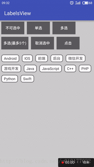
效果图:
最后给出该控件在GitHub中的地址,欢迎大家访问和使用。
https://github.com/donkingliang/LabelsView
文章已同步到我的简书
最后
以上就是着急小懒猪最近收集整理的关于Android自定义标签列表控件LabelsView解析的全部内容,更多相关Android自定义标签列表控件LabelsView解析内容请搜索靠谱客的其他文章。


发表评论 取消回复