Android 圆角按钮的实现
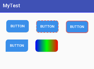
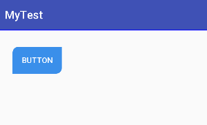
效果图:
- 在res/drawable目录下新建按钮样式文件 btn_normal.xml(正常状态) 和 btn_pressed.xml(按下状态)。
btn_normal.xml文件:
<?xml version="1.0" encoding="utf-8"?>
<shape
    xmlns:android="http://schemas.android.com/apk/res/android"
    android:shape="rectangle">

    <!-- 圆角的半径 -->
    <corners android:radius="10dp"/>

    <!-- 填充颜色 -->
    <solid android:color="#3a8fea"/>

</shape>
btn_pressed.xml文件:
<?xml version="1.0" encoding="utf-8"?>
<shape
	xmlns:android="http://schemas.android.com/apk/res/android"
	android:shape="rectangle">

    <!-- 圆角的半径 -->
    <corners android:radius="10dp"/>

    <!-- 填充颜色 -->
    <solid android:color="#0662f5"/>

</shape>
- 在res/drawable目录下新建样式文件 btn_selector.xml 文件,定义按钮的不同状态样式。
btn_selector.xml文件:
<?xml version="1.0" encoding="utf-8"?>
<selector xmlns:android="http://schemas.android.com/apk/res/android">

    <!-- 正常状态 -->
    <item android:drawable="@drawable/btn_normal" android:state_pressed="false"/>

    <!-- 按下状态 -->
    <item android:drawable="@drawable/btn_pressed" android:state_pressed="true"/>

</selector>
- 使用按钮样式。
activity_button.xml文件:
<?xml version="1.0" encoding="utf-8"?>
<android.support.constraint.ConstraintLayout
    xmlns:android="http://schemas.android.com/apk/res/android"
    xmlns:app="http://schemas.android.com/apk/res-auto"
    xmlns:tools="http://schemas.android.com/tools"
    android:layout_width="match_parent"
    android:layout_height="match_parent"
    tools:context=".ButtonActivity">

    <Button
        android:id="@+id/btn1"
        android:layout_width="wrap_content"
        android:layout_height="wrap_content"
        android:layout_marginTop="30dp"
        android:layout_marginStart="30dp"
        android:text="button"
        android:textColor="#fff"
        android:background="@drawable/btn_selector"
        app:layout_constraintLeft_toLeftOf="parent"
        app:layout_constraintTop_toTopOf="parent" />

</android.support.constraint.ConstraintLayout>
android:background=“@drawable/btn_selector”
其中的btn_selector是我们自定义的xml样式文件。
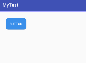
运行结果图:
- 给圆角按钮加上虚线边框样式。
btn_normal.xml文件:
<?xml version="1.0" encoding="utf-8"?>
<shape
    xmlns:android="http://schemas.android.com/apk/res/android"
    android:shape="rectangle">

    <!-- 圆角的半径 -->
    <corners android:radius="10dp"/>

    <!-- 填充颜色 -->
    <solid android:color="#3a8fea"/>

    <!-- 边框的宽度,每段虚线的长度,和两段虚线之间的间隔和颜色 -->
    <stroke
        android:width="2dp"
        android:dashWidth="6dp"
        android:dashGap="6dp"
        android:color="#e75050" />

</shape>
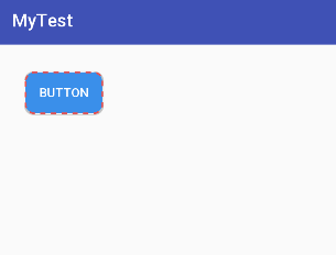
运行结果图:
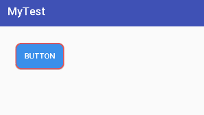
如果希望按钮边框是实线,那么把dashWidth和dashGap属性去除即可。
实线边框样式:
<?xml version="1.0" encoding="utf-8"?>
<shape
    xmlns:android="http://schemas.android.com/apk/res/android"
    android:shape="rectangle">

    <!-- 圆角的半径 -->
    <corners android:radius="10dp"/>

    <!-- 填充颜色 -->
    <solid android:color="#3a8fea"/>

    <!-- 实线边框 -->
    <stroke
        android:width="2dp"
        android:color="#e75050" />

</shape>
运行结果图:
- 实现局部圆角样式。
<?xml version="1.0" encoding="utf-8"?>
<shape
    xmlns:android="http://schemas.android.com/apk/res/android"
    android:shape="rectangle">

    <!-- 圆角的半径,左上/右下实现圆角 -->
    <corners
        android:topLeftRadius="10dp"
        android:bottomRightRadius="10dp"/>

    <!-- 填充颜色 -->
    <solid android:color="#3a8fea"/>

</shape>
运行结果图:
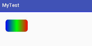
- 渐变背景色样式。
<gradient
  android:angle="integer"
  android:centerX="Float"
  android:centerY="Float"
  android:centerColor="integer"
  android:startColor="color"
  android:endColor="color"
  android:gradientRadius="integer"
  android:type=["linear"|"radial"|"sweep"]
  android:usesLevel=["true"|"false"]
  />
angle:角度,当 android:type=“linear”时有效 ,以45度为单位,逆时针方向旋转
centerX:Float。渐变色中心的 X 相对位置( 0-1.0 )。当 android:type=“linear”时无效
centerY:Float。渐变色中心的 Y 相对位置( 0-1.0 )。当 android:type=“linear”时无效
centerColor:color。可选的颜色,出现在 start 和 end 颜色之间。
gradientRadius:Float。渐变色的半径。当 android:type=“radial” 时有效。
startcolor:开始的颜色
endcolor:结束的颜色
type:渐变色的样式。有效值为:
“linear”:线性渐变,默认值
“radial”:环形渐变。 start 颜色是处于中间的颜色
“sweep”:扇形渐变
useLevel:Boolean。“ true ”表示可以当作 LevelListDrawable 使用
<?xml version="1.0" encoding="utf-8"?>
<shape
    xmlns:android="http://schemas.android.com/apk/res/android"
    android:shape="rectangle">

    <!-- 圆角的半径 -->
    <corners android:radius="10dp"/>

    <!-- 填充颜色 -->
    <solid android:color="#3a8fea"/>

    <gradient
        android:angle="180"
        android:startColor="#f00"
        android:centerColor="#0f0"
        android:endColor="#00f"
        android:type="linear"
        android:useLevel="true"/>

</shape>
运行结果图:
最后
以上就是霸气帅哥最近收集整理的关于Android 圆角按钮的实现Android 圆角按钮的实现的全部内容,更多相关Android内容请搜索靠谱客的其他文章。


发表评论 取消回复