<!DOCTYPE html>
<html>
<head>
  <meta charset="utf-8">
  <meta name="viewport" content="width=device-width">
  <title>CSS实现带阴影效果的三角形</title>
  <style>
    .box {
      position: relative;
      width: 600px;
      height: 400px;
      background: #fff;
      border: 1px solid #ccc;
      box-shadow: 2px 2px 2px #ccc;
    }
    .box:after {
      position: absolute;
      display: inline-block;
      top: 380px;
      left: 300px;
      width: 0;
      height: 0px;
      content: '';
      border-style: solid;
      border-width: 20px;
      border-color: #fff #fff transparent transparent;
      transform: rotate(135deg);
      box-shadow: 2px -2px 2px #ccc;
    }
  </style>
</head>
<body>

  <div class="box"></div>

</body>
</html>
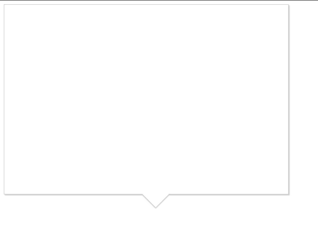
效果图:
最后
以上就是专注电灯胆最近收集整理的关于CSS实现三角形带阴影效果的全部内容,更多相关CSS实现三角形带阴影效果内容请搜索靠谱客的其他文章。
本图文内容来源于网友提供,作为学习参考使用,或来自网络收集整理,版权属于原作者所有。


发表评论 取消回复