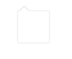
平时工作中,设计给出的类似于对话框的样式,基本上都会有阴影,这个时候一般都是有两种方式实现,一是用背景图,二是用代码实现,如图样式:
这里只说使用代码来实现:
<!DOCTYPE html>
<html>
  <head>
    <meta charset='utf-8'>
    <meta http-equiv='X-UA-Compatible' content='IE=edge'>
    <title></title>
    <meta name='viewport' content='width=device-width, initial-scale=1'>
    <style>
      .senior {
        position: relative;
        width: 100px;
        height: 100px;
        margin: 100px auto;
        background: rgba(255,255,255,1);
        box-shadow: 0px 0px 4px 1px rgba(0, 0, 0,.11);
      }

      .border-up-empty::after {
        content: '';
        position: absolute;
        left: 10px;
        top: -10px;
        width: 0;
        height: 0px;
        border-style: solid;
        border-width: 10px;
        border-color: #fff #fff transparent transparent;
        transform: rotate(-45deg);
        box-shadow: 3px -3px 3px rgba(0, 0, 0, .11);
      }
    </style>
  </head>
  <body>
    <div class="senior pt16">
      <div class="border-up-empty"></div>
    </div>
  </body>
</html>
最后
以上就是迷你奇异果最近收集整理的关于css 实现三角形阴影的全部内容,更多相关css内容请搜索靠谱客的其他文章。
本图文内容来源于网友提供,作为学习参考使用,或来自网络收集整理,版权属于原作者所有。


发表评论 取消回复