实现效果
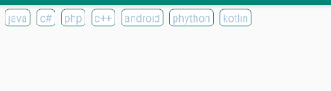
可以控制一行显示几个标签
实现方法
1 引入库:
implementation 'com.google.android:flexbox:2.0.0'注意:
Note that the default values for alignItems and alignContent for FlexboxLayout have been changed from stretch to flex_start starting from 2.0.0, it may break the existing apps. Please make sure to set stretch explicitly if you want to apply the behavior of stretch.
Note that starting from 1.1.0, the library is expected to use with AndroidX. Please migrate to AndroidX if you use 1.1.0 or above.
Please use 1.0.0 if you haven't migrated to AndroidX.
如果您尚未迁移到AndroidX,请使用1.0.0。 这句话是主要的
布局代码:
<?xml version="1.0" encoding="utf-8"?>
<LinearLayout xmlns:android="http://schemas.android.com/apk/res/android"
    xmlns:tools="http://schemas.android.com/tools"
    android:layout_width="match_parent"
    android:layout_height="match_parent"
    tools:context=".MainActivity">

   <com.google.android.flexbox.FlexboxLayout
       android:id="@+id/flexbox"
       android:layout_width="match_parent"
       android:layout_height="wrap_content"/>

</LinearLayout>
实现的activity
public class MainActivity extends AppCompatActivity {
    private FlexboxLayout flex;

    String arr[] = {"java", "c#", "php", "c++", "android", "phython", "kotlin"};

    @Override
    protected void onCreate(Bundle savedInstanceState) {
        super.onCreate(savedInstanceState);
        setContentView(R.layout.activity_main);
        flex = findViewById(R.id.flexbox);

        for (int i = 0; i < arr.length; i++) {
            TextView textView = new TextView(this);
            textView.setBackgroundResource(R.drawable.text_circle_gray);//给标签画一个背景
            textView.setText(arr[i]);
            textView.setTextColor(0xffa8c4d7);//设置字体颜色
            textView.setGravity(Gravity.CENTER);//字体居中
            textView.setPadding(10, 5, 10, 5);//设置padding
            textView.setTextSize(13);//设置字体大小
            FlexboxLayout.LayoutParams params = new FlexboxLayout.LayoutParams(FlexboxLayout.LayoutParams.WRAP_CONTENT, FlexboxLayout.LayoutParams.WRAP_CONTENT);
//            params.setFlexBasisPercent(0.2f);//相对父类所占的比例 ,可以控制一行有几个标签
            params.setMargins(20, 10, 0, 0);//根据需求自己设置
            textView.setLayoutParams(params);
            flex.addView(textView);

        }

    }
}
text_circle_gray 绘制的代码
<?xml version="1.0" encoding="utf-8"?>
<shape xmlns:android="http://schemas.android.com/apk/res/android">
    <corners android:radius="5dp" />
    <stroke
        android:width="2px"
        android:color="@color/colorPrimary" />
    <solid android:color="#ffffff" />
</shape>
如果只是实现标签功能,直接复制过去就行, 然后根据项目需求修改下即可
FlexboxLayout 其实就是把前端的Flex 布局引入到Android 如果对Flex 熟悉的化,FelxboxLayout 很容易的
下面介绍下FlexboxLayout 属性
flex-direction 属性决定主轴的方向(即内部子元素的排列方向)
1 row(默认值):水平显示,起点在左端
2 row_reverse:水平显示,起点在右端,与row相反的顺序
3 column:垂直显示,起点在顶部
4 column_reverse:垂直显示,起点在底部,与column相反的顺序
justifyContent决定元素在主轴上的对齐方式
1 flex_start(默认值):主轴方向起点对齐
2 flex_end:主轴方向终点对齐
3 center: 主轴方向居中对齐
4 space_between:主轴方向两端对齐,元素之间的间隔都相等。
5 space-around:每个元素两侧的间隔相等。所以,元素之间的间隔比元素与布局边框的间隔大一倍。
2个属性了,看看效果把
<?xml version="1.0" encoding="utf-8"?>
<LinearLayout xmlns:android="http://schemas.android.com/apk/res/android"
xmlns:app="http://schemas.android.com/apk/res-auto"
android:layout_width="match_parent"
android:layout_height="match_parent"
android:orientation="vertical">
<com.google.android.flexbox.FlexboxLayout
android:layout_width="match_parent"
android:layout_height="match_parent"
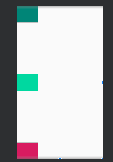
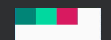
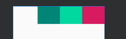
app:flexDirection="row"
app:justifyContent="space_between">
<TextView
android:id="@+id/textview1"
android:layout_width="100dp"
android:layout_height="80dp"
android:background="@color/colorPrimary" />
<TextView
android:id="@+id/textview2"
android:layout_width="100dp"
android:layout_height="80dp"
android:background="#00d8a0" />
<TextView
android:id="@+id/textview3"
android:layout_width="100dp"
android:layout_height="80dp"
android:background="@color/colorAccent" />
</com.google.android.flexbox.FlexboxLayout>
</LinearLayout>
app:flexDirection="column"效果图
app:flexDirection="row"
        app:justifyContent="space_around"
效果图

app:justifyContent="flex_start"效果图
app:justifyContent="flex_end"效果图
app:justifyContent="center"效果图

还有好多属性,
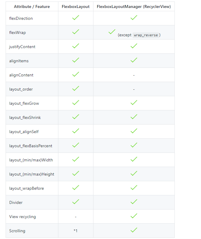
就不一个一个介绍了,大家看下官方demo 把
官方demo github地址连接
最后
以上就是义气康乃馨最近收集整理的关于Android 标签 (FlexboxLayout实现标签)的全部内容,更多相关Android内容请搜索靠谱客的其他文章。


发表评论 取消回复