示例
API
Text,很常用的一个Widget;用于显示简单样式文本,它包含一些控制文本显示样式的一些属性
text构造方法源码:
/// If the [style] argument is null, the text will use the style from the
  /// closest enclosing [DefaultTextStyle].
  ///
  /// The [data] parameter must not be null.
  const Text(
    this.data, {
    Key key,
    this.style,
    this.strutStyle,
    this.textAlign,
    this.textDirection,
    this.locale,
    this.softWrap,
    this.overflow,
    this.textScaleFactor,
    this.maxLines,
    this.semanticsLabel,
    this.textWidthBasis,
  }) : assert(
         data != null,
         'A non-null String must be provided to a Text widget.',
       ),
       textSpan = null,
       super(key: key);

  /// Creates a text widget with a [InlineSpan].
  ///
  /// The following subclasses of [InlineSpan] may be used to build rich text:
  ///
  /// * [TextSpan]s define text and children [InlineSpan]s.
  /// * [WidgetSpan]s define embedded inline widgets.
  ///
  /// The [textSpan] parameter must not be null.
  ///
  /// See [RichText] which provides a lower-level way to draw text.
  const Text.rich(
    this.textSpan, {
    Key key,
    this.style,
    this.strutStyle,
    this.textAlign,
    this.textDirection,
    this.locale,
    this.softWrap,
    this.overflow,
    this.textScaleFactor,
    this.maxLines,
    this.semanticsLabel,
    this.textWidthBasis,
  }) : assert(
         textSpan != null,
         'A non-null TextSpan must be provided to a Text.rich widget.',
       ),
       data = null,
       super(key: key);
参数详解:
data
要显示的字符串
style样式TextStyle
TextStyle的构造函数:
const TextStyle({
    this.inherit = true,
    this.color,
    this.backgroundColor,
    this.fontSize,
    this.fontWeight,
    this.fontStyle,
    this.letterSpacing,
    this.wordSpacing,
    this.textBaseline,
    this.height,
    this.locale,
    this.foreground,
    this.background,
    this.shadows,
    this.fontFeatures,
    this.decoration,
    this.decorationColor,
    this.decorationStyle,
    this.decorationThickness,
    this.debugLabel,
    String fontFamily,
    List<String> fontFamilyFallback,
    String package,
  }) : fontFamily = package == null ? fontFamily : 'packages/$package/$fontFamily',
       _fontFamilyFallback = fontFamilyFallback,
       _package = package,
       assert(inherit != null),
       assert(color == null || foreground == null, _kColorForegroundWarning),
       assert(backgroundColor == null || background == null, _kColorBackgroundWarning);
| 属性 | 说明 |
|---|---|
| inherit | 是否将null值替换为祖先文本样式中的值(例如,在TextSpan树中)。如果为false,则没有显式值的属性将恢复为默认值:白色,字体大小为10像素,采用无衬线字体。 |
| color | 字体颜色 如自定义颜色:Color.fromRGBO(155, 155, 155, 1) 也可以使用Colors类里面自带的属性 |
| backgroundColor | 文本的背景颜色 |
| fontSize | 字体大小,默认14像素 |
| fontWeight | 字体厚度,可以使文本变粗或变细 FontWeight.bold 常用的字体重量比正常重。即w700 FontWeight.normal 默认字体粗细。即w400 FontWeight.w100 薄,最薄 FontWeight.w200 特轻 FontWeight.w300 轻 FontWeight.w400 正常/普通/平原 FontWeight.w500 较粗 FontWeight.w600 半粗体 FontWeight.w700 加粗 FontWeight.w800 特粗 FontWeight.w900 最粗 |
| fontStyle | 字体变体: FontStyle.italic 使用斜体 FontStyle.normal 使用直立 |
| letterSpacing | 水平字母之间的空间间隔(逻辑像素为单位)。可以使用负值来让字母更接近。 |
| wordSpacing | 单词之间添加的空间间隔(逻辑像素为单位)。可以使用负值来使单词更接近。 |
| textBaseline | 对齐文本的水平线: TextBaseline.alphabetic:文本基线是标准的字母基线 TextBaseline.ideographic:文字基线是表意字基线; 如果字符本身超出了alphabetic 基线,那么ideograhpic基线位置在字符本身的底部。 |
| height | 文本行与行的高度,作为字体大小的倍数(取值1~2,如1.2) |
| locale | 文本的前景色,不能与color共同设置(比文本颜色color区别在Paint功能多,后续会讲解) |
| background | 文本背景色Paint()…color = backgroundColor |
| foreground | 文本的前景色,不能与color共同设置 |
| shadows | 文本的阴影可以利用列表叠加处理,例如shadows: [Shadow(color:Colors.black,offset: Offset(6, 3), blurRadius: 10)], color即阴影的颜色, offset即阴影相对文本的偏移坐标,blurRadius即阴影的模糊程度,越小越清晰 |
| decoration | 文字的线性装饰,比如 TextDecoration.underline 下划线, TextDecoration.lineThrough删除线 |
| decorationColor | 文本装饰线的颜色 |
| decorationStyle | 文本装饰线的样式,比如 TextDecorationStyle.dashed 虚线 |
textAlign
文本应如何水平对齐enum:
| 可选值 | 说明 |
|---|---|
| TextAlign.center | 将文本对齐容器的中心。 |
| TextAlign.end | 对齐容器后缘上的文本。 |
| TextAlign.start | 对齐容器前缘上的文本。 |
| TextAlign.justify | 拉伸以结束的文本行以填充容器的宽度。即使用了decorationStyle才起效 |
| TextAlign.left | 对齐容器左边缘的文本。 |
| TextAlign.right | 对齐容器右边缘的文本。 |
textDirection
相对TextAlign中的start、end而言有用(当start使用了ltr相当于end使用了rtl,也相当于TextAlign使用了left)
| 可选值 | 说明 |
|---|---|
| TextDirection.ltr | ltr从左至右, |
| TextDirection.rtl | rtl从右至左 |
softWrap
是否自动换行(true自动换行,false单行显示,超出屏幕部分默认截断处理)
overflow
文字超出屏幕之后的处理方式
| 可选值 | 说明 |
|---|---|
| TextOverflow.clip | 剪切溢出的文本以修复其容器。 |
| TextOverflow.ellipsis | 使用省略号表示文本已溢出。 |
| TextOverflow.fade | 将溢出的文本淡化为透明。 |
其他
| 属性 | 说明 |
|---|---|
| textScaleFactor | 字体显示倍率 |
| maxLines | 文字显示最大行数 |
文本拼接
在上面的例子中,Text的所有文本内容只能按同一种样式,如果我们需要对一个Text内容的不同部分按照不同的样式显示,这时就可以使用TextSpan,它代表文本的一个“片段”。我们看看TextSpan的定义:
const TextSpan({
  TextStyle style,
  Sting text,
  List<TextSpan> children,
  GestureRecognizer recognizer,
});
Demo源码
import 'dart:math';
import 'package:flutter/material.dart';
class TextDemo extends StatelessWidget {
@override
Widget build(BuildContext context) {
return new Scaffold(
appBar: AppBar(
title: Text("文本测试"),
),
backgroundColor: Colors.white,
body: buildText(),
);
}
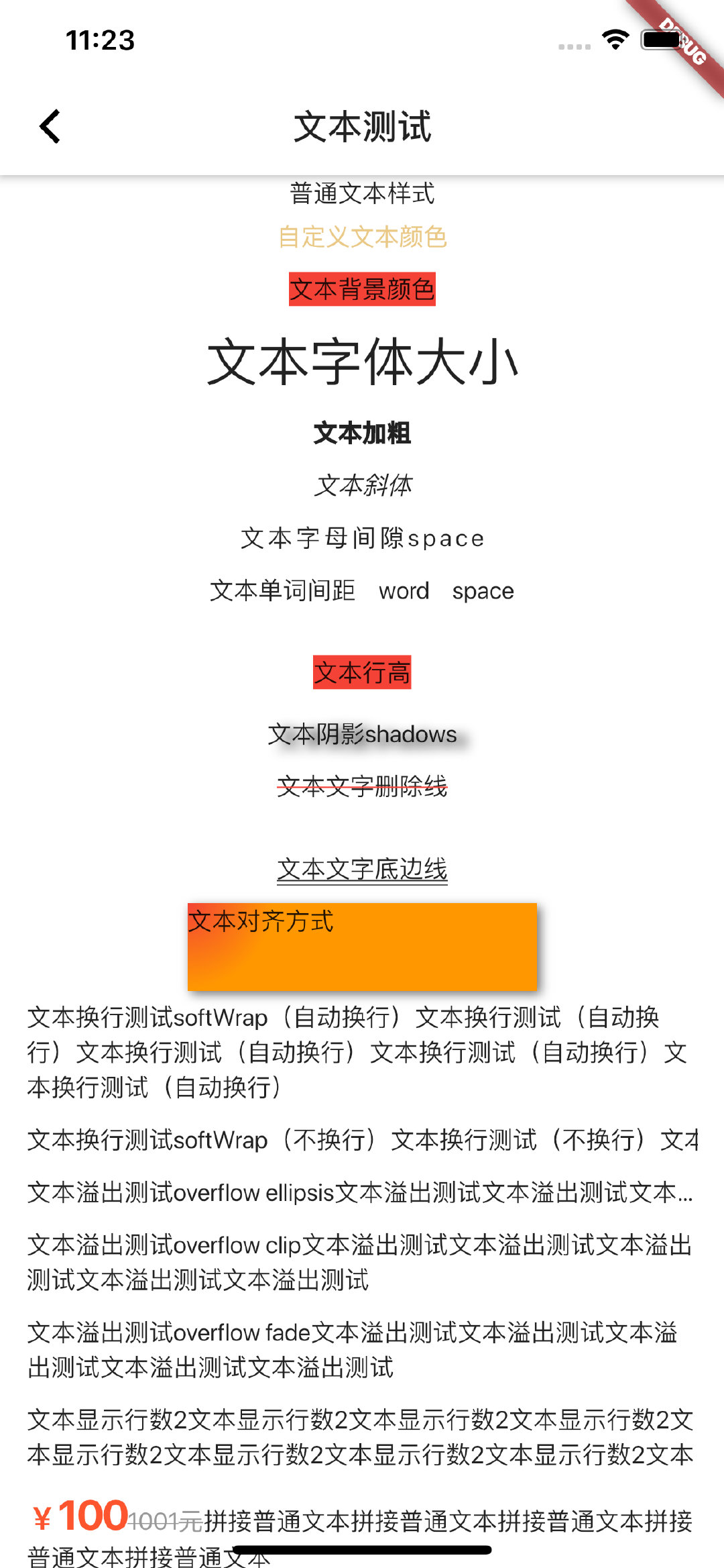
Widget buildText(){
return new SingleChildScrollView(
child: Column(
children: <Widget>[
Text('普通文本样式'),
Padding(
padding: EdgeInsets.fromLTRB(15, 5, 15, 5),
child: Text('自定义文本颜色',style: TextStyle(color: Color.fromRGBO(234,200,134,1)),),
),
Padding(
padding: EdgeInsets.fromLTRB(15, 5, 15, 5),
child: Text('文本背景颜色',style: TextStyle(backgroundColor: Colors.red),),
),
Padding(
padding: EdgeInsets.fromLTRB(15, 5, 15, 5),
child: Text('文本字体大小',style: TextStyle(fontSize: 30.0),),
),
Padding(
padding: EdgeInsets.fromLTRB(15, 5, 15, 5),
child: Text('文本加粗',style: TextStyle(fontWeight: FontWeight.w900),),
),
Padding(
padding: EdgeInsets.fromLTRB(15, 5, 15, 5),
child: Text('文本斜体',style: TextStyle(fontStyle: FontStyle.italic),),
),
Padding(
padding: EdgeInsets.fromLTRB(15, 5, 15, 5),
child: Text('文本字母间隙space',style: TextStyle(letterSpacing: 2),),
),
Padding(
padding: EdgeInsets.fromLTRB(15, 5, 15, 5),
child: Text('文本单词间距 word space',style: TextStyle(wordSpacing: 10),),
),
Padding(
padding: EdgeInsets.fromLTRB(15, 5, 15, 5),
child: Text('文本行高',style: TextStyle(height: 3, backgroundColor: Colors.red),),
),
Padding(
padding: EdgeInsets.fromLTRB(15, 5, 15, 5),
child: Text('文本阴影shadows',style: TextStyle(shadows: [Shadow(color:Colors.black,offset: Offset(6, 3), blurRadius: 10)]),),
),
Padding(
padding: EdgeInsets.fromLTRB(15, 5, 15, 5),
child: Text('文本文字删除线',style: TextStyle(decoration: TextDecoration.lineThrough, decorationColor: Colors.red),),
),
Padding(
padding: EdgeInsets.fromLTRB(15, 5, 15, 5),
child: Text('文本文字底边线',style: TextStyle(height: 3, decoration: TextDecoration.underline, decorationStyle: TextDecorationStyle.double),),
),
Container(
// margin: EdgeInsets.only(top: 50.0, left: 120.0),
constraints: BoxConstraints.tightFor(width: 200.0, height: 50.0), //卡片大小
decoration: BoxDecoration(//背景装饰
gradient: RadialGradient( //背景径向渐变
colors: [Colors.red, Colors.orange],
center: Alignment.topLeft,
radius: .98
),
boxShadow: [ //卡片阴影
BoxShadow(
color: Colors.black54,
offset: Offset(2.0, 2.0),
blurRadius: 4.0
)
]
),
// alignment: Alignment.center,
child: Text('文本对齐方式',textAlign: TextAlign.left,),
),
Padding(
padding: EdgeInsets.fromLTRB(15, 5, 15, 5),
child: Text('文本换行测试softWrap(自动换行)文本换行测试(自动换行)文本换行测试(自动换行)文本换行测试(自动换行)文本换行测试(自动换行)', softWrap: true,),
),
Padding(
padding: EdgeInsets.fromLTRB(15, 5, 15, 5),
child: Text('文本换行测试softWrap(不换行)文本换行测试(不换行)文本换行测试(不换行)文本换行测试(不换行)文本换行测试(不换行)', softWrap: false,),
),
Padding(
padding: EdgeInsets.fromLTRB(15, 5, 15, 5),
child: Text('文本溢出测试overflow ellipsis文本溢出测试文本溢出测试文本溢出测试文本溢出测试文本溢出测试', overflow: TextOverflow.ellipsis,),
),
Padding(
padding: EdgeInsets.fromLTRB(15, 5, 15, 5),
child: Text('文本溢出测试overflow clip文本溢出测试文本溢出测试文本溢出测试文本溢出测试文本溢出测试', overflow: TextOverflow.clip,),
),
Padding(
padding: EdgeInsets.fromLTRB(15, 5, 15, 5),
child: Text('文本溢出测试overflow fade文本溢出测试文本溢出测试文本溢出测试文本溢出测试文本溢出测试', overflow: TextOverflow.fade,),
),
Padding(
padding: EdgeInsets.fromLTRB(15, 5, 15, 5),
child: Text('文本显示行数2文本显示行数2文本显示行数2文本显示行数2文本显示行数2文本显示行数2文本显示行数2文本显示行数2文本显示行数2文本显示行数2文本显示行数2', maxLines: 2,),
),
Padding(
padding: EdgeInsets.fromLTRB(15, 5, 15, 5),
child: Text.rich(
TextSpan(
children: [
TextSpan(
text:'¥',
style: TextStyle(
color: Color.fromRGBO(255,85,46,1),
fontSize: 18.0,
fontWeight: FontWeight.w700
)
),
TextSpan(
text: '100',
style: TextStyle(
color: Color.fromRGBO(255,85,46,1),
fontSize: 24.0,
//字体加粗
fontWeight: FontWeight.w700
)
),
TextSpan(
text:'1001元',
style: TextStyle(
decoration: TextDecoration.lineThrough,
color: Color.fromRGBO(153,153,153,1),
fontSize: 14.0,
//字体加粗
// fontWeight: FontWeight.w700
)
),
TextSpan(
text:'拼接普通文本拼接普通文本拼接普通文本拼接普通文本拼接普通文本'
)
]
)
),
),
],
),
);
}
}
最后
以上就是生动宝贝最近收集整理的关于Flutter Text详解的全部内容,更多相关Flutter内容请搜索靠谱客的其他文章。
本图文内容来源于网友提供,作为学习参考使用,或来自网络收集整理,版权属于原作者所有。


发表评论 取消回复