ggplot2折线图组合可视化
设置路径和数据读取
setwd("C:\Users\Administrator\Desktop\R_visualization")
library(ggplot2)
df<-read.csv("MappingAnalysis_Data.csv", header = TRUE)
数据和路径脚本资料百度云的链接为:
链接:https://pan.baidu.com/s/1Dr0YweHG_zbxL8mPStTwSg
提取码:ww18
数据描述如下:
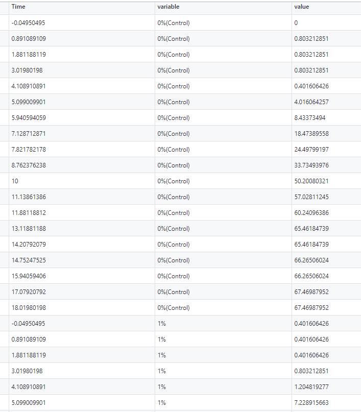
绘制形状
ggplot(data=df, aes(x=Time,y=value,group=variable)) +
  geom_line()+
  geom_point(shape=21,size=4,colour="black",fill="white") +
  theme_classic()+
  theme(
    text=element_text(size=14,color="black"),
    plot.title=element_text(size=14,family="myfont",face="bold.italic",hjust=.5,color="black"),
    legend.background = element_blank(),
    legend.position=c(0.2,0.8)
  )
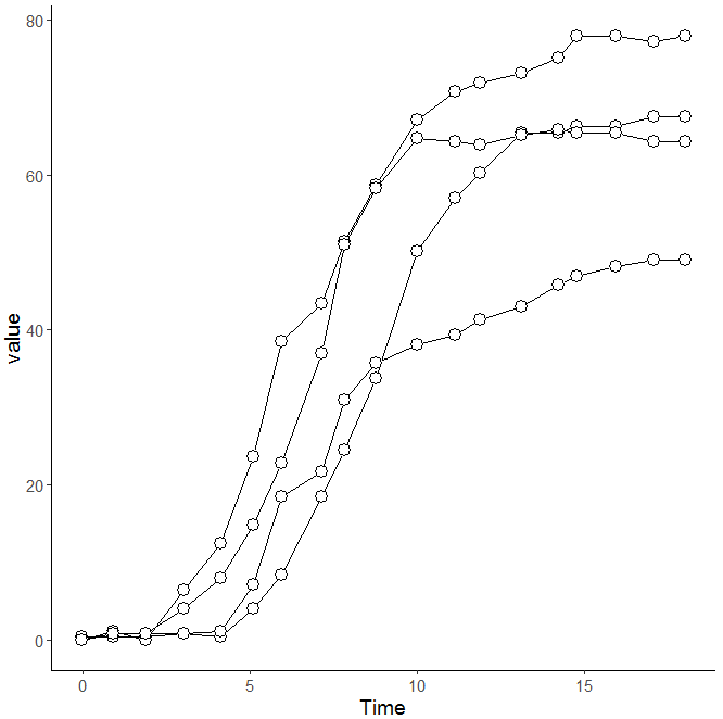
改变颜色
ggplot(data=df, aes(x=Time,y=value,fill=variable)) +
  geom_line()+
  geom_point(shape=21,size=4,colour="black") +
  scale_fill_manual(values=c("grey60","grey30","black","white"))+
  theme_classic()+
  theme(
    text=element_text(size=14,color="black"),
    plot.title=element_text(size=14,family="myfont",face="bold.italic",hjust=.5,color="black"),
    legend.background = element_blank(),
    legend.position=c(0.2,0.8)
  )
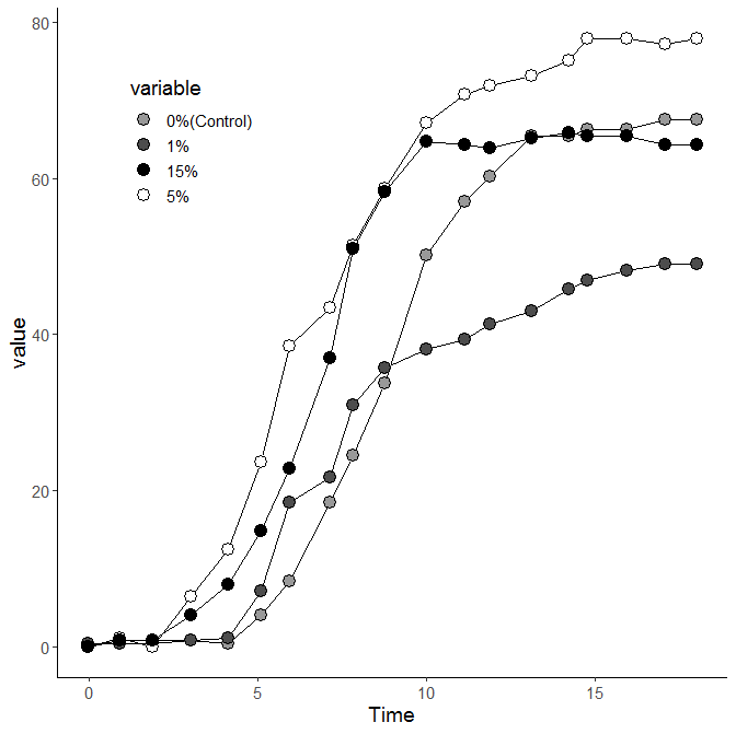
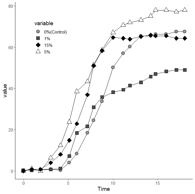
改变形状
ggplot(data=df, aes(x=Time,y=value,shape=variable)) +
  geom_line()+
  geom_point(size=4,colour="black",fill="grey60") +
  scale_shape_manual(values=c(21,22,23,24))+
  theme_classic()+
  theme(
    text=element_text(size=14,color="black"),
    plot.title=element_text(size=14,family="myfont",face="bold.italic",hjust=.5,color="black"),
    legend.background = element_blank(),
    legend.position=c(0.2,0.8)
  )
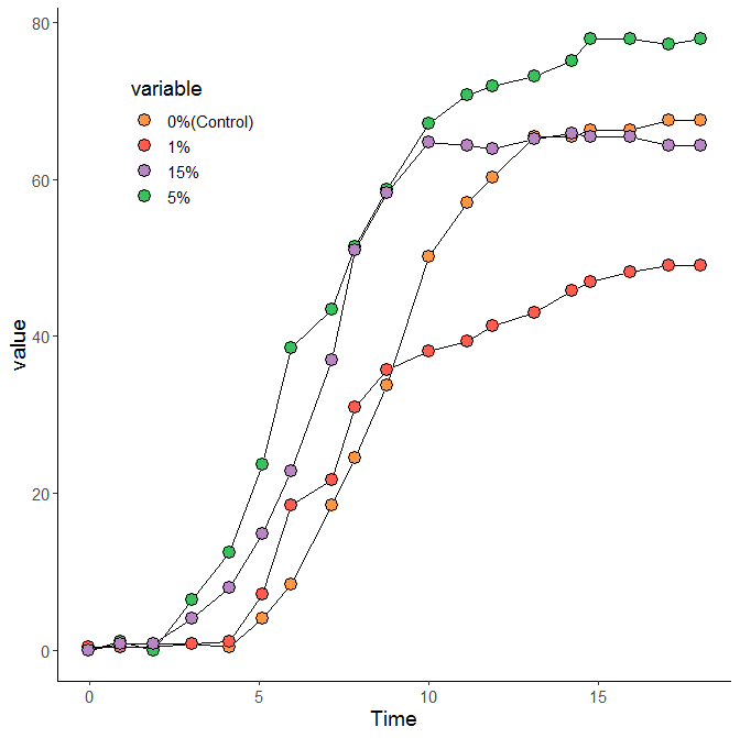
再改变颜色
ggplot(data=df, aes(x=Time,y=value,fill=variable)) +
  geom_line()+
  geom_point(shape=21,size=4,colour="black") +
  scale_fill_manual(values=c("#FF9641","#FF5B4E","#B887C3","#38C25D"))+
  theme_classic()+
  theme(
    text=element_text(size=14,color="black"),
    plot.title=element_text(size=14,family="myfont",face="bold.italic",hjust=.5,color="black"),
    legend.background = element_blank(),
    legend.position=c(0.2,0.8)
  )
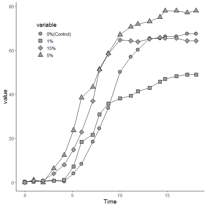
改变颜色和形状
ggplot(data=df, aes(x=Time,y=value,fill=variable,shape=variable)) +
  geom_line()+
  geom_point(size=4,colour="black") +
  scale_fill_manual(values=c("grey60","grey30","black","white"))+
  scale_shape_manual(values=c(21,22,23,24))+
  theme_classic()+
  theme(
    text=element_text(size=14,color="black"),
    plot.title=element_text(size=14,family="myfont",face="bold.italic",hjust=.5,color="black"),
    legend.background = element_blank(),
    legend.position=c(0.2,0.8)
  )
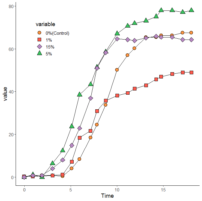
改变颜色和形状
ggplot(data=df, aes(x=Time,y=value,fill=variable,shape=variable)) +
  geom_line()+
  geom_point(size=4,colour="black") +
  scale_fill_manual(values=c("#FF9641","#FF5B4E","#B887C3","#38C25D"))+
  scale_shape_manual(values=c(21,22,23,24))+
  theme_classic()+
  theme(
    text=element_text(size=14,color="black"),
    plot.title=element_text(size=14,family="myfont",face="bold.italic",hjust=.5,color="black"),
    legend.background = element_blank(),
    legend.position=c(0.2,0.8)
  )
参考资料1:https://github.com/EasyChart/Beautiful-Visualization-with-R/
参考资料2:https://blog.csdn.net/tandelin/article/details/87719623
最后
以上就是欣慰荷花最近收集整理的关于R语言可视化(二)ggplot2折线图组合可视化的全部内容,更多相关R语言可视化(二)ggplot2折线图组合可视化内容请搜索靠谱客的其他文章。
本图文内容来源于网友提供,作为学习参考使用,或来自网络收集整理,版权属于原作者所有。


发表评论 取消回复