引言
好久不用echarts,一上手发现好多东西都忘记了,写一篇记录一下使用心得。首先是无论什么时候都不要忘记官方文档hhhhh。
布局问题
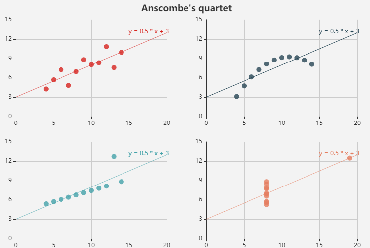
如何在一张图上显示多张图:一组数据的不同展示方式这类可以参考官方例子有很多;几组数据在一张图上分别展示,是本部分主要介绍的。
可参考官方demo:四张图
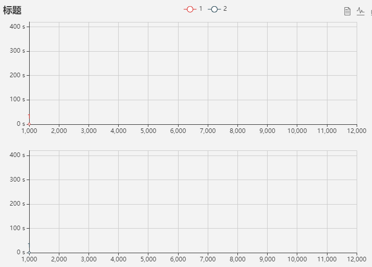
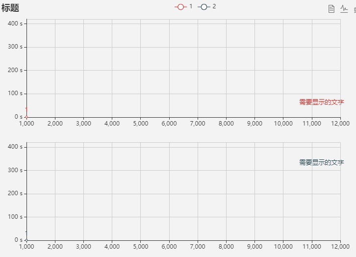
上下两图布局的可以参考以下代码:
var dataAll = [
    [
       [1000,1000],
       [1100,1100]
    ],
    [
       [1000,1000],
       [1100,1100]
       //数据数据数据
    ]
];
option = {
//这里只写需要注意的地方,其他和普通图一样
 grid: [//控制图位置
        {x: '7%', y: '7%', width: '80%', height: '39%'},
        {x: '7%', y: '56%', width: '80%', height: '39%'}
    ],
  //x,y轴设定
  xAxis: [
        {gridIndex: 0, min: 1000, max: 12000,splitNumber : 11
        //splitNumber 最大最小之间分割多少块},
        {gridIndex: 1, min: 1000, max: 12000,splitNumber : 11}
    ],
  yAxis: [
        {gridIndex: 0,  min: 0, max: 420,
        axisLabel: {formatter: '{value} s'}},//单位设定
        {gridIndex: 1, min: 0, max: 420,
        axisLabel: {formatter: '{value} s'}},
    ],
    series: [
    //series中的data,使用data: dataAll[1]这种表现方式
        {
            name: '1',
            type: 'line',
            xAxisIndex: 0,
            yAxisIndex: 0,
            label: {
                show: true//显示数字值
            },
            data:dataAll[0],
        },
        {
            name: '2',
            type: 'line',
            xAxisIndex: 1,
            yAxisIndex: 1,
            label: {
                show: true
            },
            data: dataAll[1],
        }
    ]
}
辅助线 markLine
添加位置:option→series,与data并列
可参考官方demo:
未来一周天气变化
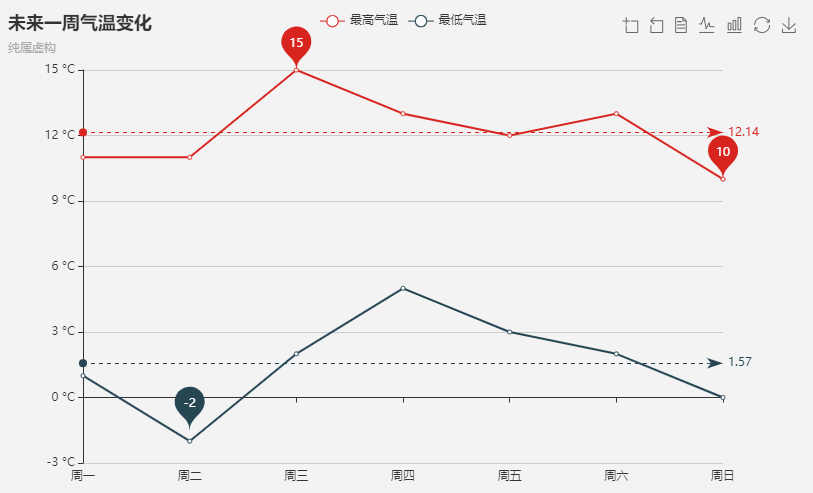
series: [
        {
            name: '最高气温',
            type: 'line',
            data: [11, 11, 15, 13, 12, 13, 10],
            markPoint: {
                data: [
                    {type: 'max', name: '最大值'},
                    {type: 'min', name: '最小值'}
                ]
            },
            markLine: {
                data: [
                    {type: 'average', name: '平均值'}
                ]
            }
        }
分组柱状图
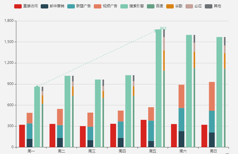
 {
            name: '搜索引擎',
            type: 'bar',
            data: [862, 1018, 964, 1026, 1679, 1600, 1570],
            markLine: {
                lineStyle: {
                    type: 'dashed'
                },
                data: [
                    [{type: 'min'}, {type: 'max'}]
                ]
            }
        }
设置自定义值的辅助线
markLine: {
                data: [
                    {name: '随便起个名字就行',
                    yAxis: 3.14, //这里设置的是平行于X轴的辅助线
                        label:{
                            show:true,
                            position:"end", //文字显示位置,可以设置start、middle、end
                            formatter: "想要显示的文字",
                        }
                    }
                ]
            }
markLine: {
                data: [
                    {
                        name: '随便取',
                        symbol: 'none',//控制什么的不知道
                        x:'83%',
                        yAxis: 300,
                        symbol: 'circle',//把这个注释掉,就没有起始点的原点了
                        lineStyle:{
                            //color:'',
                            //color:'transparent'
                            //如何设置透明色↑
                            },
                        label:{
                            show:true,
                            position:"end",
                            formatter: "需要标注的文字",
                        }
                    }
                ]
            }

文字标注
如何在图中加文字标注
可参考官方demo:line-graphic
简单版的,只插入文字:
graphic: [
        {
            type: 'text',
            id: 'text1',
            left: '76.55%',
            top: '39%',
            style: {
                fill: '#c23531',
                text: ['需要显示的文字',].join('n'),
                font: '13px Microsoft YaHei'
            }
        },
        {
            type: 'text',
            id: 'text2',
            left: '76.55%',
            top: '63%',
            style: {
                fill: '#2f4554',
                text: ['需要显示的文字',].join('n'),
                font: '13px Microsoft YaHei'
            }
        }
    ]
零零碎碎的小知识点
设置透明色:color:‘transparent’
设置显示数据值:label: {show: true},在series中设置和data平级
未完待续
最后
以上就是精明月饼最近收集整理的关于echarts:如何一张图显示多张图、添加辅助线、辅助文字、设置透明色、显示数值标签的全部内容,更多相关echarts内容请搜索靠谱客的其他文章。
本图文内容来源于网友提供,作为学习参考使用,或来自网络收集整理,版权属于原作者所有。


发表评论 取消回复