目录
属性触发器
数据触发器
事件触发器
触发器有多种形式:属性触发器,事件触发器和数据触发器。它们允许您在标记种完成通常用后台代码完成的操作,这是分离样式和代码的持续过程的一部分
属性触发器
最常见的触发器是属性触发器,它在标记种简单地用<Trigger>元素定义。它在所有者控件上监视特定属性,并且当该属性具有与指定值匹配的值时,可以更改属性
<Window x:Class="_002属性触发器.MainWindow"
xmlns="http://schemas.microsoft.com/winfx/2006/xaml/presentation"
xmlns:d="http://schemas.microsoft.com/expression/blend/2008"
xmlns:x="http://schemas.microsoft.com/winfx/2006/xaml"
xmlns:mc="http://schemas.openxmlformats.org/markup-compatibility/2006"
mc:Ignorable="d"
Title="MainWindow" Height="450" Width="800">
<Grid>
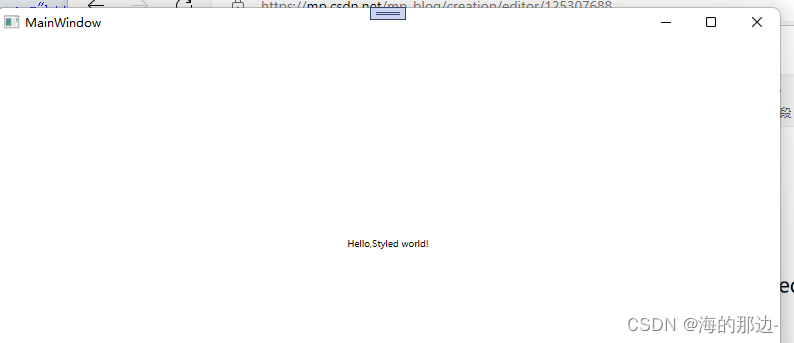
<TextBlock Text="Hello,styled world!" FontSize="38" HorizontalAlignment="Center" VerticalAlignment="Center">
<TextBlock.Style>
<Style TargetType="TextBlock">
<Setter Property="Foreground" Value="BurlyWood">
</Setter>
<Style.Triggers>
<Trigger Property="IsMouseOver" Value="True">
<Setter Property="Foreground" Value="Red"></Setter>
<Setter Property="TextDecorations" Value="Underline"></Setter>
</Trigger>
</Style.Triggers>
</Style>
</TextBlock.Style>
</TextBlock>
</Grid>
</Window>
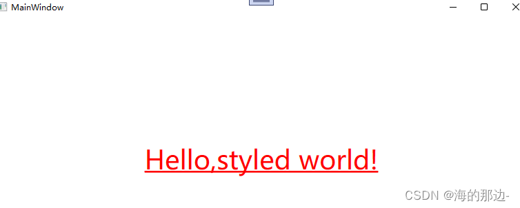
在这个样式中,我们将Foreground属性设置为蓝色,使其看起来像一个超链接。 然后我们添加一个触发器,它监听IsMouseOver属性 - 一旦这个属性变为True,我们应用两个setter:我们将Foreground更改为红色,然后给文本加下划线。 这是一个很好的例子,说明使用触发器应用变更是多么容易,完全没有任何后台代码。
数据触发器
由<DataTrigger>元素表示的数据触发器用于不一定时以来属性的属性。它们通过创建与常规属性的绑定来工作,然后监视其更改。这也用于将触发器绑定到不同控件上的属性
<Window x:Class="_003数据触发器.MainWindow"
        xmlns="http://schemas.microsoft.com/winfx/2006/xaml/presentation"
        xmlns:d="http://schemas.microsoft.com/expression/blend/2008"
        xmlns:x="http://schemas.microsoft.com/winfx/2006/xaml"
        xmlns:mc="http://schemas.openxmlformats.org/markup-compatibility/2006"
        mc:Ignorable="d"
        Title="MainWindow" Height="450" Width="800">
    <StackPanel HorizontalAlignment="Center" VerticalAlignment="Center">
        <CheckBox x:Name="cbSample" Content="Hello,world?"></CheckBox>
        <TextBlock HorizontalAlignment="Center" VerticalAlignment="Center" Margin="0,20,0,0" FontSize="48">
            <TextBlock.Style>
                <Style TargetType="TextBlock">
                    <Setter Property="Text" Value="No"></Setter>
                    <Setter Property="Foreground" Value="Red"></Setter>
                    <Style.Triggers>
                        <DataTrigger Binding="{Binding ElementName=cbSample,Path=IsChecked}" Value="True">
                            <Setter Property="Text" Value="Yes!"></Setter>
                            <Setter Property="Foreground" Value="Green"></Setter>
                        </DataTrigger>
                    </Style.Triggers>
                </Style>
            </TextBlock.Style>
        </TextBlock>
    </StackPanel>
</Window>
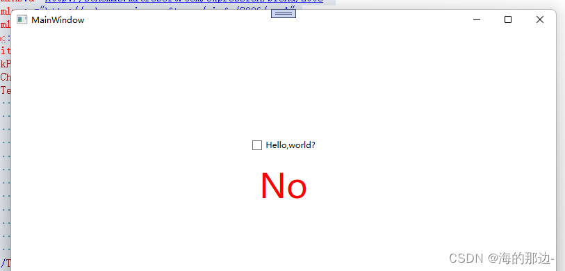
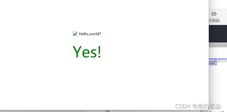
在这个例子中,我们有一个CheckBox和一个TextBlock。 使用DataTrigger,我们将TextBlock绑定到CheckBox的IsChecked属性。 然后我们提供一个默认样式,其文本为“No”,前景色为红色,然后使用DataTrigger,我们提供一个样式,用于CheckBox的IsChecked属性更改为True时,我们将其设置为绿色,并显示"Yes!"的文本。 (如截图所示)。
事件触发器
由<EventTrigger>元素表示的事件触发器主要用于触发动画,以响应被调用的事件。
<Window x:Class="_004事件触发器.MainWindow"
xmlns="http://schemas.microsoft.com/winfx/2006/xaml/presentation"
xmlns:d="http://schemas.microsoft.com/expression/blend/2008"
xmlns:x="http://schemas.microsoft.com/winfx/2006/xaml"
xmlns:mc="http://schemas.openxmlformats.org/markup-compatibility/2006"
mc:Ignorable="d"
Title="MainWindow" Height="450" Width="800">
<Grid>
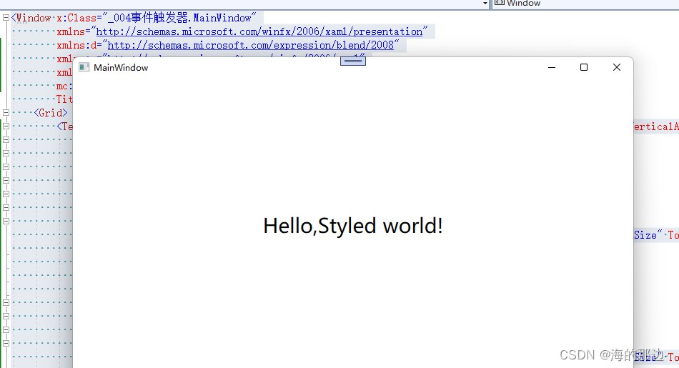
<TextBlock x:Name="lblStyled" Text="Hello,Styled world!" FontSize="18" HorizontalAlignment="Center" VerticalAlignment="Center">
<TextBlock.Style>
<Style TargetType="TextBlock">
<Style.Triggers>
<EventTrigger RoutedEvent="MouseEnter">
<EventTrigger.Actions>
<BeginStoryboard>
<Storyboard>
<DoubleAnimation Duration="0:0:0.300" Storyboard.TargetProperty="FontSize" To="28"></DoubleAnimation>
</Storyboard>
</BeginStoryboard>
</EventTrigger.Actions>
</EventTrigger>
<EventTrigger RoutedEvent="MouseLeave">
<EventTrigger.Actions>
<BeginStoryboard>
<Storyboard>
<DoubleAnimation Duration="0:0:0.800" Storyboard.TargetProperty="FontSize" To="9"></DoubleAnimation>
</Storyboard>
</BeginStoryboard>
</EventTrigger.Actions>
</EventTrigger>
</Style.Triggers>
</Style>
</TextBlock.Style>
</TextBlock>
</Grid>
</Window>
标记可能看起来很复杂,但是如果你运行这个例子并查看结果,你会发现我们实际上已经完成了一个非常酷的动画,两个方法在大约20行的XAML中。 如您所见,我使用EventTrigger订阅两个事件:MouseEnter和MouseLeave。 当鼠标进入时,我会在300毫秒内进行平滑和动画过渡到28像素的FontSize。 当鼠标离开时,我将FontSize改回18像素,但我做得有点慢,只是为了它看起来很酷。
小结
WPF样式可以轻松获得一致的外观,并且通过触发器,这种外观变得动态。 样式在您的应用程序中非常棒,在控件模板中使用它们时甚至更好。
最后
以上就是忧心大白最近收集整理的关于WPF样式:触发器数据触发器和事件触发器属性触发器 数据触发器事件触发器 的全部内容,更多相关WPF样式内容请搜索靠谱客的其他文章。


发表评论 取消回复