css伪元素实现选中效果
.item{
      border: 1px solid #00a9ff;
      position: relative;

      &:after {
        position: absolute;
        content: '';
        width: 0px;
        height: 0px;
        top: 0px;
        right: 0px;
        border-top: 10px solid #00a9ff;
        border-bottom: 10px solid transparent;
        border-left: 10px solid transparent;
        border-right: 10px solid #00a9ff;
        z-index: 1;
      }

      &:before {
        position: absolute;
        content: '';
        width: 4px;
        height: 8px;
        transform: rotate(45deg);
        border-right: 2px solid #FFF;
        border-bottom: 2px solid #FFF;
        top: 0px;
        right: 3px;
        z-index: 2;
      }
    }
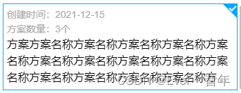
最后效果如下:
最后
以上就是明亮薯片最近收集整理的关于css伪元素实现选中效果【打勾效果】的全部内容,更多相关css伪元素实现选中效果【打勾效果】内容请搜索靠谱客的其他文章。
本图文内容来源于网友提供,作为学习参考使用,或来自网络收集整理,版权属于原作者所有。


发表评论 取消回复