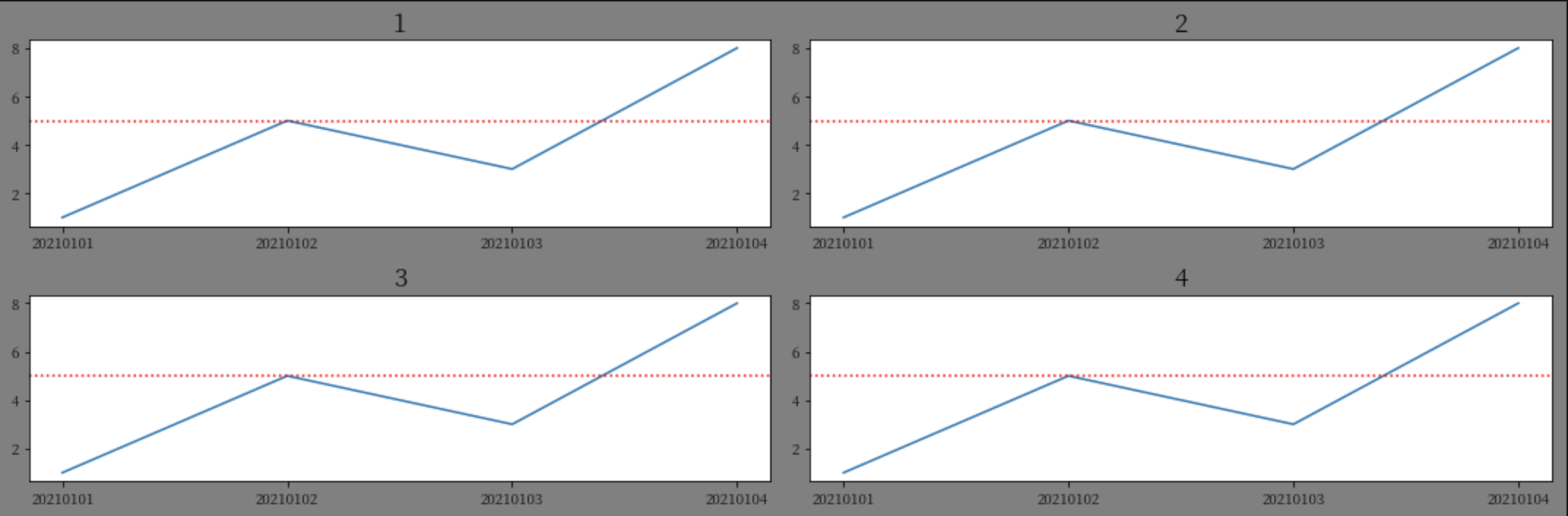
画子图:
import matplotlib.pyplot as plt

width  = 15
height = 5
data = {
    '1':{'20210101':1,'20210102':5,'20210103':3,'20210104':8},
    '2':{'20210101':1,'20210102':5,'20210103':3,'20210104':8},
    '3':{'20210101':1,'20210102':5,'20210103':3,'20210104':8},
    '4':{'20210101':1,'20210102':5,'20210103':3,'20210104':8}
}
#创建画布column_len宽,row_len长
fig = plt.figure(figsize=(width,height))
#设置画布背景色
fig.patch.set_facecolor('gray')

c = 1
for group,dates in data.items():
    x  = []
    y = []
    for date,val in dates.items():
        x.append(date)
        y.append(val)

    #画子图图,在2 * 2的方格里的c位置
    plt.subplot(2,2,c)
    #设置x轴和y轴
    plt.plot(x,y)
    #子图title
    plt.title(f"{group}",fontsize='xx-large',fontweight='heavy')
    #在y轴指定坐标添加水平直线, ls 线条样式,c 线条颜色

    plt.axhline(y=5,ls=":",c="r")

    #子图间距自适应
    plt.tight_layout()

    c += 1
plt.show()
效果图:
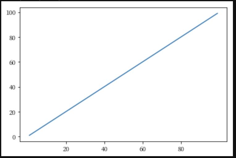
x轴自定义显示:
x = range(1,100)
y = range(1,100)
xt = []
for i in x:
    #x轴,每隔20,显示一个坐标
    if(i % 20 == 0):
        xt.append(i)

# '-' 实线
plt.plot(x,y,'-')
plt.xticks(xt)
plt.show()
效果图:
最后
以上就是要减肥戒指最近收集整理的关于python3 画图matplotlib.pyplot的全部内容,更多相关python3内容请搜索靠谱客的其他文章。
本图文内容来源于网友提供,作为学习参考使用,或来自网络收集整理,版权属于原作者所有。


发表评论 取消回复