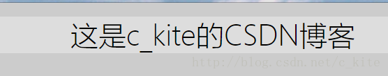
1. 水平居中
效果:
<!DOCTYPE html>
<html lang="en">

<head>
  <title>水平居中</title>
  <style type="text/css">
    body {
      background-color: #CCC;
    }

    .container {
      margin: 0 auto;
      background-color: #ddd;
      text-align: center;
    }
  </style>
</head>

<body>
  <div class="container">
    <span>这是c_kite的CSDN博客</span>
  </div>
</body>

</html>
或者使用绝对定位方式
    .container {
      position: absolute;
      left: 50%;
      width: 960px;
      margin-left: -480px;
      text-align: center;
      background: #ddd;
    }
2. 自适应块级元素水平居中
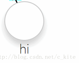
效果: 宽度不固定, 也可以自适应居中
<!DOCTYPE html>
<html lang="en">

<head>
  <title>水平居中</title>
  <style type="text/css">
    .container{
      display: inline-block;
    }
    .box {
      width: 50px;
      height: 50px;
      list-style: none;
      border: 1px solid #ccc;
      border-radius: 50%;
      padding: 0;
      box-shadow: 0 6px 12px rgba(0,0,0,.175);
    }
    .container .center{
      position: relative;
      left: 50%; /*左边缘移动到父元素的中心*/
      transform: translateX(-50%); /*左边缘向左移动自身宽度的一半*/
      text-align: center; /*文字居中*/
    }
  </style>
</head>

<body>
  <div class="container">
    <div class="box"></div>
    <div class="center">hi</div>
  </div>
</body>

</html>
3. 行内元素垂直居中
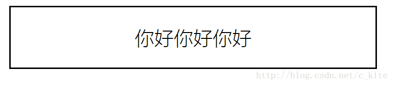
单行文本垂直居中
效果:
<!DOCTYPE html>
<html lang="en">

<head>
  <title>水平居中</title>
  <style type="text/css">
  .row {
    width: 300px;
    height: 50px;
    line-height: 50px;
    border: 1px solid black;
    text-align: center;
  }
  </style>
</head>

<body>
  <div class="row">
    你好你好你好
  </div>
</body>

</html>
4. 多行文本垂直居中
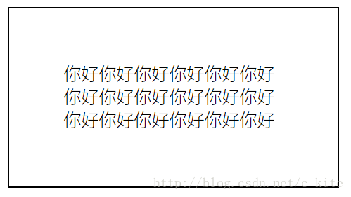
( 1 ). 不固定高度垂直居中
效果:
代码:
<!DOCTYPE html>
<html lang="en">

<head>
  <title>水平居中</title>
  <style type="text/css">
  .row {
    width: 200px;
    padding: 50px;
    border: 1px solid black;
  }
  </style>
</head>

<body>
  <div class="row">
    你好你好你好你好你好你好你好你好你好你好你好你好你好你好你好你好你好你好
  </div>
</body>

</html>
( 2 ). 固定高度多行文本居中
效果:
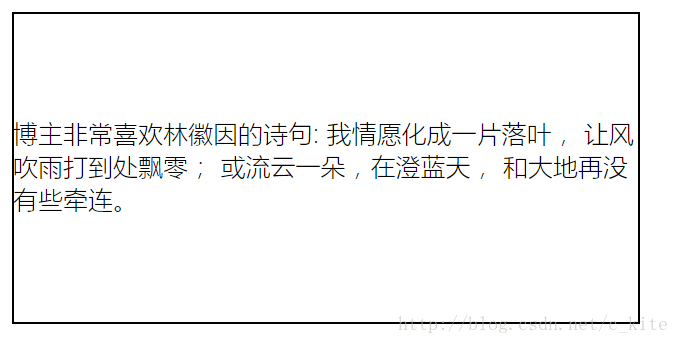
<!DOCTYPE html>
<html lang="en">

<head>
  <title>水平居中</title>
  <style type="text/css">
  .wrap {
    height: 200px;
    display: table;/*此元素会作为块级表格来显示*/
  }
  .content {
    vertical-align: middle;/*把此元素放置在父元素的中部*/
    display: table-cell;/*此元素会作为一个表格的单元格显示*/
    border: 1px solid black;
    width: 400px;
  }
  </style>
</head>

<body>
  <div class="wrap">
    <div class="content">
      博主非常喜欢林徽因的诗句: 我情愿化成一片落叶, 让风吹雨打到处飘零; 或流云一朵,在澄蓝天, 和大地再没有些牵连。
    </div>
  </div>
</body>

</html>
5. 块级元素的垂直居中
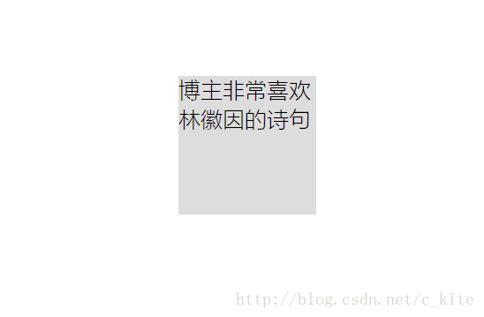
( 1 ). 固定高度
效果:
代码:
<!DOCTYPE html>
<html lang="en">
<head>
<title>水平居中</title>
<style type="text/css">
.wrap {
width: 100px;
height: 100px;
position: absolute;
left: 50%;
top: 50%;
margin-left: -50px;
margin-top: -50px;
background: #dddddd;
}
</style>
</head>
<body>
<div class="wrap">
博主非常喜欢林徽因的诗句
</div>
</body>
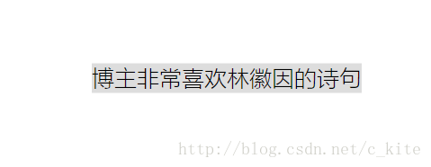
</html>( 2 ). 不固定高度
效果:
代码:
<!DOCTYPE html>
<html lang="en">
<head>
<title>水平居中</title>
<style type="text/css">
.wrap {
position: absolute;
left: 50%;
top: 50%;
transform: translate(-50%, -50%);/*左, 上边缘向左, 上移动自身宽, 高度的一半*/
background: #dddddd;
}
</style>
</head>
<body>
<div class="wrap">
博主非常喜欢林徽因的诗句
</div>
</body>
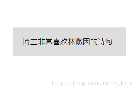
</html>6. 基于视口单位的解决方案
效果:
代码:
<!DOCTYPE html>
<html lang="en">

<head>
  <title>水平居中</title>
  <style type="text/css">
  .wrap {
    width: 200px;
    padding: 20px;
    margin: 50vh auto 0;/*外边距采用视口单位*/
    transform: translateY(-50%);/*上边缘向上移动自身高度的一半*/
    background: #dddddd;
  }
  </style>
</head>

<body>
  <div class="wrap">
      博主非常喜欢林徽因的诗句
  </div>
</body>

</html>
7. 基于FlexBox的解决方案
当使用flexbox的时候. 样式margin设置为auto不仅在水平方向上居中, 在垂直方向上也居中, 如果仅需要实现单独的垂直居中需求, 需使用align-self设置为center
效果:
代码:
<!DOCTYPE html>
<html lang="en">

<head>
  <meta charset="UTF-8">
  <meta name="viewport" content="width=device-width, initial-scale=1.0">
  <meta http-equiv="X-UA-Compatible" content="ie=edge">
  <title>水平居中</title>
  <style type="text/css">
  body{
    display: flex;
    min-height: 100vh;
    margin: 0;
  }
  .wrap {
    margin: auto;
    padding: 20px;
    background: #dddddd;
  }
  </style>
</head>

<body>
  <div class="wrap">
      博主非常喜欢林徽因的诗句
  </div>
</body>

</html>
最后
以上就是单身小伙最近收集整理的关于CSS七种常用居中方式的全部内容,更多相关CSS七种常用居中方式内容请搜索靠谱客的其他文章。
本图文内容来源于网友提供,作为学习参考使用,或来自网络收集整理,版权属于原作者所有。


发表评论 取消回复