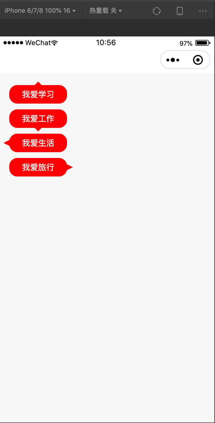
示例如下:
<view class="triangle">
<!-- 用伪类实现向上的箭头 -->
 <view class="word desc1">我爱学习</view>
 <!-- 用伪类实现向下的箭头 -->
 <view class="word desc2">我爱工作</view>
 <!-- 用伪类实现向左的箭头 -->
 <view class="word desc3">我爱生活</view>
 <!-- 用伪类实现向右的箭头 -->
 <view class="word desc4">我爱旅行</view>
</view>
css如下:
// 2rpx = 1px
.triangle{
 margin: 40rpx;
}
.word{
  margin-top: 20rpx;
  width: 200rpx;
  padding: 20rpx;
  line-height: 24rpx;
  box-sizing: border-box;
  background:#f00;
  color: #fff;
  font-size: 28rpx;
  border-radius: 28rpx;
  text-align:center;
  position: relative;
}
/* 向上的箭头 */
.desc1::before{
  content: '';
  position:absolute;
  top:-12rpx;
  left: 50%;
  transform: translateX(-50%);
  width: 0;
  height: 0;
  border-left: 12rpx solid transparent;
  border-right: 12rpx solid transparent;
  border-bottom: 12rpx solid #f00;
  font-size: 0;
  line-height: 0;
}
/* 向下的箭头 */
.desc2::before{
  content: '';
  position:absolute;
  bottom: -12rpx;
  left: 50%;
  transform: translateX(-50%);
  width: 0;
  height: 0;
  border-left: 12rpx solid transparent;
  border-right: 12rpx solid transparent;
  border-top: 12rpx solid #f00;
  font-size: 0;
  line-height: 0;
}
/* 向左的箭头 */
.desc3::before{
  content: '';
  position:absolute;
  top:50%;
  left: -20rpx;
  transform: translateY(-50%);
  width: 0;
  height: 0;
  border-top: 12rpx solid transparent;
  border-right: 24rpx solid #f00;
  border-bottom: 12rpx solid transparent;
  font-size: 0;
  line-height: 0;
}
/* 向右的箭头 */
.desc4::before{
  content: '';
  position:absolute;
  top:50%;
  right: -20rpx;
  transform: translateY(-50%);
  width: 0;
  height: 0;
  border-top: 12rpx solid transparent;
  border-left: 24rpx solid #f00;
  border-bottom: 12rpx solid transparent;
  font-size: 0;
  line-height: 0;
}
效果如下:
最后
以上就是成就夏天最近收集整理的关于css实现实心三角形的全部内容,更多相关css实现实心三角形内容请搜索靠谱客的其他文章。
本图文内容来源于网友提供,作为学习参考使用,或来自网络收集整理,版权属于原作者所有。


发表评论 取消回复