百度前端技术实战训练营——Web布局(上)
- 网站布局
- 元素显示模式
- 块级元素
- 行内元素
- 行内块元素
- 元素显示模式转换
- 盒子模型
- 边框
- 内边距
- 外边距
- flex布局
- 绝对底部
- 元素的对齐
- 定位
- 浮动
CSS布局指通过CSS去拾取网页中的元素,并且控制它们相对普通文档流、周边元素、父容器甚至浏览器窗口的位置,覆盖默认的布局行为。
newline
网站布局
合理布局的作用:
- 使内容更加清晰页面
- 载入更快
- 有利于搜索引擎的爬取
网站通常分为页眉、菜单、内容和页脚:
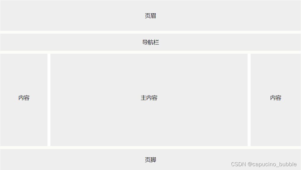
- 页眉
页眉(header)通常位于网站顶部(或顶部导航菜单的正下方)。它通常包含徽标(logo)或网站名称:
.header {
    background-color: #F1F1F1;
    text-align: center;
    padding: 20px;
}
- 导航栏
导航栏包含链接列表,以帮助访问者浏览网站:
/* navbar 容器 */
.topnav {
    overflow: hidden;
    background-color: #333;
}

/* Navbar 链接 */
.topnav a {
    float: left;
    display: block;
    color: #f2f2f2;
    text-align: center;
    padding: 14px 16px;
    text-decoration: none;
}

/* 链接 - 悬停时改变颜色 */
.topnav a:hover {
    background-color: #ddd;
    color: black;
}
- 内容
使用哪种布局通常取决于目标用户。最常见的布局是以下布局之一(或将它们组合在一起):
1-列布局(通常用于移动浏览器)
2-列布局(通常用于平板电脑和笔记本电脑)
3-列布局 (仅用于台式机)
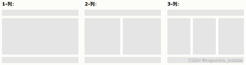
以下实例创建 3 列布局,并在较小的屏幕上将其更改为 1 列布局:
/* 创建三个相等的列,它们彼此相邻浮动 */
.column {
    float: left;
    width: 33.33%;
}

/* 在列后清除浮动 */
.row:after {
    content: "";
    display: table;
    clear: both;
}

/* 响应式布局 - 使三列堆叠,而不是在较小的屏幕(宽度为 600 像素或更小)上并排 */
@media screen and (max-width: 600px) {
    .column {
        width: 100%;
    }
}
效果:
- 页脚
页脚位于页面底部。它通常包含诸如版权和联系方式之类的信息:
.footer {
    background-color: #F1F1F1;
    text-align: center;
    padding: 10px;
}
newline
元素显示模式
以下是一个盒子模型:
网页的标签非常多,在不同地方会用到不同类型的标签,了解他们的特点可以更好的布局我们的网页。元素显示模式就是元素(标签)以什么方式进行显示,比如<div>自己占一行,比如一行可以放多个<span>。HTML 元素一般分为块元素和行内元素两种类型。
newline
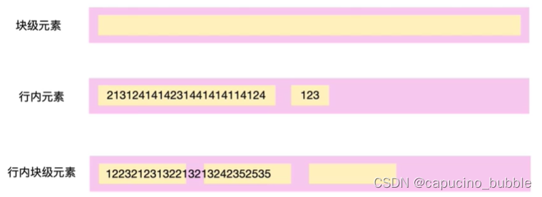
块级元素
常见的块元素有<h1>~<h6>、<p>、<div>、<ul>、<ol>、<li>等,其中 <div> 标签是最典型的块元素。
块级元素的特点:
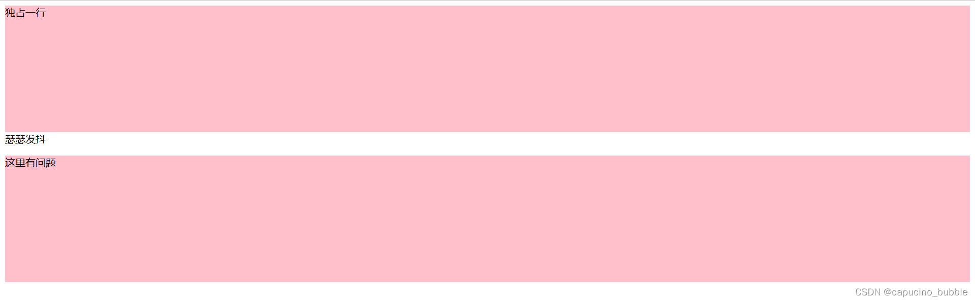
① 独占一行。
② 高度,宽度、外边距以及内边距都可以控制。
③ 宽度默认是容器(父级宽度)的100%。
④ 是一个容器及盒子,里面可以放行内或者块级元素。
- 文字类的元素内不能使用块级元素
<p>标签主要用于存放文字,因此<p>里面不能放块级元素,特别是不能放<div>- 同理,
<h1>~<h6>等都是文字类块级标签,里面也不能放其他块级元素
<!DOCTYPE html>
<html lang="en">

<head>
    <meta charset="UTF-8">
    <meta name="viewport" content="width=device-width, initial-scale=1.0">
    <meta http-equiv="X-UA-Compatible" content="ie=edge">
    <title>显示模式之块级元素</title>
    <style>
        div {
            /* width: 200px; */
            height: 200px;
            background-color: pink;
        }
    </style>
</head>

<body>
    <div>独占一行</div> 瑟瑟发抖
    <p>
    <div>这里有问题</div>
    </p>
</body>

</html>
效果:
newline
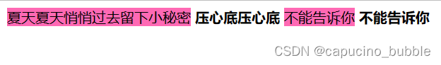
行内元素
行内元素的特点:
① 相邻行内元素在一行上,一行可以显示多个。
② 高、宽直接设置是无效的。
③ 默认宽度就是它本身内容的宽度。
④ 行内元素只能容纳文本或其他行内元素。
- 链接里面不能再放链接
- 特殊情况链接
<a>里面可以放块级元素,但是给<a>转换一下块级模式最安全
<head>
    <style>
        span {
            width: 100px;
            height: 100px;
            background-color: hotpink;
        }
    </style>
</head>

<body>
    <span>夏天夏天悄悄过去留下小秘密</span> <strong>压心底压心底</strong>
    <span>不能告诉你</span> <strong>不能告诉你</strong>

    <a href="http://www.baidu.com">
        <a href=""></a>
    </a>
</body>
效果:
newline
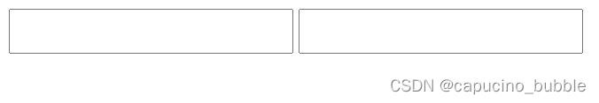
行内块元素
在行内元素中有几个特殊的标签 —— <img />、<input />、<td>,它们同时具有块元素和行内元素的特点,称为行内块元素。
行内块元素的特点:
① 和相邻行内元素(行内块)在一行上,但是他们之间会有空白缝隙,一行可以显示多个(行内元素特点)。
② 默认宽度就是它本身内容的宽度(行内元素特点)。
③ 高度,行高、外边距以及内边距都可以控制(块级元素特点)。
<head>
    <style>
        input {
            width: 249px;
            height: 35px;
        }
    </style>
</head>

<body>
    <input type="text">
    <input type="text">
</body>
效果:
newline
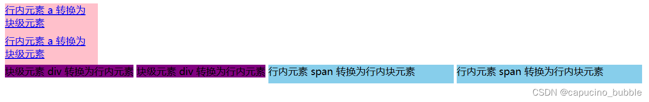
元素显示模式转换
- 转换为块元素:
display:block; - 转换为行内元素:
display:inline; - 转换为行内块:
display: inline-block
<!DOCTYPE html>
<html lang="en">

<head>
    <meta charset="UTF-8">
    <meta name="viewport" content="width=device-width, initial-scale=1.0">
    <meta http-equiv="X-UA-Compatible" content="ie=edge">
    <title>元素显示模式转换</title>
    <style>
        a {
            width: 150px;
            height: 50px;
            background-color: pink;
            /* 把行内元素 a 转换为 块级元素 */
            display: block;
        }

        div {
            width: 300px;
            height: 100px;
            background-color: purple;
            /* 把 div 块级元素转换为行内元素 */
            display: inline;
        }

        span {
            width: 300px;
            height: 30px;
            background-color: skyblue;
            display: inline-block;
        }
    </style>
</head>

<body>
    <a href="#">行内元素 a 转换为 块级元素</a>
    <a href="#">行内元素 a 转换为 块级元素</a>
    <div>块级元素 div 转换为行内元素</div>
    <div>块级元素 div 转换为行内元素</div>
    <span>行内元素 span 转换为行内块元素</span>
    <span>行内元素 span 转换为行内块元素</span>
</body>

</html>
效果:
newline
盒子模型
网页布局过程:
- 先准备好相关的网页元素,网页元素基本都是盒子 Box 。
- 利用 CSS 设置好盒子样式,然后摆放到相应位置。
- 往盒子里面装内容。
网页布局的核心本质: 就是利用 CSS 摆盒子。
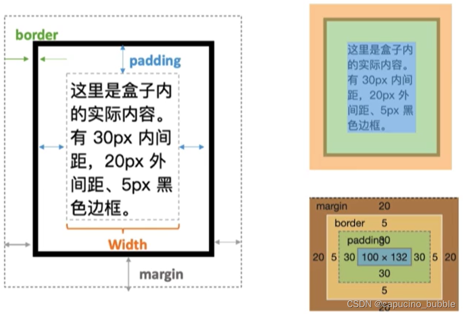
所谓盒子模型,就是把 HTML 页面中的布局元素看作是一个矩形的盒子,也就是一个盛装内容的容器。CSS 盒子模型本质上是一个盒子,封装周围的 HTML 元素,它包括:边框、外边距、内边距和实际内容。
<style>
	.box {
		width: 100px;margin: 20px;padding: 30px;border: 5px solid black;
	}
</style>

<div class=“box”></div>
效果:
边框
border 可以设置元素的边框。
边框由三部分组成:
border-width定义边框粗细,单位为pxborder-style定义边框样式
border-style可以设置如下值:
none:没有边框即忽略所有边框的宽度(默认值)
solid:边框为单实线(最为常用的)
dashed:边框为虚线
dotted:边框为点线border-color定义边框颜色
边框简写:
border: 1px solid red; 没有顺序
边框分开写法:
border-top: 1px solid red; /* 只设定上边框, 其余同理 */
border-collapse 属性控制浏览器绘制表格边框的方式。它控制相邻单元格的边框。
border-collapse:collapse;
边框会额外增加盒子的实际大小。因此我们有两种方案解决:
- 测量盒子大小的时候,不量边框.
- 如果测量的时候包含了边框,则需要 width/height 减去边框宽度
<!DOCTYPE html>
<html lang="en">

<head>
    <meta charset="UTF-8">
    <meta name="viewport" content="width=device-width, initial-scale=1.0">
    <meta http-equiv="X-UA-Compatible" content="ie=edge">
    <title>盒子模型之边框</title>
    <style>
        div {
            width: 300px;
            height: 200px;
            /* border-width 边框的粗细  一般情况下都用 px */
            border-width: 5px;
            /* border-style 边框的样式  solid 实线边框   dashed 虚线边框  dotted 点线边框*/
            border-style: solid;
            /* border-style: dashed; */
            /* border-style: dotted; */
            /* border-color 边框的颜色  */
            border-color: pink;
        }
    </style>
</head>

<body>
    <div></div>
</body>

</html>
内边距
padding 属性用于设置内边距,即边框与内容之间的距离。
padding-left - 左内边距
padding-right - 右内边距
padding-top - 上内边距
padding-bottom - 下内边距
简写属性:上右下左,顺时针
padding: 5px 10px 20px 30px;
当我们给盒子指定 padding 值之后,发生了 2 件事情:
- 内容和边框有了距离,添加了内边距。
- padding影响了盒子实际大小。
也就是说,如果盒子已经有了宽度和高度,此时再指定内边框,会撑大盒子。
解决方案:如果保证盒子跟效果图大小保持一致,则让 width/height 减去多出来的内边距大小即可。
<!DOCTYPE html>
<html lang="en">
<head>
    <meta charset="UTF-8">
    <meta name="viewport" content="width=device-width, initial-scale=1.0">
    <meta http-equiv="X-UA-Compatible" content="ie=edge">
    <title>盒子模型之内边距</title>
    <style>
        div {
            width: 200px;
            height: 200px;
            background-color: pink;
            /* padding-left: 5px;
            padding-top: 5px;
            padding-bottom: 5px;
            padding-right: 5px; */
            /* 内边距复合写法(简写) */
            /* padding: 5px; */
            /* padding: 5px 10px; */
            /* padding: 5px 10px 20px; */
            padding: 5px 10px 20px 30px;
        }
    </style>
</head>
<body>
    <div>
        盒子内容是content盒子内容是content盒子内容是content盒子内容是content
    </div>
</body>
</html>
外边距
margin 属性用于设置外边距,即控制盒子和盒子之间的距离。
margin-left - 左外边距
margin-right - 右外边距
margin-top - 上外边距
margin-bottom - 下外边距
外边距可以让块级盒子水平居中,但是必须满足两个条件:
① 盒子必须指定了宽度(width)。
② 盒子左右的外边距都设置为 auto 。
.header{ width:960px; margin:0 auto;}
常见的写法,以下三种都可以:
margin-left: auto; margin-right: auto;margin: auto;margin: 0 auto;
以上方法是让块级元素水平居中,行内元素或者行内块元素水平居中给其父元素添加 text-align:center 即可。
<!DOCTYPE html>
<html lang="en">
<head>
    <meta charset="UTF-8">
    <meta name="viewport" content="width=device-width, initial-scale=1.0">
    <meta http-equiv="X-UA-Compatible" content="ie=edge">
    <title>盒子模型之外边距margin</title>
    <style>
      div {
          width: 200px;
          height: 200px;
          background-color: pink;
      }
      /* .one {
          margin-bottom: 20px;
      } */
      .two {
          /* margin-top: 20px; */
          /* margin: 30px; */
          margin: 30px 50px;
      }
    </style>
</head>
<body>
    <div class="one">1</div>
    <div class="two">2</div>
</body>
</html>
网页元素很多都带有默认的内外边距,而且不同浏览器默认的也不一致。因此我们在布局前,首先要清除下网页元素的内外边距。
* {
 	padding:0; /* 清除内边距 */
 	margin:0; /* 清除外边距 */
 }
newline
flex布局
在 Flexbox 布局模块(问世)之前,可用的布局模式有以下四种:
- 块(Block),用于网页中的部分(节)
- 行内(Inline),用于文本
- 表,用于二维表数据
- 定位,用于元素的明确位置
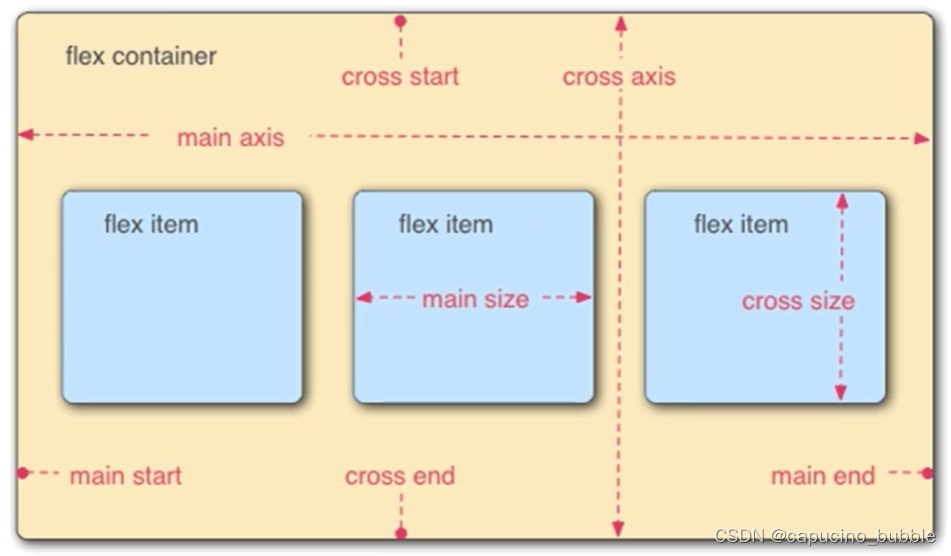
flex是flexbox的缩写,意为弹性布局,是一维的布局模型,任何一个容器都可以指定为 flex布局。弹性框布局模块,可以更轻松地设计灵活的响应式布局结构,而无需使用浮动或定位。
newline
flex元素有以下属性:
-
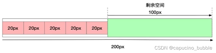
flex-basis属性定义了在分配多余空间之前,项目占据的主轴空间(main size)。浏览器根据这个属性,计算主轴是否有多余空间。它的默认值为auto,即项目的本来大小。 -
flex-grow属性定义项目的放大比例,默认为0,即如果存在剩余空间,也不放大。
-
flex-shrink属性定义了项目的缩小比例,默认为1,即如果空间不足,该项目将缩小。
-
flex为flex-grow,flex-shrink,flex-basis的缩写
flex的适用场景:
- 导航
- 拆分导航
- 元素居中
- 绝对底部
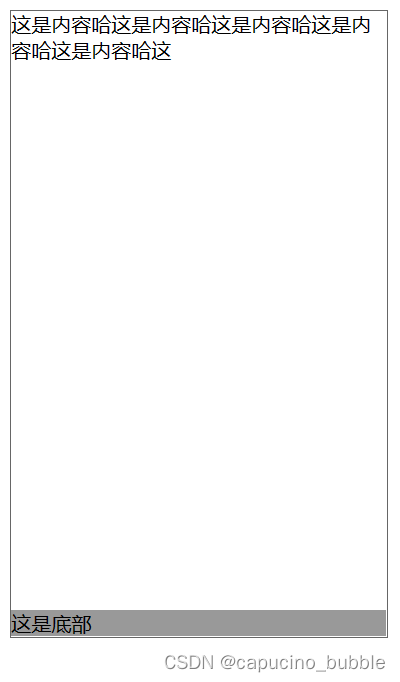
绝对底部
课程案例。
<!DOCTYPE html>
<html lang="en">

<head>
    <meta charset="UTF-8">
    <meta http-equiv="X-UA-Compatible" content="IE=edge">
    <meta name="viewport" content="width=device-width, initial-scale=1.0">
    <title>绝对底部</title>
</head>

<body>
    <style>
        .container {
            display: flex;
            flex-direction: column;
            width: 300px;
            height: 500px;
            border: 1px solid #666;
        }

        .content {
            flex-grow: 1;
        }

        .footer {
            background-color: #999;
        }
    </style>
    <div class="container">
        <div class="content">这是内容哈这是内容哈这是内容哈这是内容哈这是内容哈这</div>
        <footer class="footer">这是底部</footer>
    </div>
</body>

</html>
效果:
课程案例。自行尝试各种属性效果。
<!DOCTYPE html>
<html lang="en">

<head>
    <meta charset="UTF-8">
    <meta http-equiv="X-UA-Compatible" content="IE=edge">
    <meta name="viewport" content="width=device-width, initial-scale=1.0">
    <title>flex布局</title>
</head>

<body>
    <style>
        html, body {
            margin: 0;
            padding: 0;
        }

        .container {
            display: flex;
            border: 1px solid #666;
            width: 600px;
        }

        .item {
            width: 100px;
            background-color: #efef38;
            border: 1px solid black;
            text-align: center;
            /* flex-shrink: 0; */
        }

        .item-two {
            flex-grow: 1;
        }

        .item-three {
            /* flex-shrink: 1; */
        }
    </style>
    <div class="container">
        <div class="item item-one">1</div>
        <div class="item item-two">2</div>
        <div class="item item-three">3</div>
        <div class="item item-four">4</div>
        <div class="item item-five">5</div>
    </div>
</body>

</html>
newline
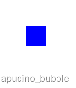
元素的对齐
align-items 属性定义flex子项在flex容器的当前行的侧轴(纵轴)方向上的对齐方式。
justify-content 属性用于描述弹性盒子容器的对齐方式。它包含沿着分布在浏览器中的 flex 容器的主轴的内容项之间和周围的空间。
课程案例。
<!DOCTYPE html>
<html lang="en">

<head>
    <meta charset="UTF-8">
    <meta http-equiv="X-UA-Compatible" content="IE=edge">
    <meta name="viewport" content="width=device-width, initial-scale=1.0">
    <title>元素的对齐</title>
</head>

<body>
    <style>
        .container {
            border: 1px solid #666;
            width: 100px;
            height: 100px;
            display: flex;
            align-items: center;
            justify-content: center;
        }

        .center {
            width: 32px;
            height: 32px;
            background-color: blue;
        }
    </style>

    <div class="container">
        <div class="center"></div>
    </div>
</body>

</html>
效果:
newline
定位
定位能够把一个元素从它原本在正常布局流中应该在的位置移动到另一个位置。
position
- static 静态定位
- relative 相对定位
- absolute 绝对定位
- fixed 固定定位
- sticky 粘性定位
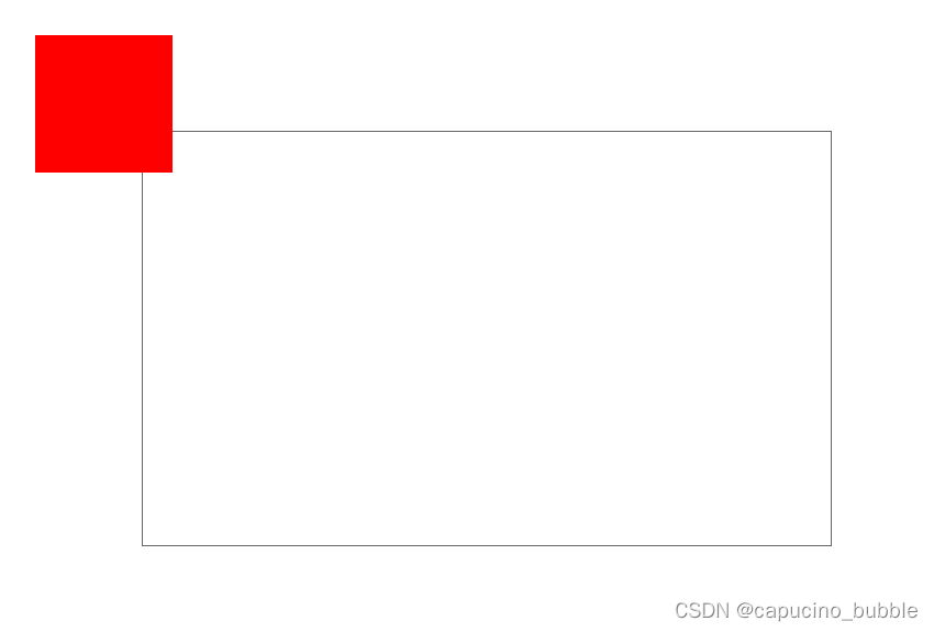
课程案例,展示定位多种属性:
<!DOCTYPE html>
<html lang="en">

<head>
    <meta charset="UTF-8">
    <meta http-equiv="X-UA-Compatible" content="IE=edge">
    <meta name="viewport" content="width=device-width, initial-scale=1.0">
    <title>定位</title>
</head>

<body>
    <style>
        .container {
            border: 1px solid #666;
            width: 500px;
            height: 300px;
            margin: 100px;
            /* position: fixed; */
        }

        .child {
            width: 100px;
            height: 100px;
            background-color: red;
            position: fixed;
            top: 30px;
            left: 30px;
        }
    </style>
    <div class="container">
        <div class="child"></div>
    </div>
</body>

</html>
效果:
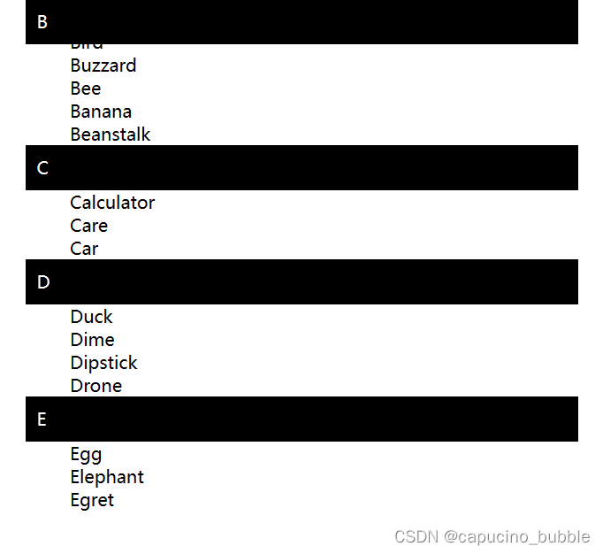
课程案例,展示 position: sticky; 属性:
<!DOCTYPE html>
<html lang="en">

<head>
    <meta charset="UTF-8">
    <meta http-equiv="X-UA-Compatible" content="IE=edge">
    <meta name="viewport" content="width=device-width, initial-scale=1.0">
    <title>定位-sticky</title>
</head>

<body>
    <style>
        body {
            width: 500px;
            height: 2000px;
            margin: 0 auto;
        }

        dt {
            background-color: black;
            color: white;
            padding: 10px;
            position: sticky;
            top: 0;
            left: 0;
            margin: lem 0;
        }
    </style>
    </head>

    <body>
        <h1>Sticky positioning</h1>
        <dl>
            <dt>A</dt>
            <dd>Apple</dd>
            <dd>Ant</dd>
            <dd>Altimeter</dd>
            <dd>Airplane</dd>

            <dt>B</dt>
            <dd>Bird</dd>
            <dd>Buzzard</dd>
            <dd>Bee</dd>
            <dd>Banana</dd>
            <dd>Beanstalk</dd>

            <dt>C</dt>
            <dd>Calculator</dd>
            <dd>Care</dd>
            <dd>Car</dd>

            <dt>D</dt>
            <dd>Duck</dd>
            <dd>Dime</dd>
            <dd>Dipstick</dd>
            <dd>Drone</dd>

            <dt>E</dt>
            <dd>Egg</dd>
            <dd>Elephant</dd>
            <dd>Egret</dd>

        </dl>
    </body>

</html>
效果:
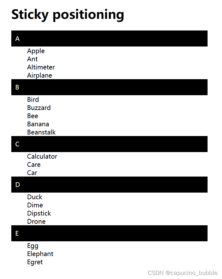
上下滑动列表后,标题会粘在顶部:
浮动
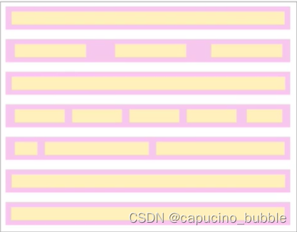
把一个元素“浮动”起来,会改变该元素本身和在正常布局流中跟随它的其他元素的行为。
这一元素会浮动到左侧或右侧,并且从正常布局流中移除,这时候其他的周围内容就会在这个浮动元素的周围环绕。
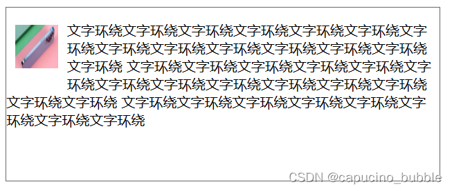
课程案例。
- 文字环绕:
<!DOCTYPE html>
<html lang="en">

<head>
    <meta charset="UTF-8">
    <meta http-equiv="X-UA-Compatible" content="IE=edge">
    <meta name="viewport" content="width=device-width, initial-scale=1.0">
    <title>浮动之文字环绕</title>
</head>

<body>
    <style>
        .container {
            border: 1px solid #666;
            width: 500px;
            height: 200px;
        }

        img {
            width: 50px;
            height: 50px;
            float: left;
            margin: 20px 10px;
        }
    </style>
    <div class="container">
        <img src="https://img-s.msn.cn/tenant/amp/entityid/AA16eIfj.img?w=300&h=156&q=90&m=6&f=jpg&u=t">
        <p>文字环绕文字环绕文字环绕文字环绕文字环绕文字环绕文字环绕文字环绕文字环绕文字环绕文字环绕文字环绕文字环绕文字环绕
            文字环绕文字环绕文字环绕文字环绕文字环绕文字环绕文字环绕文字环绕文字环绕文字环绕文字环绕文字环绕文字环绕文字环绕
            文字环绕文字环绕文字环绕文字环绕文字环绕文字环绕文字环绕文字环绕
        </p>
    </div>
</body>

</html>
效果:
- 消除浮动
<!DOCTYPE html>
<html lang="en">

<head>
    <meta charset="UTF-8">
    <meta http-equiv="X-UA-Compatible" content="IE=edge">
    <meta name="viewport" content="width=device-width, initial-scale=1.0">
    <title>消除浮动</title>
</head>

<body>
    <style>
        .container {
            width: 800px;
            height: 600px;
            border: 1px solid #666;
        }

        .col {
            width: 200px;
            float: left;
            margin-right: 20px;
        }

        .right {
            float: right;
        }

        .no-float {
            /* clear: left; */
            border: 1px solid #999;
        }

        .no-float-bottom {
            border: 1px solid #999;
        }
    </style>
    <div class="container">
        <div class="col">我在左边浮动我在左边浮动我在左边浮动我在左边浮动我在左边</div>
        <div class="col">我是中间内容我是中间内容我是中间内容我是中间内容我是中间我是中间内容
            我是中间内容我是中间内容我是中间内容我是中间内容我是中间内容我是中间内容我是中间内容
            我是中间内容我是中间内容我是中间内容我是中间内容我是中间内容我是中间内容我是中间内容
            我是中间内容我是中间内容我是中间内容我是中间内容
        </div>
        <div class="col right">我在右边浮动我在右边浮动我在右边浮动我在右边浮动我在右边浮动我在右边浮动
            我在右边浮动我在右边浮动我在右边浮动我在右边浮动我在右边浮动我在右边浮动我在右边浮动
            我在右边浮动我在右边浮动我在右边浮动我在右边浮动我在右边浮动我在右边浮动我在右边浮动
            我在右边浮动我在右边浮动我在右边浮动
        </div>
        <div class="no-float">我不想浮动</div>
        <div class="no-float-bottom">我也不想浮动</div>
    </div>
</body>

</html>
效果:
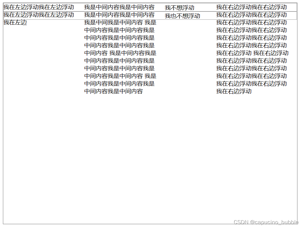 清除浮动后不想浮动的元素就不会浮动上去:
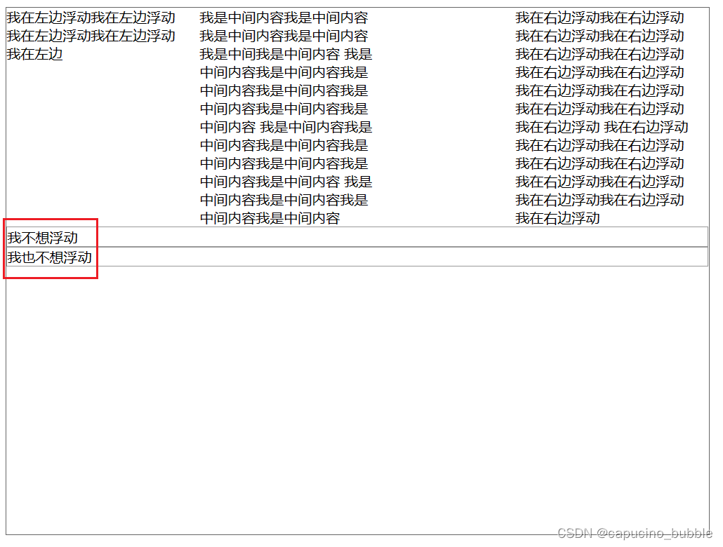
需要注意的是,某元素设置浮动(如:float: left; )后,接在其后面的所有元素都会浮动,消除浮动需要设置 clear: left; 同样地,此设置也会沿用到之后的所有元素,除非重新设置浮动。
最后
以上就是如意棒球最近收集整理的关于百度前端技术实战训练营——Web布局(上)的全部内容,更多相关百度前端技术实战训练营——Web布局(上)内容请搜索靠谱客的其他文章。


发表评论 取消回复