shape使用、渐变色、分割线、边框、半透明、半透明阴影效果。
首先简单了解一下shape中常见的属性。(详细介绍参看 api文档)
<?xml version="1.0" encoding="utf-8"?>
<shape
 xmlns:android="http://schemas.android.com/apk/res/android"
 android:shape=["rectangle" | "oval" | "line" | "ring"] > --- 默认为rectangle
 <corners -- shape=“rectangle”时使用,
  android:radius="integer" -- 半径,会被下边的属性覆盖,默认为1dp,
  android:topLeftRadius="integer"
  android:topRightRadius="integer"
  android:bottomLeftRadius="integer"
  android:bottomRightRadius="integer" />
 <gradient -- 渐变
  android:angle="integer"
  android:centerX="integer"
  android:centerY="integer"
  android:centerColor="integer"
  android:endColor="color"
  android:gradientRadius="integer"
  android:startColor="color"
  android:type=["linear" | "radial" | "sweep"]
  android:useLevel=["true" | "false"] />
 <padding
  android:left="integer"
  android:top="integer"
  android:right="integer"
  android:bottom="integer" />
 <size -- 指定大小,一般用在imageview配合scaleType属性使用。大小一般会适配滴
  android:width="integer"
  android:height="integer" />
 <solid -- 填充颜色,可是是十六进制颜色。(比如想设置半透明效果,直接使用十六就只就OK)
  android:color="color" />
 <stroke -- 指定边框,border,dashWidth和dashGap有一个为0dp则为实线
  android:width="integer"
  android:color="color"
  android:dashWidth="integer" -- 虚线宽度
  android:dashGap="integer" /> -- 虚线间隔宽度
</shape>
注意:
<corners>
1、android:radius,半径,会被下边的单个角度半径属性覆盖,默认为1dp,
2、在使用时,如果单独设置四个角度,又大小不一致时,eclipse的graphics preview会报错。但是直接真机运行即可。(比如实线上边直角,下边屈角的效果)
<size>
Note: The shape scales to the size of the container View proportionate to the dimensions defined here, by default. When you use the shape in an ImageView, you can restrict scaling by setting the android:scaleType to "center"
举个栗子:
1、渐变色 res/drawable/gradient_box.xml:
<?xml version="1.0" encoding="utf-8"?>
<shape xmlns:android="http://schemas.android.com/apk/res/android"
 android:shape="rectangle">
 <gradient
  android:startColor="#FFFF0000"
  android:endColor="#80FF00FF"
  android:angle="45"/>
 <padding android:left="7dp"
  android:top="7dp"
  android:right="7dp"
  android:bottom="7dp" />
 <corners android:radius="8dp" />
</shape>
如图:

2、白色边框、半透明效果
<?xml version="1.0" encoding="utf-8"?>
<shape xmlns:android="http://schemas.android.com/apk/res/android"
 android:shape="rectangle" >
 <corners android:radius="16dp" />
 <!-- 这是半透明,还可以设置全透明,那就是白色边框的效果了 -->
 <solid android:color="#80065e8d" />
 <stroke
  android:dashGap="0dp"
  android:width="4dp"
  android:color="@android:color/white" />
</shape>
如图:


3、分割线效果:
<?xml version="1.0" encoding="utf-8"?>
<shape xmlns:android="http://schemas.android.com/apk/res/android"
 android:shape="line" >
 <stroke
  android:width="4dp"
  android:color="@android:color/black" />
</shape>
如图:

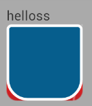
4、单边屈角效果
<?xml version="1.0" encoding="utf-8"?>
<shape android:shape="rectangle" xmlns:android="http://schemas.android.com/apk/res/android">

 <corners
  android:topLeftRadius="5dp"
  android:topRightRadius="5dp"
  android:bottomLeftRadius="30dp"
  android:bottomRightRadius="30dp"/>

 <!-- 这是半透明,还可以设置全透明,那就是白色边框的效果了 -->
 <solid android:color="#ff065e8d" />

 <stroke
  android:dashGap="0dp"
  android:width="4dp"
  android:color="@android:color/white" />

</shape>
如图:
另:附上一份颜色进制图,需要的可以查阅:http://tools.uoften.com/static/colorpicker/index.html
以上就是本文的全部内容,希望对大家的学习有所帮助,也希望大家多多支持靠谱客。
最后
以上就是美好故事最近收集整理的关于android shape的使用及渐变色、分割线、边框、半透明阴影的全部内容,更多相关android内容请搜索靠谱客的其他文章。
本图文内容来源于网友提供,作为学习参考使用,或来自网络收集整理,版权属于原作者所有。


发表评论 取消回复