
本文操作环境:windows7系统、HTML5&&CSS3版、Dell G3电脑。
css怎么写六边形?
教你用CSS画正六边形
说下两种css 制作正六边形的方法。
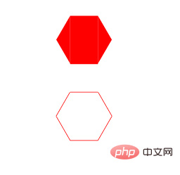
先看一下结果:
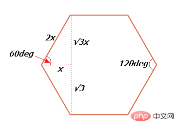
在之前要先了解一下正六边形内角和边的关系,正六边形的每个内角是60deg,如图(√3其实是根号3):
方法一:原理把正六边形分成三部分,左中右分别是:before部分,p部分,after部分,如图:
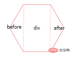
before三角形部分是p的before伪元素,after三角形部分是p的after伪元素。
html代码:
<p class='p'></p>
登录后复制css代码:
.p {
                position: relative;
                width: 50px;
                height: 86.6px;
                margin: 50px auto;
                background-color: red;
            }
            .p:before {
                content: '';
                display: block;
                position: absolute;
                width: 0;
                height: 0;
                right:50px;
                border-width: 43.3px 25px;
                border-style: solid;
                border-color: transparent red transparent transparent;
            }
            .p:after {
                content: '';
                display: block;
                position: absolute;
                width: 0;
                height: 0;
                left:50px;
                border-width: 43.3px 25px;
                border-style: solid;
                border-color: transparent transparent transparent red;
                top:0;
            }登录后复制
注意p及伪元素的宽高需要根据上面的公式计算。
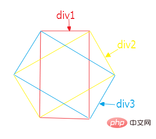
方法二:也是把正六边形分成三个宽高相同的p,然后使用定位以及css3 transform:rotate分别向左右旋转60deg形成正六边形,如图:
html代码:
<p style='position:relative;width:100px;margin:0 auto;'>
    <p class='one'></p>
    <p class='two'></p>
    <p class='three'></p>
</p>登录后复制
css代码:
 1 .one {
 2                 width: 50px;
 3                 height: 86.6px;
 4                 margin: 0 auto;
 5                 border-top: 1px solid red;
 6                 border-bottom: 1px solid red;
 7             }
 8             .two {
 9                 position: absolute;
10                 width: 50px;
11                 height: 86.6px;
12                 left: 25px;
13                 top: 0;
14                 transform: translate(-50%,-50%);
15                 transform: rotate(60deg);
16                 border-top: 1px solid red;
17                 border-bottom: 1px solid red;
18             }
19             .three {
20                 position: absolute;
21                 width: 50px;
22                 height: 86.6px;
23                 left: 25px;
24                 top: 0;
25                 transform: translate(-50%,-50%);
26                 transform: rotate(300deg);
27                 border-top: 1px solid red;
28                 border-bottom: 1px solid red;
29             }登录后复制
以上两种方法,元素的宽高尺寸以及左右位移需要根据上面的公式计算不能随意填写
推荐学习:《css视频教程》
以上就是css怎么写六边形的详细内容,更多请关注靠谱客其它相关文章!

最后
以上就是忧心水杯最近收集整理的关于css怎么写六边形的全部内容,更多相关css怎么写六边形内容请搜索靠谱客的其他文章。
本图文内容来源于网友提供,作为学习参考使用,或来自网络收集整理,版权属于原作者所有。


发表评论 取消回复