在页面没有响应时,展示加载动画是一种对用户友好的表现,不至于白屏,等响应内容渲染到页面时再移除动画
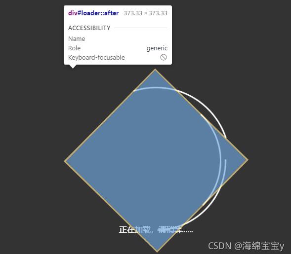
先放loading效果图

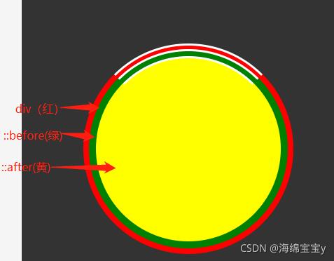
原理:伪类+动画,下面是步骤图,贴上助于理解,加载动画本质是设置一个定宽定高的正方形,border-radius: 50%;使其成为圆形,再给该div3px的边框并设为透明,然后在单独设置上边框为白色,用::before,::after伪类absolute定位并进行同样设置,不同之处是依次增大留出的间隙,以及动画执行时间变长和设置延迟,这样就能形成圆圈不同快慢的旋转
完整代码:
components文件夹下loading.vue
<template>
  <div id="loader_wrapper">
    <div id="loader"></div>
    <div class="load_title">正在加载,请稍等......</div>
  </div>
</template>
<script>
  export default{
      name:"loading",
  }
</script>
<style scoped>
#loader_wrapper{
  position: fixed;
  top: 0;
  left: 0;
  width: 100%;
  height: 100%;
  z-index: 99;
  background: rgba(0, 0, 0,.8);
  background-size: 100% 100%;
}
#loader{
  display: block;
  position: relative;
  left: 50%;
  top: 50%;
  width: 300px;
  height: 300px;
  /* background: red; */
  margin: -150px 0 0 -150px;
  border-radius: 50%;
  border: 3px solid transparent;
  border-top-color: #fff;
  -webkit-animation: spin 5s linear infinite;
  -ms-animation: spin 5s linear infinite;
  -moz-animation: spin 5s linear infinite;
  -o-animation : spin 5s linear infinite;
  animation:spin 5s linear infinite;
  z-index: 1001;
}
#loader:before{
  content:"";
  position: absolute;
  top: 5px;
  left: 5px;
  right: 5px;
  bottom: 5px;
  border-radius: 50%;
  /* background: green; */
  border: 3px solid transparent;
  border-top-color: #fff;
   -webkit-animation: spin 8s linear infinite;
  -ms-animation: spin 8s linear infinite;
  -moz-animation: spin 8s linear infinite;
  -o-animation : spin 8s linear infinite;
  animation:spin 8s linear infinite;
}
#loader:after{
  content:"";
  position: absolute;
  top: 15px;
  left: 15px;
  right: 15px;
  bottom: 15px;
  border-radius: 50%;
  /* background: yellow; */
  border: 3px solid transparent;
  border-top-color: #fff;
   -webkit-animation: spin 8s linear 1s infinite;
  -ms-animation: spin 8s linear 1s infinite;
  -moz-animation: spin 8s linear 1s infinite;
  -o-animation : spin 8s linear 1s infinite;
  animation:spin 8s linear 1s infinite;
}
@-webkit-keyframes spin {
  0%{
    -webkit-transform: rotate(0deg);
    -ms-transform: rotate(0deg);
    transform:rotate(0deg);
  }
  100%{
    -webkit-transform: rotate(360deg);
    -ms-transform: rotate(360deg);
    transform: rotate(360deg);
  }
}

@keyframes spin{
  0%{
    -webkit-transform: rotate(0deg);
    -ms-transform: rotate(0deg);
    transform:rotate(0deg);
  }
  100%{
    -webkit-transform: rotate(360deg);
    -ms-transform: rotate(360deg);
    transform: rotate(360deg);
  }
}
#loader_wrapper .load_title{
  font-family: "Open Sans";
  color:#fff;
  font-size: .3rem;
  width: 100%;
  text-align: center;
  z-index: 9999;
  position: absolute;
  top: 70%;
  opacity: 1;
  line-height: .3rem;
}
</style>
在cs.vue页面中引入并注册loading
cs.vue
<template>
  <div class="main">
    <loading v-if="!initFlag"></loading>
    111
  </div>
</template>

<script>
  import loading from "../components/loading"
  export default {
    name:"tranin",
    data () {
      return{
        initFlag:false,//初始化全局数据的请求 false表示请求失败

      }

    },
    components:{
      loading,
    }
  }
</script>
以上就是本文的全部内容,希望对大家的学习有所帮助,也希望大家多多支持靠谱客。
最后
以上就是受伤跳跳糖最近收集整理的关于vue手写加载动画项目的全部内容,更多相关vue手写加载动画项目内容请搜索靠谱客的其他文章。
本图文内容来源于网友提供,作为学习参考使用,或来自网络收集整理,版权属于原作者所有。


发表评论 取消回复