本文讲的是手动生成数据,可视化生成的数据,以及可视化模型训练之后的数据。附有代码和解释。
-
- 生成点数据和绘制散点图
- 可视化绘制机器学习模型预测之后的结果
- 对npmeshgrid方法的解释
- 附录
先上效果图:
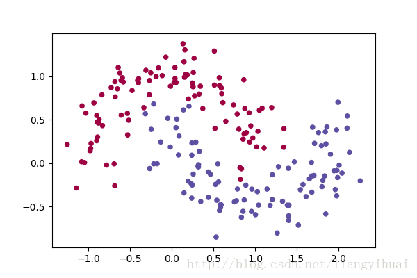
图一:绘制双月亮型的散点图
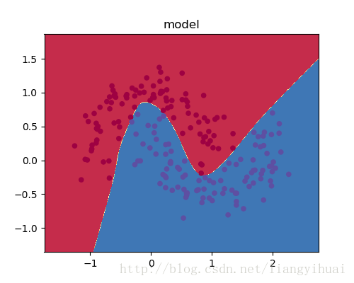
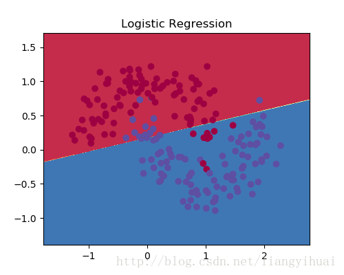
图2-2:显示线性模型的逻辑回归分类的结果
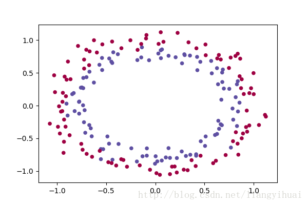
图二:绘制双圆形散点图。
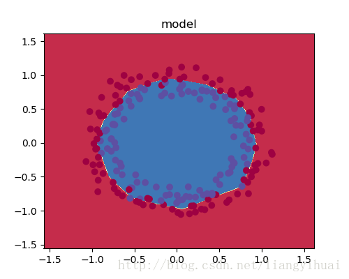
图2-2: 可视化分类结果
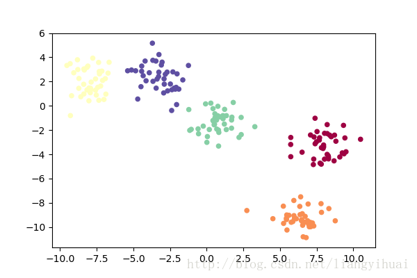
图三:绘制多聚类散点图
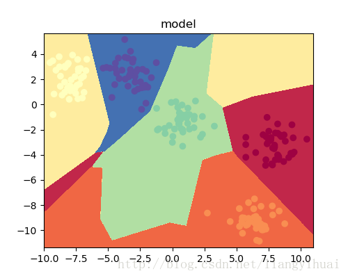
图3-3:可视化分类结果
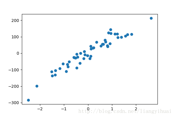
图四:绘制回归散点图
生成点数据和绘制散点图
使用python的sklearn和matplotlib可以生成点数据以及绘制和显示它们。上图所示的点都是二维的,也就是x和y轴。对于多维的数据也是可以生成的,但是,多维的数据不容易绘制和展示,特别是超过三维之后。
对于图一的双月亮型的散点图,x的shape是(n, 2),y是一个数组。如果要把这些数据绘制成第一张图所示的样子,需要把X的两个值分别当成坐标轴上的x和y,坐标点上所对应的value是0或者1。如果把这些数据输入机器学习模型,那么X的两个值代表两个feature,而label便是y了。
X和y的数据格式:
X= [[-0.93536724  0.69245937]
 [ 0.05074294  0.40678444]
 [-0.24745421  0.38727354]
 [ 0.75084375 -0.44781772]]

y= [1, 0, 1, 1, 1]
下面是具体的代码:
首先需要导入包和设置显示窗口的大小
# Package imports
import matplotlib.pyplot as plt
import numpy as np
import sklearn.linear_model
import matplotlib

# Display plots inline and change default figure size
matplotlib.rcParams['figure.figsize'] = (6.0, 4.0)
np.random.seed(6)
生成月亮形的数据集,其中总共有200个点,并且让数据包含一点噪声
X, y = sklearn.datasets.make_moons(200, noise=0.20)最后便是绘制散点图。其中X[:, 0]表示获取X中第一列的数据,并把它作为散点图的x轴,X[:, 1]表示获取X第二列的数据并把它作为散点图的y轴。
plt.scatter(X[:, 0], X[:, 1], s=20, c=y, cmap=plt.cm.Spectral)
plt.show()这样之后,就可以顺利绘制一个双月亮形的散点图了。如果要绘制其他形状的图片,那么只需要参考下面的包就可以生成和绘制其他数据了。这些包在sklearn.dataset模块下的_init_.py文件下。如果使用pycharm的话,可以从下面的语句中进去(按住ctrl键,点击datasets):
X, y = sklearn.datasets.make_moons(200, noise=0.20)sklearn.dataset模块下的数据生成的方法:
'clear_data_home',
'dump_svmlight_file',
'fetch_20newsgroups',
'fetch_20newsgroups_vectorized',
'fetch_lfw_pairs',
'fetch_lfw_people',
'fetch_mldata',
'fetch_olivetti_faces',
'fetch_species_distributions',
'fetch_california_housing',
'fetch_covtype',
'fetch_rcv1',
'fetch_kddcup99',
'get_data_home',
'load_boston',
'load_diabetes',
'load_digits',
'load_files',
'load_iris',
'load_breast_cancer',
'load_linnerud',
'load_mlcomp',
'load_sample_image',
'load_sample_images',
'load_svmlight_file',
'load_svmlight_files',
'load_wine',
'make_biclusters',
'make_blobs',
'make_circles',
'make_classification',
'make_checkerboard',
'make_friedman1',
'make_friedman2',
'make_friedman3',
'make_gaussian_quantiles',
'make_hastie_10_2',
'make_low_rank_matrix',
'make_moons',
'make_multilabel_classification',
'make_regression',
'make_s_curve',
'make_sparse_coded_signal',
'make_sparse_spd_matrix',
'make_sparse_uncorrelated',
'make_spd_matrix',
'make_swiss_roll',
'mldata_filename']
生成数据的完整代码:
# Package imports
import matplotlib.pyplot as plt
import numpy as np
import sklearn
import sklearn.datasets
import sklearn.linear_model
import matplotlib

# Display plots inline and change default figure size
matplotlib.rcParams['figure.figsize'] = (6.0, 4.0)

np.random.seed(6)
X, y = sklearn.datasets.make_moons(200, noise=0.20)
print(X)
print(y)

# X, y = sklearn.datasets.make_circles(200, noise=0.08)

# X, y = sklearn.datasets.make_blobs(200, centers=5)

# X, y = sklearn.datasets.make_regression(n_samples=50,n_features=1, n_targets=1, noise=30)
# plt.scatter(X, y)

plt.scatter(X[:, 0], X[:, 1], s=20, c=y, cmap=plt.cm.Spectral)

plt.show()
可视化(绘制)机器学习模型预测之后的结果
但是,如何显示模型训练之后的效果图呢? 比如就像图1-2这样的效果。下面函数使用了下面的算法.
该方法的参数pre_func是模型的预测函数。该函数的思路为:
1. 寻找一个长方体,使它能够完全覆盖所有的点。
2. 把这个长方体分成多个小格子,每个格子的边长为0.01
3. 把格子所在的坐标两个值作为机器学习模型的两个feature,输入pred_func函数中预测,预测函数返回不同的值对应不同的类别,也对应不同的颜色。
4. 在相应的格子里面绘制相应的颜色。
def plot_decision_boundary(pred_func):
    # Set min and max values and give it some padding
    x_min, x_max = X[:, 0].min() - .5, X[:, 0].max() + .5
    y_min, y_max = X[:, 1].min() - .5, X[:, 1].max() + .5
    h = 0.01
    # Generate a grid of points with distance h between them
    #该函数下面有解释
    xx, yy = np.meshgrid(np.arange(x_min, x_max, h), np.arange(y_min, y_max, h))
    print(len(xx.ravel()), xx.shape, len(yy.ravel()), yy.shape)
    # Predict the function value for the whole gid
    Z = pred_func(np.c_[xx.ravel(), yy.ravel()])
    Z = Z.reshape(xx.shape)
    # Plot the contour and training examples
    plt.contourf(xx, yy, Z, cmap=plt.cm.Spectral)
    plt.scatter(X[:, 0], X[:, 1], c=y, cmap=plt.cm.Spectral)
对np.meshgrid方法的解释:
In [3]: x = np.arange(4)

In [4]: x
Out[4]: array([0, 1, 2, 3])

In [5]: y = np.arange(5)

In [6]: y
Out[6]: array([0, 1, 2, 3, 4])

In [7]: data_list = np.meshgrid(x, y)

In [8]: data_list
Out[8]:
[array([[0, 1, 2, 3],
        [0, 1, 2, 3],
        [0, 1, 2, 3],
        [0, 1, 2, 3],
        [0, 1, 2, 3]]),
  array([[0, 0, 0, 0],
        [1, 1, 1, 1],
        [2, 2, 2, 2],
        [3, 3, 3, 3],
        [4, 4, 4, 4]])]
In [9]: xx, yy = data_list

In [10]: xx
Out[10]:
array([[0, 1, 2, 3],
       [0, 1, 2, 3],
       [0, 1, 2, 3],
       [0, 1, 2, 3],
       [0, 1, 2, 3]])

In [11]: yy
Out[11]:
array([[0, 0, 0, 0],
       [1, 1, 1, 1],
       [2, 2, 2, 2],
       [3, 3, 3, 3],
       [4, 4, 4, 4]])

In [12]: xx.shape
Out[12]: (5, 4)

In [13]: yy.shape
Out[13]: (5, 4)
可以明显看出,yy代表y轴,所以数值从上往下递增,xx代表x轴,数值从左往右递增。
结束!谢谢!
附录
本文使用下面的tensorflow代码进行模型预测和图片生成的。
import tensorflow as tf
import numpy as np

import matplotlib.pyplot as plt
import numpy as np
import sklearn
import sklearn.datasets
import sklearn.linear_model
import matplotlib

learning_rate = 0.2
num_epoch = 1000;
example_num = 200;

input_node_num = 2;
output_node_num = 5;


def get_case_data(example_num = 200):
    np.random.seed(6)
    X, y = sklearn.datasets.make_moons(example_num, noise=0.20)
    # X, y = sklearn.datasets.make_circles(200, noise=0.08)
    # X, y = sklearn.datasets.make_blobs(200, centers=5)
    return X, y;


def convert_to_one_hot(y, depth):
    return tf.one_hot(y, depth, axis=0).eval()


def process_original_data(X, Y):
    X = X.T
    Y = convert_to_one_hot(Y, 5)
    return X, Y

#
# def display(X, Y):
#     matplotlib.rcParams['figure.figsize'] = (6.0, 4.0)
#     plt.scatter(X[:, 0], X[:, 1], s=4, c=Y, cmap=plt.cm.Spectral)
#     plt.show()


def initialize_parameters():
    W1 = tf.get_variable("W1", [6, input_node_num], initializer=tf.contrib.layers.xavier_initializer(seed=1))
    b1 = tf.get_variable("b1", [6, 1], initializer=tf.zeros_initializer())
    W2 = tf.get_variable("W2", [8, 6], initializer=tf.contrib.layers.xavier_initializer(seed=1))
    b2 = tf.get_variable("b2", [8, 1], initializer=tf.zeros_initializer())
    W3 = tf.get_variable("W3", [output_node_num, 8], initializer=tf.contrib.layers.xavier_initializer(seed=1))
    b3 = tf.get_variable("b3", [output_node_num, 1], initializer=tf.zeros_initializer())


    result = {'W1':W1, 'b1':b1, 'W2':W2, 'b2':b2, 'W3':W3, 'b3':b3}
    return result


def forward_propagate(X, parameters):
    X = tf.cast(X, np.float32)

    W1 = parameters['W1']
    b1 = parameters['b1']
    W2 = parameters['W2']
    b2 = parameters['b2']
    W3 = parameters['W3']
    b3 = parameters['b3']

    ### START CODE HERE ### (approx. 5 lines)              # Numpy Equivalents:
    Z1 = tf.add(tf.matmul(W1, X), b1)  # Z1 = np.dot(W1, X) + b1
    A1 = tf.nn.relu(Z1)  # A1 = relu(Z1)
    Z2 = tf.add(tf.matmul(W2, A1), b2)  # Z2 = np.dot(W2, a1) + b2
    A2 = tf.nn.relu(Z2)  # A2 = relu(Z2)
    Z3 = tf.add(tf.matmul(W3, A2), b3)
    return Z3


def compute_cost(Z3, y):
    logits = tf.transpose(Z3)
    labels = tf.transpose(y)
    return tf.reduce_mean(tf.nn.softmax_cross_entropy_with_logits(logits=logits, labels=labels))


def predict(X, parameters):
    y_hat = forward_propagate(X, parameters)
    y_hat = tf.transpose(y_hat)
    y_hat = tf.nn.softmax(logits=y_hat)
    return y_hat


def plot_decision_boundary(X, y, pred_func):
    # Set min and max values and give it some padding
    x_min, x_max = X[:, 0].min() - .5, X[:, 0].max() + .5
    y_min, y_max = X[:, 1].min() - .5, X[:, 1].max() + .5
    h = 0.01
    # Generate a grid of points with distance h between them
    xx, yy = np.meshgrid(np.arange(x_min, x_max, h), np.arange(y_min, y_max, h))
    # Predict the function value for the whole gid
    Z = pred_func(np.c_[xx.ravel(), yy.ravel()])#
    Z = Z.eval() # 因为Z是一个tensorflow对象,所以需要调用eval方法
    Z = np.argmax(Z, axis=1)
    Z = np.reshape(Z, xx.shape)
    # Plot the contour and training examples
    plt.contourf(xx, yy, Z, cmap=plt.cm.Spectral)
    plt.scatter(X[:, 0], X[:, 1], c=y, s=20, cmap=plt.cm.Spectral)


X_original, Y_original = get_case_data(example_num)


def build_model(X_original, Y_original):
    X = tf.placeholder(dtype=tf.float32, shape=(input_node_num, None), name='X')
    Y = tf.placeholder(dtype=tf.float32, shape=(output_node_num, None), name='y')

    parameters = initialize_parameters();
    y_hat = forward_propagate(X, parameters=parameters)
    cost = compute_cost(y_hat, Y)
    train = tf.train.GradientDescentOptimizer(learning_rate).minimize(cost)

    with tf.Session() as sess:
        sess.run(tf.global_variables_initializer())

        X_train, Y_train = process_original_data(X_original, Y_original)

        for i in range(num_epoch):
            _, training_cost = sess.run([train, cost], feed_dict={X: X_train, Y: Y_train})
            if i % 10 == 0:
                print(training_cost)

        correct_prediction = tf.equal(tf.argmax(y_hat), tf.argmax(Y))
        accuracy = tf.reduce_mean(tf.cast(correct_prediction, dtype="float"))
        print("Train Accuracy:", accuracy.eval({X: X_train, Y: Y_train}))

        parameters = sess.run(parameters)

        def do_predict(X):
            return predict(X.T, parameters)

        matplotlib.rcParams['figure.figsize'] = (5.0, 4.0)
        plot_decision_boundary(X_original, Y_original, lambda x: do_predict(x))
        plt.title("model")
        plt.show()

build_model(X_original, Y_original)
1
1
1
1
1
1
最后
以上就是敏感手套最近收集整理的关于深度学习1:生成模型的输入数据集和可视化的全部内容,更多相关深度学习1:生成模型内容请搜索靠谱客的其他文章。


发表评论 取消回复