目录
- 一、使用 iconify 图标库
- 1. 下载插件
- 2. 配置 vite.config.ts
- 3. 使用
- 3.1 方式 1
- 3.2 方式 2
- 二、使用 iconfont 图标库
- 1. 下载 iconfont.js
- 2. 将 iconfont.js 放入项目并全局引入
- 3. 下载并配置自动按需导入插件(可选)
- 4. 封装公共图标组件
- 5. 组件内使用
- 三、使用本地 svg 图标
- 1. 下载插件
- 2. 配置 vite.config.ts
- 3. 封装使用
一、使用 iconify 图标库
Icon Sets • Iconify
Icônes (icones.js.org)
1. 下载插件
iconify 组件封装
pnpm install @iconify/vue -D
按需自动导入图标组件
pnpm install unplugin-icons -D
按需自动导入组件(可选)
pnpm install unplugin-vue-components -D
2. 配置 vite.config.ts
import Vue from '@vitejs/plugin-vue'
import Components from 'unplugin-vue-components/vite'
import Icons from 'unplugin-icons/vite'
import IconsResolver from 'unplugin-icons/resolver'

export default defineConfig {
	plugins: [
	  Vue(),
    Components({
      // 自动按需导入组件目录
      dirs: ["src/components"],
      resolvers: [
        // 自动按需加载iconify图标库图标
        IconsResolver()
      ]
    })
    Icons({
      // 自动安装图标
      autoInstall: true
    })
  ]
}
3. 使用
3.1 方式 1
组件内直接使用
<i-图标集-标图名/>
如Element Plus的图标: <i-ep-user/>
如Ant Design的图标: <i-ant-design-user-outlined/>
3.2 方式 2
封装组件 IconifyIcon,目录 srccomponentsIconifyIconindex.vue
<script setup lang="ts" name="IconifyIcon">
import { Icon } from "@iconify/vue";
import type { CSSProperties } from "vue";

interface IconifyProps {
  name: string; // 图标的名称 ==> 必传
  color?: string; // 图标的颜色 ==> 非必传
  iconStyle?: CSSProperties; // 图标的样式 ==> 非必传
}

const props = withDefaults(defineProps<IconifyProps>(), {
  iconStyle: () => ({ width: "20px", height: "20px" }),
});
</script>

<template>
  <Icon :icon="props.name" :color="props.color" :style="props.iconStyle" />
</template>

<style>
svg {
  display: inline-block;
  width: 1em;
  height: 1em;
  vertical-align: -0.15em;
  fill: currentColor;
  overflow: hidden;
}
</style>
组件内使用
<script setup lang="ts" name="IconifyIcon">
import SvgIcon from "@/components/IconifyIcon/index.vue";

const iconStyle = { width: "100px", height: "100px", color: "#0d9488" };
</script>

<template>
	<IconifyIcon name="ep:menu" color="#0d9488" :icon-style="iconStyle" />
</template>
二、使用 iconfont 图标库
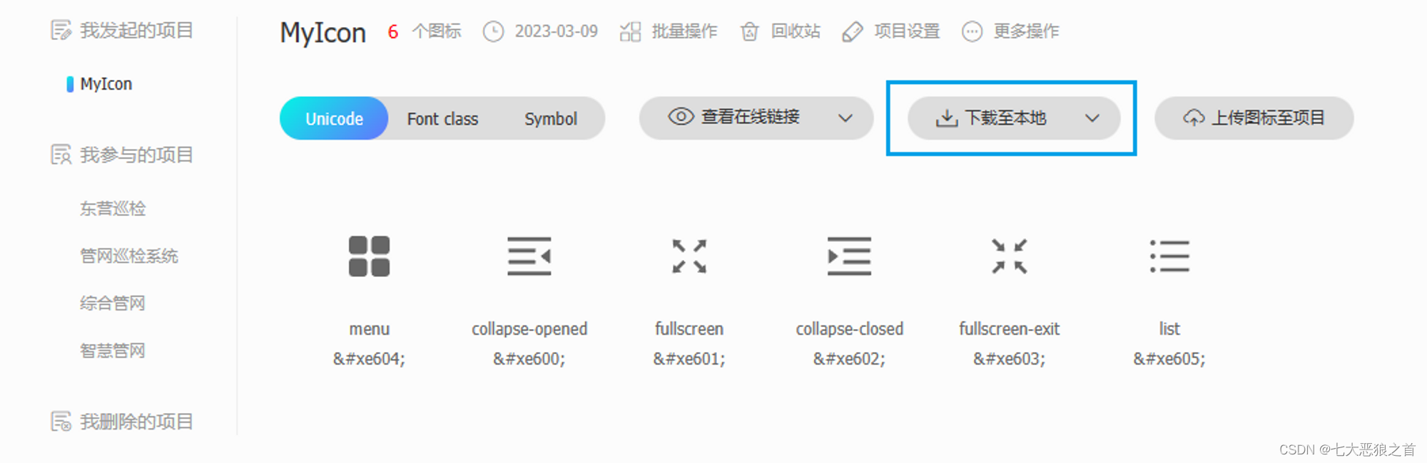
https://www.iconfont.cn/
1. 下载 iconfont.js
2. 将 iconfont.js 放入项目并全局引入
main.ts引入
import "@/assets/icons/iconfont/iconfont.js";
3. 下载并配置自动按需导入插件(可选)
pnpm install unplugin-vue-components -D
// vite.config.ts

import Vue from '@vitejs/plugin-vue'
import Components from 'unplugin-vue-components/vite'

export default defineConfig {
  plugins: [
    Vue(),
    Components({
      // 自动按需导入组件目录
      dirs: ["src/components"]
    })
  ]
}
4. 封装公共图标组件
封装组件 SvgIcon, 目录 srccomponentsSvgIconindex.vue
<script setup lang="ts" name="SvgIcon">
import { computed, CSSProperties } from "vue";

interface SvgProps {
	name: string; // 图标的名称 ==> 必传
	prefix?: string; // 图标的前缀 ==> 非必传(默认为"icon")
	iconStyle?: CSSProperties; // 图标的样式 ==> 非必传
}

// 接收父组件参数并设置默认值
const props = withDefaults(defineProps<SvgProps>(), {
	prefix: "icon",
	iconStyle: () => ({ width: "20px", height: "20px" })
});

const symbolId = computed(() => `#${props.prefix}-${props.name}`);
</script>

<template>
	<svg :style="iconStyle" aria-hidden="true">
		<use :xlink:href="symbolId" />
	</svg>
</template>

<style scoped>
svg {
	width: 1em;
	height: 1em;
	overflow: hidden;
	vertical-align: -0.15em;
	fill: currentColor;
}
</style>
5. 组件内使用
<script setup lang="ts" name="svgIcon">
import SvgIcon from "@/components/SvgIcon/index.vue";

const iconStyle = { width: "100px", height: "100px", color: "#0d9488" };
</script>

<template>
	<SvgIcon name="menu" :iconStyle="iconStyle" />
</template>
三、使用本地 svg 图标
1. 下载插件
pnpm install vite-plugin-svg-icons -D
自动按需导入(可选)
pnpm install unplugin-vue-cmponents -D
2. 配置 vite.config.ts
import Vue from '@vitejs/plugin-vue'
import Components from 'unplugin-vue-components/vite'
import { createSvgIconsPlugin } from 'vite-plugin-svg-icons'

export default defineConfig {
  plugins: [
    Vue(),
    Components({
      // 自动按需导入组件目录
      dirs: ["src/components"]
    }),
    createSvgIconsPlugin({
      // 配置路径, 项目存放svg的目录
      iconDirs: [resolve(process.cwd(), 'src/assets/icons/svg')],
      symbolId: 'icon-[dir]-[name]'
    })
  ]
}
3. 封装使用
与 “二、使用 iconfont 图标库” 共用同一组件。(本质都是SVG图标公共组件)
最后
以上就是忧心蜡烛最近收集整理的关于Vue3+Vite 图标封装3种方案一、使用iconify图标库二、使用iconfont图标库三、使用本地svg的全部内容,更多相关Vue3+Vite内容请搜索靠谱客的其他文章。
本图文内容来源于网友提供,作为学习参考使用,或来自网络收集整理,版权属于原作者所有。


发表评论 取消回复