
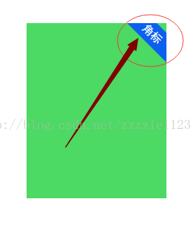
先来看看效果:
(推荐教程:html视频教程)
实现代码:
<!DOCTYPE html>
<html>
<head>
    <meta charset="UTF-8">
    <title>制作角标的方法</title>
    <script src="http://cdn.static.runoob.com/libs/jquery/1.10.2/jquery.min.js"></script>
    <style>
          .con{
            height: 250px;
            width: 200px;
            margin: 0 auto;
            overflow: hidden;
            margin-top: 100px;
            position: relative;
            background-color: #4cd964;
          }
      .subscript{
        color: #fff;
        height: 30px;
        width: 100px;
        position: absolute;
        right: -30px;
        text-align: center;
        line-height: 30px;
        font-family: "黑体";
        background-color: #0c60ee;
        -moz-transform:rotate(45deg);
        -webkit-transform:rotate(45deg);
        -o-transform:rotate(45deg);
        -ms-transform:rotate(45deg);
        transform:rotate(45deg);
      }
    </style>
</head>
<body>
<div>
    <div>
      角标
    </div>
</div>
</body>
</html>登录后复制
相关推荐:html教程
以上就是html怎么实现上角标效果的详细内容,更多请关注靠谱客其它相关文章!

最后
以上就是动人绿茶最近收集整理的关于html怎么实现上角标效果的全部内容,更多相关html怎么实现上角标效果内容请搜索靠谱客的其他文章。
本图文内容来源于网友提供,作为学习参考使用,或来自网络收集整理,版权属于原作者所有。


发表评论 取消回复