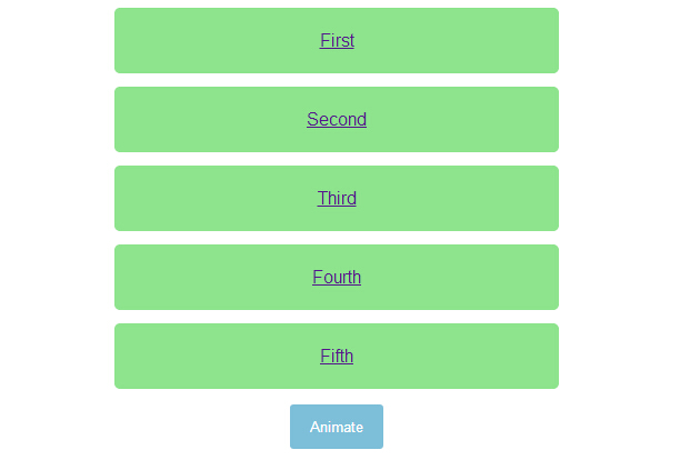
今天给大家分享一款基jquery超炫的动画导航菜单。这款导航菜单,初始时页面中间一个按钮,单击按钮,菜单从左侧飞入页中。再次单击按钮,导航飞入左侧消息。动画效果很非常炫。一起看下效果图:
源码下载
html代码:
<ul>
<li><a href="http://www.w2bc.com">First</a></li>
<li><a href="http://www.w2bc.com">Second</a></li>
<li><a href="http://www.w2bc.com">Third</a></li>
<li><a href="http://www.w2bc.com">Fourth</a></li>
<li><a href="http://www.w2bc.com">Fifth</a></li>
</ul>
<button>
Animate</button>
<script src='jquery.js'></script>
<script> $('button').on('click', function () {
$('ul').toggleClass('animate');
}); //@ sourceURL=pen.js
</script>
css代码:
body
{
text-align: center;
}

ul
{
width: 400px;
padding: 0;
margin: 0 auto;
}
ul.animate li
{
transform: translate(0);
}
ul.animate li:nth-of-type(1)
{
transition-delay: 0.05s;
}
ul.animate li:nth-of-type(2)
{
transition-delay: 0.1s;
}
ul.animate li:nth-of-type(3)
{
transition-delay: 0.15s;
}
ul.animate li:nth-of-type(4)
{
transition-delay: 0.2s;
}
ul.animate li:nth-of-type(5)
{
transition-delay: 0.25s;
}

li
{
list-style: none;
display: block;
padding: 20px;
margin: 12px 0;
border-radius: 5px;
font-family: Helvetica, sans-serif;
color: #fff;
background: #8DE48D;
transform: translate(-500%);
transition: transform 0.75s cubic-bezier(0.175, 0.885, 0.32, 1.08);
}
li:nth-of-type(5)
{
transition-delay: 0.15s;
}
li:nth-of-type(4)
{
transition-delay: 0.3s;
}
li:nth-of-type(3)
{
transition-delay: 0.45s;
}
li:nth-of-type(2)
{
transition-delay: 0.6s;
}
li:nth-of-type(1)
{
transition-delay: 0.75s;
}

button
{
padding: 12px 18px;
border: none;
border-radius: 3px;
color: #fff;
background: #7DBED8;
}
button:focus
{
outline: none;
}
最后
以上就是温婉蛋挞最近收集整理的关于一款基jquery超炫的动画导航菜单可响应单击事件的全部内容,更多相关一款基jquery超炫内容请搜索靠谱客的其他文章。
本图文内容来源于网友提供,作为学习参考使用,或来自网络收集整理,版权属于原作者所有。


发表评论 取消回复