[index.html]
<!DOCTYPE html>
<html lang="en">
<head>
<meta charset="UTF-8">
<title>CSS3动画</title>
<link rel="stylesheet" href="indexCSS.css">
</head>
<body>
<!--CSS3 2D、3D转换-->
<!--转换是使元素改变形状、尺寸和位置的一种效果-->
<!--通过转换能够对元素进行移动、缩放、转动、拉长或拉伸-->
<!--transform: function(); 转换属性-->
<!--2D转换方法-->
<!--translate() 移动-->
<!--rotate() 旋转-->
<!--scale() 缩放-->
<!--skew() 倾斜-->
<!--matrix() 矩阵-->
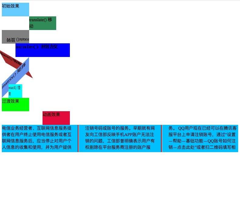
<div id="dID1">初始效果</div>
<div id="dID2">translate() 移动</div>
<div id="dID3">rotate() 旋转</div>
<div id="dID4">scale() 缩放</div>
<div id="dID5">skew() 倾斜</div>
<div id="dID6">matrix() 矩阵</div>
<!--3D转换方法-->
<!--rotateX()-->
<!--rotateY()-->
<div id="dID7">rotateX() 3旋转</div>
<!--CSS3过渡-->
<!--过渡是指元素从一种样式转换成另一种样式,包括动画执行的CSS和动画执行的时间。-->
<!--过渡属性:-->
<!--transition 属性是一个简写属性,用于设置四个过渡属性:-->
<!--transition-property 规定设置过渡效果的 CSS 属性的名称。-->
<!--transition-duration 规定完成过渡效果需要多少秒或毫秒。-->
<!--transition-timing-function 规定速度效果的速度曲线。-->
<!--transition-delay 定义过渡效果何时开始。-->
<div class="dClass1">过渡效果</div>
<!--CSS3动画-->
<!--需要遵循@keyframes规则,即规定动画的时长和规定动画的名称。-->
<!--animation 属性是一个简写属性,用于设置六个动画属性:-->
<!--animation-name 规定需要绑定到选择器的 keyframe 名称。-->
<!--animation-duration 规定完成动画所花费的时间,以秒或毫秒计。-->
<!--animation-timing-function 规定动画的速度曲线。-->
<!--animation-delay 规定在动画开始之前的延迟。-->
<!--animation-iteration-count 规定动画应该播放的次数。-->
<!--animation-direction 规定是否应该轮流反向播放动画。-->
<div class="dClass2">动画效果</div>
<!--CSS3多列-->
<!--多列属性-->
<!--column-count 分列的数量-->
<!--column-gap 每一列中间间隔的距离-->
<!--column-rule 每一列之间的线宽以及线的颜色-->
<div class="dClass3">
电信业务经营者、互联网信息服务提供者在用户终止使用电信服务或者互联网信息服务后,应当停止对用户个人信息的收集和使用,并为用户提供注销号码或账号的服务。
早期就有网友向工信部反映手机APP账户无法注销的问题,工信部曾明确表示用户有权删除在平台服务商注册的账户服务。
QQ用户现在已经可以在腾讯客服平台上申请注销账号,通过“设置—帮助—基础功能—QQ账号如何注销—点击此处”或者扫二维码填写相关信息。
审核通过之后,这个QQ号从此就不再属于你了,同时还有你的Q点Q币等绑定的虚拟财产,连同你的QQ秀、你偷的菜、抢的停车位和豪华黄钻绿钻,以及杀马特贵族的光荣也将一同被清空。
</div>
</body>
</html>[indexCSS.css]
/*CSS3转换*/
#dID1{
    width: 100px;
    height: 50px;
    background-color: #66CCFF;
}
/*2转换*/
#dID2{
    width: 100px;
    height: 50px;
    background-color: seagreen;
    /*translate()移动方法
      有两个参数:
      参数一表示X轴方向的移动
      参数二表示Y周方向的移动
      */
    /*添加支持的浏览器,输入属性后也可以选择编辑自动添加。*/
    -webkit-transform: translate(100px,0px);  /*safari chrome*/
    -moz-transform: translate(100px,0px); /*Firefox*/
    -ms-transform: translate(100px,0px); /*IE*/
    -o-transform: translate(100px,0px); /*opera*/
    transform: translate(100px,0px);
}
#dID3{
    width: 100px;
    height: 50px;
    background-color: grey;
    /*rotate()旋转方法
      有一个参数: 参数表示旋转的角度
      deg 角度单位
    */
    -webkit-transform: rotate(180deg);
    -moz-transform: rotate(180deg);
    -ms-transform: rotate(180deg);
    -o-transform: rotate(180deg);
    transform: rotate(180deg);
}
#dID4{
    margin-left: 100px;
    width: 100px;
    height: 50px;
    background-color: blue;
    /*scale()缩放方法
      有两个参数:
      参数一表示宽度的缩放倍数
      参数二表示高度的缩放倍数
    */
    -webkit-transform: scale(2,1);
    -moz-transform: scale(2,1);
    -ms-transform: scale(2,1);
    -o-transform: scale(2,1);
    transform: scale(2,1);
}
#dID5{
    width: 100px;
    height: 50px;
    background-color: brown;
    /*skew()倾斜方法
      有两个参数:
      参数一表示围绕X轴倾斜的角度
      参数二表示围绕Y轴倾斜的角度
      同样还有方法skewX()和skewY(),它们只有一个参数。
    */
    -webkit-transform: skew(30deg,30deg);
    -moz-transform: skew(30deg,30deg);
    -ms-transform: skew(30deg,30deg);
    -o-transform: skew(30deg,30deg);
    transform: skew(30deg,30deg);
}
#dID6{
    width: 100px;
    height: 50px;
    background-color: cornflowerblue;
    /*matrix()矩阵变形方法
      基本语法transform: matrix(a, c, b, d, tx, ty);
      a, c, b, d是一个二维矩阵:
        ┌     ┐
        │ a b │
        │ c d │
        └     ┘
        tx, ty就是就是基于X和Y 坐标重新定位元素。
      tx, ty参数值在各个浏览器下有差异:
        firefox下tx, ty除了0值之外必须只用长度单位值(“px”,“em”等)或者使用百分数
        webkit和opera下tx, ty的值部门加单位或者百分数,他们就是一个数值,默认单位是px;
    */
    -webkit-transform: matrix(1.0,-1.0,0.0,1.0,0,0);
    -moz-transform: matrix(1.0,-1.0,0.0,1.0,0,0);
    -ms-transform: matrix(1.0,-1.0,0.0,1.0,0,0);
    -o-transform: matrix(1.0,-1.0,0.0,1.0,0,0);
    transform: matrix(1.0,-1.0,0.0,1.0,0,0);
}
/*3D转换*/
#dID7{
    width: 100px;
    height: 50px;
    background-color: aqua;
    /*rotateX()
      有一个参数: 元素围绕其 X 轴以给定的度数进行旋转
     */
    -webkit-transform: rotateX(60deg);
    -moz-transform: rotateX(60deg);
    -ms-transform: rotateX(60deg);
    -o-transform: rotateX(60deg);
    transform: rotateX(60deg);
    /*rotateY()
      有一个参数: 元素围绕其 Y 轴以给定的度数进行旋转
    */
    -webkit-transform: rotate(60deg);
    -moz-transform: rotate(60deg);
    -ms-transform: rotate(60deg);
    -o-transform: rotateY(60deg);
    transform: rotateY(60deg);
}

/*CSS3过渡*/
.dClass1{
    width: 100px;
    height: 50px;
    background-color: lime;
    /*使用简写的方式实现过渡*/
    -webkit-transition: width 2s, height 2s, transform 2s;
    -moz-transition: width 2s, height 2s, transform 2s;
    -ms-transition: width 2s, height 2s, transform 2s;
    -o-transition: width 2s, height 2s, transform 2s;
    transition: width 2s, height 2s, transform 2s;
    /*延时2秒执行*/
    transition-delay: 2s;
}
/*鼠标放上去的时候执行*/
.dClass1:hover{
    /*改变宽度*/
    width: 200px;
    /*改变高度*/
    height: 100px;
    /*旋转360度*/
    -webkit-transform: rotate(360deg);
    -moz-transform: rotate(360deg);
    -ms-transform: rotate(360deg);
    -o-transform: rotate(360deg);
    transform: rotate(360deg);
}

/*CSS3动画*/
.dClass2{
    width: 100px;
    height: 50px;
    background-color: blueviolet;
    /*使用相对布局,进行不占位的移动操作*/
    position: relative;
    /*动画效果*/
    animation: tempAnimation 5s infinite alternate;
    /*浏览器适配*/
    -webkit-animation: tempAnimation 5s infinite alternate; /* Safari 和 Chrome */
}
@keyframes tempAnimation{
    0%{background: blueviolet; left:0px; top:0px}
    25%{background: #FF0000; left:200px; top:0px}
    50%{background: seagreen; left:200px; top:200px}
    75%{background: cornflowerblue; left:0px; top:200px}
    100%{background: deepskyblue; left:0px; top:0px}
}
/*浏览器适配*/
@-webkit-keyframes tempAnimation {
    0%{background: blueviolet; left:0px; top:0px}
    25%{background: #FF0000; left:200px; top:0px}
    50%{background: seagreen; left:200px; top:200px}
    75%{background: cornflowerblue; left:0px; top:200px}
    100%{background: deepskyblue; left:0px; top:0px}
}

/*CSS3多列*/
.dClass3{
    width: 100%;
    height: 100px;
    background-color: deepskyblue;
    /*分列数量*/
    -webkit-column-count: 3;
    -moz-column-count: 3;
    column-count: 3;
    /*每列间距*/
    -webkit-column-gap: 50px;
    -moz-column-gap: 50px;
    column-gap: 50px;
    /*每列之间的线宽及颜色*/
    column-rule: 5px outset #FF0000;
    /*适配浏览器*/
    -webkit-column-rule: 5px outset #FF0000;
}
示意图:
最后
以上就是无私水蜜桃最近收集整理的关于CSS3动画(2D/3D转换、过渡、动画和多列)的全部内容,更多相关CSS3动画(2D/3D转换、过渡、动画和多列)内容请搜索靠谱客的其他文章。
本图文内容来源于网友提供,作为学习参考使用,或来自网络收集整理,版权属于原作者所有。


发表评论 取消回复