转自
http://blog.csdn.net/xyz_lmn/article/details/38304427
作为Android应用程序开发者都知道android是一个“碎片化”的世界。多种系统版本、多种尺寸、多种分辨率、多种机型,还有不同的厂商定制的不同ROM,你开发的应用会在不可预期的手机上报错。这给开发适配带来不小的难度。这篇文章会告诉我们怎么解决这个问题。
1、Android碎片化
1.1、android系统版本
Android更新较大的版本如下:
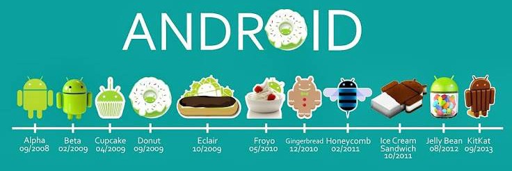
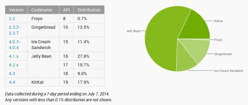
上面只有当前可用版本,Android L作为开发者版本没有出现其中,未来会有更多的版本。下图给出Android各个版本的占有率,这个是googleplay统计的近期数据。googleplay只支持2.2以上的手机,所以统计中缺少2.2以下版本。
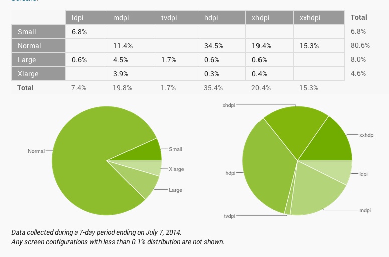
1.2、Android中不同尺寸、不同分辨率市场占有情况
3、Android不同机型
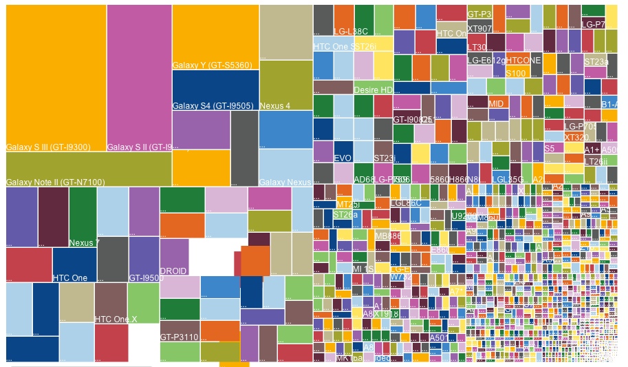
这是OpenSignal在2013年的调查调查结果,Android系统设备覆盖了11,868不同机型,现在肯定会更多。
2、基本概念
Android“碎片化”如此严重,那么我们怎么解决Android应用适配问题呢。Android官方文档给出了解决方案,这篇文章也是参考总结的官方文档。
解决Android“碎片化”化问题,我们需要了解一些基础概念。
屏幕大小
根据屏幕对角线实际测量的物理大小(android已经根据屏幕大小分为四类small, normal, large, extra large),具体怎么划分的下面会提到。
屏幕密度
屏幕物理区域一个单位(一般用英寸)的像素数量,一般简称dpi(dots per inch,每英寸上的点数,记住DPI这个概念很重要)屏幕密度也分为四类 low, medium, high, extra high,他们的比例关系是 0.75:1:1.5:2,具体的值为120:160:240:320。
屏幕方向
屏幕方向分为横屏和竖屏。
分辨率
一个物理屏幕上像素点的总数。一般我们的App不会直接使用分辨率,而是使用密度和屏幕大小。
独立像素单位(Density-independent pixel (dp))
一个虚拟的单位,用来决定UI布局的。用来表述布局的尺寸或者位置。
dp是一个与屏幕密度有关系的单位,dp与像素的换算关系为 px = dp * (dpi / 160)。例如在240密度(dpi)的屏幕上一个dp等于1.5个像素。以后我们应该尽量使用dp单位布局,不要使用像素单位。这样会使你的app屏幕兼容性更好
Android1.6开始就支持多屏幕和密度了,这都是为了更好的用户体验,为了简化我们多屏幕的开发,当然这要声明<uses-sdk android:minSdkVersion="4" />或者大于4。android提供了一组范围让我们使用,见下图:
3、Android中资源配置
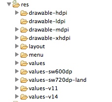
Android工程中经常看到下图的资源文件配置,一般会包含animator、anim、color、drawable、layout、menu、raw、value、xml等。
命名规则是<resources_name>-<config_qualifier>。
<resources_name>:资源文件名
<config_qualifier>:特定条件下可以使用这种资源
| Configuration | Qualifier Values | Description |
| MCC and MNC | Examples:mcc310mcc310-mnc004mcc208-mnc00etc. | The mobile country code (MCC), optionally followed by mobile network code (MNC) from the SIM card in the device. For example, mcc310 is U.S. on any carrier,mcc310-mnc004 is U.S. on Verizon, and mcc208-mnc00 is France on Orange. If the device uses a radio connection (GSM phone), the MCC and MNC values come from the SIM card. You can also use the MCC alone (for example, to include country-specific legal resources in your application). If you need to specify based on the language only, then use the language and region qualifier instead (discussed next). If you decide to use the MCC and MNC qualifier, you should do so with care and test that it works as expected. Also see the configuration fields mcc, and mnc, which indicate the current mobile country code and mobile network code, respectively. |
| Language and region | Examples:enfren-rUSfr-rFRfr-rCAetc. | The language is defined by a two-letter ISO 639-1 language code, optionally followed by a two letter ISO 3166-1-alpha-2 region code (preceded by lowercase "r"). The codes are not case-sensitive; the r prefix is used to distinguish the region portion. You cannot specify a region alone. This can change during the life of your application if the user changes his or her language in the system settings. See Handling Runtime Changes for information about how this can affect your application during runtime. See Localization for a complete guide to localizing your application for other languages. Also see the locale configuration field, which indicates the current locale. |
| Layout Direction | ldrtlldltr | The layout direction of your application. ldrtl means "layout-direction-right-to-left". ldltr means "layout-direction-left-to-right" and is the default implicit value. This can apply to any resource such as layouts, drawables, or values. For example, if you want to provide some specific layout for the Arabic language and some generic layout for any other "right-to-left" language (like Persian or Hebrew) then you would have: res/ layout/ main.xml (Default layout) layout-ar/ main.xml (Specific layout for Arabic) layout-ldrtl/ main.xml (Any "right-to-left" language, except for Arabic, because the "ar" language qualifier has a higher precedence.) Note: To enable right-to-left layout features for your app, you must setsupportsRtl to "true" and set targetSdkVersion to 17 or higher. Added in API level 17. |
| smallestWidth | sw<N>dpExamples:sw320dpsw600dpsw720dpetc. | The fundamental size of a screen, as indicated by the shortest dimension of the available screen area. Specifically, the device's smallestWidth is the shortest of the screen's available height and width (you may also think of it as the "smallest possible width" for the screen). You can use this qualifier to ensure that, regardless of the screen's current orientation, your application has at least <N> dps of width available for its UI. For example, if your layout requires that its smallest dimension of screen area be at least 600 dp at all times, then you can use this qualifer to create the layout resources, res/layout-sw600dp/. The system will use these resources only when the smallest dimension of available screen is at least 600dp, regardless of whether the 600dp side is the user-perceived height or width. The smallestWidth is a fixed screen size characteristic of the device; the device's smallestWidth does not change when the screen's orientation changes. The smallestWidth of a device takes into account screen decorations and system UI. For example, if the device has some persistent UI elements on the screen that account for space along the axis of the smallestWidth, the system declares the smallestWidth to be smaller than the actual screen size, because those are screen pixels not available for your UI. Thus, the value you use should be the actual smallest dimension required by your layout (usually, this value is the "smallest width" that your layout supports, regardless of the screen's current orientation). Some values you might use here for common screen sizes: 320, for devices with screen configurations such as: 240x320 ldpi (QVGA handset) 320x480 mdpi (handset) 480x800 hdpi (high density handset) 480, for screens such as 480x800 mdpi (tablet/handset). 600, for screens such as 600x1024 mdpi (7" tablet). 720, for screens such as 720x1280 mdpi (10" tablet). When your application provides multiple resource directories with different values for the smallestWidth qualifier, the system uses the one closest to (without exceeding) the device's smallestWidth. Added in API level 13. Also see the android:requiresSmallestWidthDp attribute, which declares the minimum smallestWidth with which your application is compatible, and thesmallestScreenWidthDp configuration field, which holds the device's smallestWidth value. For more information about designing for different screens and using this qualifier, see the Supporting Multiple Screens developer guide. |
| Available width | w<N>dpExamples:w720dpw1024dpetc. | Specifies a minimum available screen width, in dp units at which the resource should be used—defined by the <N> value. This configuration value will change when the orientation changes between landscape and portrait to match the current actual width. When your application provides multiple resource directories with different values for this configuration, the system uses the one closest to (without exceeding) the device's current screen width. The value here takes into account screen decorations, so if the device has some persistent UI elements on the left or right edge of the display, it uses a value for the width that is smaller than the real screen size, accounting for these UI elements and reducing the application's available space. Added in API level 13. Also see the screenWidthDp configuration field, which holds the current screen width. For more information about designing for different screens and using this qualifier, see the Supporting Multiple Screens developer guide. |
| Available height | h<N>dpExamples:h720dph1024dpetc. | Specifies a minimum available screen height, in "dp" units at which the resource should be used—defined by the <N> value. This configuration value will change when the orientation changes between landscape and portrait to match the current actual height. When your application provides multiple resource directories with different values for this configuration, the system uses the one closest to (without exceeding) the device's current screen height. The value here takes into account screen decorations, so if the device has some persistent UI elements on the top or bottom edge of the display, it uses a value for the height that is smaller than the real screen size, accounting for these UI elements and reducing the application's available space. Screen decorations that are not fixed (such as a phone status bar that can be hidden when full screen) are not accounted for here, nor are window decorations like the title bar or action bar, so applications must be prepared to deal with a somewhat smaller space than they specify. Added in API level 13. Also see the screenHeightDp configuration field, which holds the current screen width. For more information about designing for different screens and using this qualifier, see the Supporting Multiple Screens developer guide. |
| Screen size | smallnormallargexlarge | small: Screens that are of similar size to a low-density QVGA screen. The minimum layout size for a small screen is approximately 320x426 dp units. Examples are QVGA low density and VGA high density. normal: Screens that are of similar size to a medium-density HVGA screen. The minimum layout size for a normal screen is approximately 320x470 dp units. Examples of such screens a WQVGA low density, HVGA medium density, WVGA high density. large: Screens that are of similar size to a medium-density VGA screen. The minimum layout size for a large screen is approximately 480x640 dp units. Examples are VGA and WVGA medium density screens. xlarge: Screens that are considerably larger than the traditional medium-density HVGA screen. The minimum layout size for an xlarge screen is approximately 720x960 dp units. In most cases, devices with extra large screens would be too large to carry in a pocket and would most likely be tablet-style devices. Added in API level 9. Note: Using a size qualifier does not imply that the resources are only for screens of that size. If you do not provide alternative resources with qualifiers that better match the current device configuration, the system may use whichever resources are the best match. Caution: If all your resources use a size qualifier that is larger than the current screen, the system will not use them and your application will crash at runtime (for example, if all layout resources are tagged with the xlarge qualifier, but the device is a normal-size screen). Added in API level 4. See Supporting Multiple Screens for more information. Also see the screenLayout configuration field, which indicates whether the screen is small, normal, or large. |
| Screen aspect | longnotlong | long: Long screens, such as WQVGA, WVGA, FWVGA notlong: Not long screens, such as QVGA, HVGA, and VGA Added in API level 4. This is based purely on the aspect ratio of the screen (a "long" screen is wider). This is not related to the screen orientation. Also see the screenLayout configuration field, which indicates whether the screen is long. |
| Screen orientation | portland | port: Device is in portrait orientation (vertical) land: Device is in landscape orientation (horizontal) This can change during the life of your application if the user rotates the screen. See Handling Runtime Changes for information about how this affects your application during runtime. Also see the orientation configuration field, which indicates the current device orientation. |
| UI mode | cardesktelevisionappliancewatch | car: Device is displaying in a car dock desk: Device is displaying in a desk dock television: Device is displaying on a television, providing a "ten foot" experience where its UI is on a large screen that the user is far away from, primarily oriented around DPAD or other non-pointer interaction appliance: Device is serving as an appliance, with no display watch: Device has a display and is worn on the wrist Added in API level 8, television added in API 13, watch added in API 20. For information about how your app can respond when the device is inserted into or removed from a dock, read Determining and Monitoring the Docking State and Type. This can change during the life of your application if the user places the device in a dock. You can enable or disable some of these modes using UiModeManager. SeeHandling Runtime Changes for information about how this affects your application during runtime. |
| Night mode | nightnotnight | night: Night time notnight: Day time Added in API level 8. This can change during the life of your application if night mode is left in auto mode (default), in which case the mode changes based on the time of day. You can enable or disable this mode using UiModeManager. See Handling Runtime Changes for information about how this affects your application during runtime. |
| Screen pixel density (dpi) | ldpimdpihdpixhdpinodpitvdpi | ldpi: Low-density screens; approximately 120dpi. mdpi: Medium-density (on traditional HVGA) screens; approximately 160dpi. hdpi: High-density screens; approximately 240dpi. xhdpi: Extra high-density screens; approximately 320dpi. Added in API Level 8 nodpi: This can be used for bitmap resources that you do not want to be scaled to match the device density. tvdpi: Screens somewhere between mdpi and hdpi; approximately 213dpi. This is not considered a "primary" density group. It is mostly intended for televisions and most apps shouldn't need it—providing mdpi and hdpi resources is sufficient for most apps and the system will scale them as appropriate. This qualifier was introduced with API level 13. There is a 3:4:6:8 scaling ratio between the four primary densities (ignoring the tvdpi density). So, a 9x9 bitmap in ldpi is 12x12 in mdpi, 18x18 in hdpi and 24x24 in xhdpi. If you decide that your image resources don't look good enough on a television or other certain devices and want to try tvdpi resources, the scaling factor is 1.33*mdpi. For example, a 100px x 100px image for mdpi screens should be 133px x 133px for tvdpi. Note: Using a density qualifier does not imply that the resources are only for screens of that density. If you do not provide alternative resources with qualifiers that better match the current device configuration, the system may use whichever resources are the best match. See Supporting Multiple Screens for more information about how to handle different screen densities and how Android might scale your bitmaps to fit the current density. |
| Touchscreen type | notouchfinger | notouch: Device does not have a touchscreen. finger: Device has a touchscreen that is intended to be used through direction interaction of the user's finger. Also see the touchscreen configuration field, which indicates the type of touchscreen on the device. |
| Keyboard availability | keysexposedkeyshiddenkeyssoft | keysexposed: Device has a keyboard available. If the device has a software keyboard enabled (which is likely), this may be used even when the hardware keyboard is not exposed to the user, even if the device has no hardware keyboard. If no software keyboard is provided or it's disabled, then this is only used when a hardware keyboard is exposed. keyshidden: Device has a hardware keyboard available but it is hidden and the device does not have a software keyboard enabled. keyssoft: Device has a software keyboard enabled, whether it's visible or not. If you provide keysexposed resources, but not keyssoft resources, the system uses the keysexposed resources regardless of whether a keyboard is visible, as long as the system has a software keyboard enabled. This can change during the life of your application if the user opens a hardware keyboard. See Handling Runtime Changes for information about how this affects your application during runtime. Also see the configuration fields hardKeyboardHidden and keyboardHidden, which indicate the visibility of a hardware keyboard and and the visibility of any kind of keyboard (including software), respectively. |
| Primary text input method | nokeysqwerty12key | nokeys: Device has no hardware keys for text input. qwerty: Device has a hardware qwerty keyboard, whether it's visible to the user or not. 12key: Device has a hardware 12-key keyboard, whether it's visible to the user or not. Also see the keyboard configuration field, which indicates the primary text input method available. |
| Navigation key availability | navexposednavhidden | navexposed: Navigation keys are available to the user. navhidden: Navigation keys are not available (such as behind a closed lid). This can change during the life of your application if the user reveals the navigation keys. See Handling Runtime Changes for information about how this affects your application during runtime. Also see the navigationHidden configuration field, which indicates whether navigation keys are hidden. |
| Primary non-touch navigation method | nonavdpadtrackballwheel | nonav: Device has no navigation facility other than using the touchscreen. dpad: Device has a directional-pad (d-pad) for navigation. trackball: Device has a trackball for navigation. wheel: Device has a directional wheel(s) for navigation (uncommon). Also see the navigation configuration field, which indicates the type of navigation method available. |
| Platform Version (API level) | Examples:v3v4v7etc. | The API level supported by the device. For example, v1 for API level 1 (devices with Android 1.0 or higher) and v4 for API level 4 (devices with Android 1.6 or higher). See the Android API levels document for more information about these values. |
资源文件可以配置多种选择条件。
Android系统是怎样找到最合适的资源的请参考:
4、怎么解决这些问题
其实给出的解决方法也是官方文档中,这里会简单的写一点,有条件可以看一下参考中的链接。
4.1 Supporting Different Devices
4.1.1支持不同的语言
这一点是应用怎么实现国际化,使用values文件添加config_qualifier属性,例如:
MyProject/
res/
values/
strings.xml
values-es/
strings.xml
values-fr/
strings.xml
4.1.2支持不同的屏幕
Android手机的屏幕有两个属性,屏幕尺寸、屏幕密度。前面也介绍了屏幕的尺寸、密度。解决这个问题,我们需要声明不同的布局,不同的图片资源。屏幕的方向(横屏、竖屏)也是在这处理的。这个和前面国际化处理一样的,使用资源文件添加config_qualifier属性。
4.1.2.1 Create Different Layouts
适配不同尺寸可以创建下面目录:
MyProject/
res/
layout/
main.xml
layout-large/
main.xml
MyProject/
res/
layout/
main.xml
layout-land/
main.xml
如果需要同时适配,需要更多的条件:
MyProject/
res/
layout/
# default (portrait)
main.xml
layout-land/
# landscape
main.xml
layout-large/
# large (portrait)
main.xml
layout-large-land/
# large landscape
main.xml
Android3.2中为了适配平板的开发,增加了smallestWidth属性。详情参考。
4.1.2.2 Create Different Bitmaps
- xhdpi: 2.0
- hdpi: 1.5
- mdpi: 1.0 (baseline)
- ldpi: 0.75
如果你在mdpi中放置200x200的图片,建议你在mdpi中放置100x100的图片。
MyProject/
res/
drawable-xhdpi/
awesomeimage.png
drawable-hdpi/
awesomeimage.png
drawable-mdpi/
awesomeimage.png
drawable-ldpi/
awesomeimage.png
 。
。
4.1.3支持不同的平台版本
Android版本的升级就会带来新的api,我们怎么适配不同的系统版本呢。
1、使用 Android Support Library
2、AndroidManifest文件配置minSdk、targetSdk。
- <manifest xmlns:android="http://schemas.android.com/apk/res/android" ... >
- <uses-sdk android:minSdkVersion="4" android:targetSdkVersion="15" />
- ...
- </manifest>
3、检测版本号,根据版本号调用api
- private void setUpActionBar() {
- // Make sure we're running on Honeycomb or higher to use ActionBar APIs
- if (Build.VERSION.SDK_INT >= Build.VERSION_CODES.HONEYCOMB) {
- ActionBar actionBar = getActionBar();
- actionBar.setDisplayHomeAsUpEnabled(true);
- }
- }
4、使用平台的Styles and Themes
- <activity android:theme="@android:style/Theme.Dialog">
- <activity android:theme="@android:style/Theme.Translucent">
4.2 Designing for Multiple Screens
Android设备包含phone、glass、watch、autocar等等,这些屏幕尺寸从小到watch大到电视,我们的应用能够兼容这么多的尺寸是很重要的。
4.2.1支持不同屏幕尺寸
4.2.1.1 Use "wrap_content" and "match_parent"
UI实现中view和layout的高度、宽度使用"wrap_content" and "match_parent",不使用固定值。
4.2.1.2 Use RelativeLayout
UI实现中layout尽量使用RelativeLayout,这样可以控制相对位置,还能减少布局的层级。
4.2.1.3 Use Size Qualifiers
距离使用dp和字体使用sp作为单位,不使用px。
4.2.1.4 Use the Smallest-width Qualifier
使用Smallest-width Qualifier,这个是Android3.2开始支持的,以适配平板。
- res/layout-sw600dp/main.xml
4.2.1.5 Use Layout Aliases
使用Layout的别名,以适配不同尺寸的屏幕。
4.2.1.6 Use Orientation Qualifiers
使用屏幕方向属性,以支持横屏、竖屏。
4.2.1.7 Use Nine-patch Bitmaps
使用.9图片,.9图片能很好地支持横向、竖向拉伸。
4.2.2支持不同屏幕密度
见4.1.2.2 Create Different Bitmaps
4.2.3创建自适应界面
这里主要是运行时检测,什么是运行时检测呢,就是在java代码中判断需要的view是否找到(是否为空),例如下面的代码。
- public class NewsReaderActivity extends FragmentActivity {
- boolean mIsDualPane;
- @Override
- public void onCreate(Bundle savedInstanceState) {
- super.onCreate(savedInstanceState);
- setContentView(R.layout.main_layout);
- View articleView = findViewById(R.id.article);
- mIsDualPane = articleView != null &&
- articleView.getVisibility() == View.VISIBLE;
- }
- }
这一方面的,可以参考《Android UI开发第三十篇——使用Fragment构建灵活的桌面》。
Android应用如何支持屏幕多尺寸多分辨率问题基本就这些,更多经验需要从实践中总结。
后记:很久的时候和一位小伙伴讨论过应用适配的问题,说好了要总结出来的,现在权当实现诺言,写的有些凌乱,有读不通的通信请留言。
想了解Android历史的同学可以参考
参考:
http://developer.android.com/about/dashboards/index.htmlhttp://opensignal.com/reports/fragmentation-2013/
http://developer.android.com/guide/practices/screens_support.html
http://developer.android.com/guide/topics/resources/providing-resources.html
http://developer.android.com/training/basics/supporting-devices/index.html
http://developer.android.com/training/multiscreen/index.html
http://www.androidized.com/a-brief-history-of-android/
最后
以上就是时尚胡萝卜最近收集整理的关于Android应用如何支持屏幕多尺寸多分辨率问题的全部内容,更多相关Android应用如何支持屏幕多尺寸多分辨率问题内容请搜索靠谱客的其他文章。





发表评论 取消回复