原理:利用兄弟选择器配合伪元素自定义单复选框
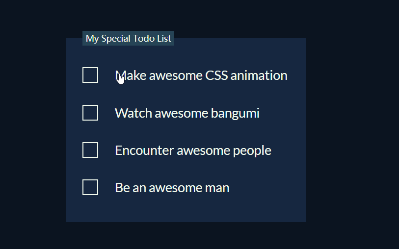
Demo 预览
基本样式
 <body>
    <form>
      <fieldset class="todo-list">   // fieldset 元素可将表单内的相关元素分组。
        <legend class="todo-list__title">My Special Todo List</legend> // legend 标签为 fieldset 元素定义标题。
        <label class="todo-list__label">
          <input type="checkbox" name="" id="" />
          <i class="check"></i>
          <span>Make awesome CSS animation</span>
        </label>
        <label class="todo-list__label">
          <input type="checkbox" name="" id="" />
          <i class="check"></i>
          <span>Watch awesome bangumi</span>
        </label>
        <label class="todo-list__label">
          <input type="checkbox" name="" id="" />
          <i class="check"></i>
          <span>Encounter awesome people</span>
        </label>
        <label class="todo-list__label">
          <input type="checkbox" name="" id="" />
          <i class="check"></i>
          <span>Be an awesome man</span>
        </label>
      </fieldset>
    </form>
  </body>
      body {
        display: flex;
        flex-direction: column;
        height: 100vh;
        justify-content: center;
        align-items: center;
        background: #0b1420;
      }

      .todo-list {
        display: flex;
        flex-direction: column;
        padding: 0 75px 10px 30px;
        background: #162740;
        border: transparent;
      }
    .todo-list .todo-list__title {
        padding: 3px 6px;
        color: #f1faee;
        background-color: #264456;
      }

      .todo-list .todo-list__label {
        display: flex;
        align-items: center;
        margin: 40px 0;
        font-size: 24px;
        font-family: Lato, sans-serif;
        color: #f1faee;
        cursor: pointer;
      }
完成后,页面显示效果如图
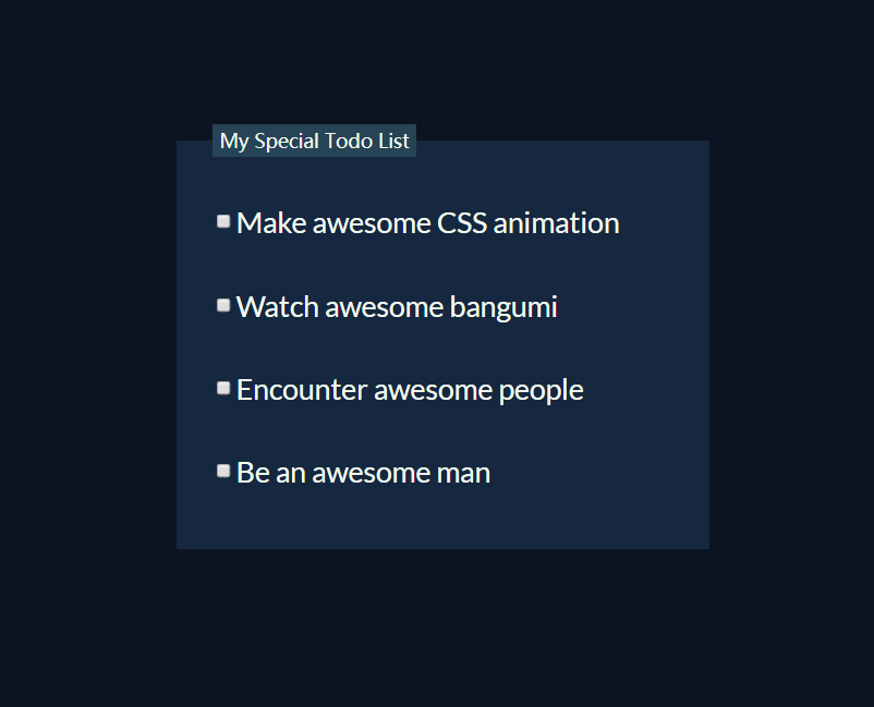
添加checkbox选择框的样式
      .todo-list .todo-list__label input[type="checkbox"] {
        opacity: 0; // 隐藏实际的checkbox选择框
      }
      // 将li标签的点放大并加上边框
      .todo-list .todo-list__label input[type="checkbox"] + .check {
        position: absolute;
        width: 25px;
        height: 25px;
        border: 2px solid #f1faee;
        transition: 0.2s;
      }
      // 点击后将把框变成√
      // 通过:checked CSS 伪类选择器获取点击选中的元素
       .todo-list .todo-list__label input[type="checkbox"]:checked + .check {
        width: 25px;
        height: 15px;
        border-top: transparent; // 隐藏旋转后的边框
        border-right: transparent;
        -webkit-transform: rotate(-45deg);
        transform: rotate(-45deg);
      }
      // 调整li与span之间的距离
       .todo-list .todo-list__label input[type="checkbox"] ~ span {
        position: relative;
        left: 40px;
        white-space: nowrap;
        transition: 0.5s;
      }
   	// 点击变色
	   .todo-list .todo-list__label input[type="checkbox"]:checked ~ span {
        color: #585b57;
      }
      // 创建点击后的中划线以及一些动画过渡
       .todo-list .todo-list__label input[type="checkbox"] ~ span::before {
        position: absolute;
        content: "";
        top: 50%;  // 居中的划线
        left: 0;
        width: 100%;
        height: 1px;
        background: #f1faee;
        -webkit-transform: scaleX(0);
        transform: scaleX(0);
        -webkit-transform-origin: right;
        transform-origin: right;
        transition: -webkit-transform 0.5s;
        transition: transform 0.5s;
        transition: transform 0.5s, -webkit-transform 0.5s;
      }

      .todo-list
        .todo-list__label
        input[type="checkbox"]:checked
        ~ span::before {
        -webkit-transform: scaleX(1);
        transform: scaleX(1);
        -webkit-transform-origin: left;
        transform-origin: left;
      }
完整代码
<!DOCTYPE html>
<html lang="en">
  <head>
    <meta charset="UTF-8" />
    <meta name="viewport" content="width=device-width, initial-scale=1.0" />
    <meta http-equiv="X-UA-Compatible" content="ie=edge" />
    <title>Document</title>
    <style>
      @import url("https://fonts.googleapis.com/css?family=Lato:400,400i,700");
      body {
        display: flex;
        flex-direction: column;
        height: 100vh;
        justify-content: center;
        align-items: center;
        background: #0b1420;
      }

      .todo-list {
        display: flex;
        flex-direction: column;
        padding: 0 75px 10px 30px;
        background: #162740;
        border: transparent;
      }
      .todo-list .todo-list__title {
        padding: 3px 6px;
        color: #f1faee;
        background-color: #264456;
      }
      .todo-list .todo-list__label {
        display: flex;
        align-items: center;
        margin: 40px 0;
        font-size: 24px;
        font-family: Lato, sans-serif;
        color: #f1faee;
        cursor: pointer;
      }
      .todo-list .todo-list__label input[type="checkbox"] {
        opacity: 0;
        -webkit-appearance: none;
        -moz-appearance: none;
        appearance: none;
      }
      .todo-list .todo-list__label input[type="checkbox"] + .check {
        position: absolute;
        width: 25px;
        height: 25px;
        border: 2px solid #f1faee;
        transition: 0.2s;
      }
      .todo-list .todo-list__label input[type="checkbox"]:checked + .check {
        width: 25px;
        height: 15px;
        border-top: transparent;
        border-right: transparent;
        -webkit-transform: rotate(-45deg);
        transform: rotate(-45deg);
      }
      .todo-list .todo-list__label input[type="checkbox"] ~ span {
        position: relative;
        left: 40px;
        white-space: nowrap;
        transition: 0.5s;
      }
      .todo-list .todo-list__label input[type="checkbox"] ~ span::before {
        position: absolute;
        content: "";
        top: 50%;
        left: 0;
        width: 100%;
        height: 1px;
        background: #f1faee;
        -webkit-transform: scaleX(0);
        transform: scaleX(0);
        -webkit-transform-origin: right;
        transform-origin: right;
        transition: -webkit-transform 0.5s;
        transition: transform 0.5s;
        transition: transform 0.5s, -webkit-transform 0.5s;
      }
      .todo-list .todo-list__label input[type="checkbox"]:checked ~ span {
        color: #585b57;
      }
      .todo-list
        .todo-list__label
        input[type="checkbox"]:checked
        ~ span::before {
        -webkit-transform: scaleX(1);
        transform: scaleX(1);
        -webkit-transform-origin: left;
        transform-origin: left;
      }
    </style>
  </head>
  <body>
    <form>
      <fieldset class="todo-list">
        <legend class="todo-list__title">My Special Todo List</legend>
        <label class="todo-list__label">
          <input type="checkbox" name="" id="" />
          <i class="check"></i>
          <span>Make awesome CSS animation</span>
        </label>
        <label class="todo-list__label">
          <input type="checkbox" name="" id="" />
          <i class="check"></i>
          <span>Watch awesome bangumi</span>
        </label>
        <label class="todo-list__label">
          <input type="checkbox" name="" id="" />
          <i class="check"></i>
          <span>Encounter awesome people</span>
        </label>
        <label class="todo-list__label">
          <input type="checkbox" name="" id="" />
          <i class="check"></i>
          <span>Be an awesome man</span>
        </label>
      </fieldset>
    </form>
  </body>
</html>
最后
以上就是雪白钥匙最近收集整理的关于CSS3-纯css实现TodoList的全部内容,更多相关CSS3-纯css实现TodoList内容请搜索靠谱客的其他文章。
本图文内容来源于网友提供,作为学习参考使用,或来自网络收集整理,版权属于原作者所有。


发表评论 取消回复