CSS
- 1、CSS简介
- 2、CSS如何生效
- a) 外部样式表—最常用
- b) 内部样式表
- c) 内联样式
- d) 级联的优先级
- 3、CSS语法
- 选择器
- a) 元素选择器
- b) id选择器
- c) class选择器
- 4、颜色 color
- 5、尺寸
- 6、对齐 text-align
- 7、盒子模型 div
- 8、边框与边距
- a) 边框 border
- b) 边距 padding
- 9、定位position
- a) static
- b) relative
- c) fixed
- d) absolute
- 10、溢出 overflow
- 11、浮动 float
- 12、不透明度 opacity
- 13、组合选择器
- a) 后代选择器
- b) 子选择器
- 14、伪类和伪元素
1、CSS简介
CSS是级联样式表(Cascading Style Sheets)。
HTML 用于撰写页面的内容,而 CSS 将决定这些内容该如何在屏幕上呈现。
网页的内容是由 HTML的元素构建的,这些元素如何呈现,涉及许多方面,如整个页面的布局,元素的位置、距离、颜色、大小、是否显示、是否浮动、透明度等等。
在 Internet 早期阶段(CSS大量使用之前),页面的内容和样式都由 HTML 来负责,这是一个相当糟糕的问题。万维网联盟 W3C(World Wide Web Consortium)意识到这个问题,于1997年推出 CSS 1.0(当前最新的版本是 CSS3 ),正式推动了内容(HTML)和表现(CSS)的分离,人们开始可以把所有的布局和样式代码从 HTML 中移除放入到 CSS 中。
2、CSS如何生效
让CSS样式生效的方法有三种:
外部样式表,内部样式表,内联样式
a) 外部样式表—最常用
新建如下内容的一个 HTML文件(后缀为.html):
<!DOCTYPE html>
<html>
<head>
<meta charset="utf-8">
<!-- 注意下面这个语句,将导入外部的 mycss.css 样式表文件 -->
<link rel="stylesheet" type="text/css" href="mycss.css">
<title>页面标题</title>
</head>
<body>
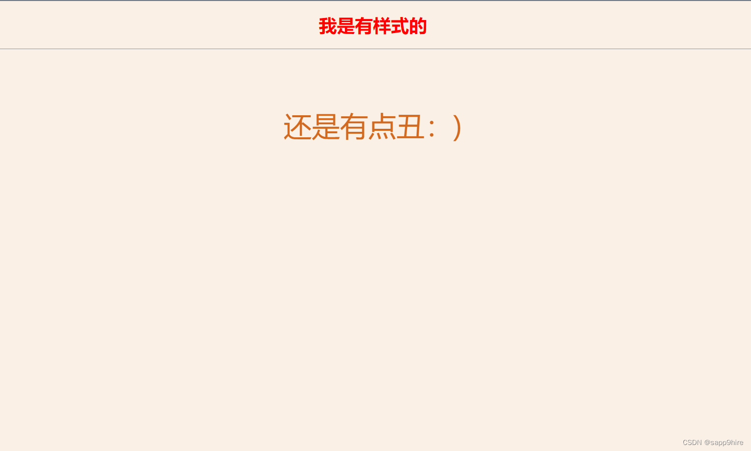
<h1>我是有样式的</h1>
<hr>
<p class="haha">还是有点丑:)</p>
</body>
</html>
在同一目录新建一个样式表文件mycss.css(注意后缀名为css)如下:
body {
  background-color: linen;
  text-align: center;
}
h1 {
  color: red;
}
.haha {
  margin-top: 100px;
  color: chocolate;
  font-size: 50px;
}
在浏览器中显示效果如下:
可以在项目目录下建一个文件夹如css专门存放样式表文件,
如此我们引入样式文件时路径就变为 ./css/mycss.css之类的。
引入外部样式表是现在 主流方式,因为众多的样式规则单独放在一个文件中,与 HTML 内容分开,结构清晰。同时其它页面也可使用,达到复用的目的。
b) 内部样式表
我们也可以将样式放在 HTML 文件中,这称为内部样式表。如:
<!DOCTYPE html>
<html>
<head>
  <meta charset="utf-8">
  <!-- 注意下面这个语句,将导入外部的 mycss.css 样式表文件 -->
  <link rel="stylesheet" type="text/css" href="mycss.css">
  <title>页面标题</title>
  <style>
    body {
      background-color: linen;
      text-align: center;
    }
    h1 {
      color: red;
    }
    .haha {
      margin-top: 100px;
      color: chocolate;
      font-size: 50px;
    }
  </style>
</head>
<body>
  <h1>我是有样式的</h1>
  <hr>
  <p class="haha">还是有点丑:)</p>
</body>
</html>
该例子与上述例子一样的效果,但注意在<head>元素中引入了<style>标签,放入了样式。
一般而言,只有页面的样式规则较少时可采用这种方式。
c) 内联样式
所谓内联样式,就是直接把样式规则直接写到要应用的元素中,如:
<h3 style="color:green;">I am a heading</h3>
内联样式是最不灵活的一种方式,完全将内容和样式合在一起,实际应用中非常少见。
d) 级联的优先级
样式的优先级,从高到低分别是:
- 内联样式
- 内部样式表或外部样式表
- 浏览器缺省样式
即哪个样式定义离元素的距离近,哪个就生效。
3、CSS语法
一条CSS样式规则由两个主要的部分构成:选择器,以{}包裹的一条或多条声明:
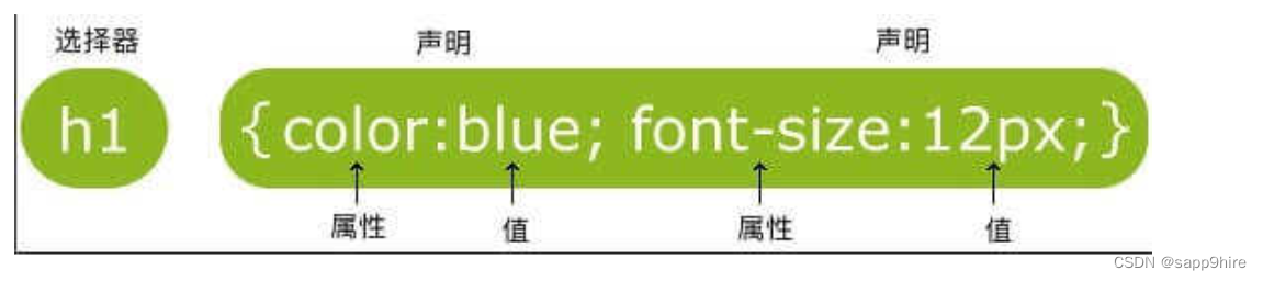
意思是: 页面中所有的一级标题都显示为蓝色,字体大小为12像数。
- 选择器是需要改变样式的对象(上图对象即为一级标题)
- 每条声明由一个属性和一个值组成。
- 无论是一条或多条声明,都需要用
{}包裹,且声明用;分割 - 属性(property)是您希望设置的样式属性(style attribute)
- 每个属性有一个值。属性 和 值 被
:分开。
选择器
选择器包含有:元素选择器、id选择器和class选择器;
其中最为普遍的是class选择器。
a) 元素选择器
即为上图示例:
css:
  <!-- 为方便演示对比都添加了背景颜色 -->
  body { background-color: linen; }
  h1 { color: blue;font-size: 12px; }
html:
<body>
   <h1>我是有样式的</h1>
</body>
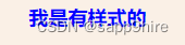
font-size:文本字体大小设置
b) id选择器
css:
 body { background-color: linen; }
/* 注意:id选择器前有 # 号。 */
#sky{
  color: blue;
}
这条规则表明,找到页面上id为sky的那个元素让它呈现蓝色,
如下.html文件中所示的页面,蓝色的天空这几个字就将会是蓝色的。
<p id="sky">蓝色的天空</p>
<p id="forest">绿色的森林</p>
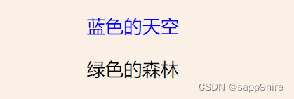
HTML中,元素的id值必须唯一
所以,id 选择器适用范围只有一个元素
c) class选择器
css:
 body { background-color: linen; }
/* 注意:class选择器前有 . 号。 */
.center{
  text-align: center;
}
.large{
  font-size: 30px;
}
.red{
  color: red;
}
以上代码定义了三条规则,分别应用于页面上对应的元素,
如只要页面上某元素的class为red,那么就让它呈现红色。
html:
<body>
    <p class="large">很大的</p>
    <p class="center">在中间</p>
    <p class="red">红色的</p>
</body>
浏览器页面如下:
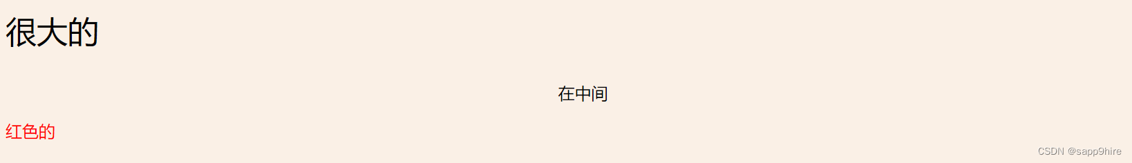
由上例可看出,元素的class值可以多个,也可以重复。
因此,实际应用中,class 选择器应用非常普遍。
4、颜色 color
颜色在网页中的重要性不言而喻。
我们可以采用 颜色名称 或者 颜色RGB16进制值 ,来设定前景或背景的颜色。如:
<!-- 颜色名称 -->
<h3 style="background-color:Tomato;">Tomato</h3>
<h3 style="background-color:Orange;">Orange</h3>
<h3 style="background-color:DodgerBlue;">DodgerBlue</h3>
<h3 style="background-color:MediumSeaGreen;">MediumSeaGreen</h3>
<h3 style="background-color:Gray;">Gray</h3>
<h3 style="background-color:SlateBlue;">SlateBlue</h3>
<h3 style="background-color:Violet;">Violet</h3>
<h3 style="background-color:LightGray;">LightGray</h3>
<hr>
<!-- 颜色值,3个字节分别代表RGB(Red,Green,Blue)的0~255的值 -->
<h3 style="background-color:#ff0000;">#ff0000</h3>
<h3 style="background-color:#0000ff;">#0000ff</h3>
<h3 style="background-color:#3cb371;">#3cb371</h3>
<h3 style="background-color:#ee82ee;">#ee82ee</h3>
<h3 style="background-color:#ffa500;">#ffa500</h3>
<h3 style="background-color:#6a5acd;">#6a5acd</h3>
<!-- 文本颜色 -->
<h3 style="color:Tomato;">Hello World</h3>
<p style="color:DodgerBlue;">Lorem ipsum dolor sit, amet consectetur adipisicing elit.</p>
<p style="color:MediumSeaGreen;">Ad facilis est ducimus rem consectetur, corporis omnis, eveniet esse dolor molestiae numquam odio corrupti, sed obcaecati praesentium accusamus? Tempora, dolor a?</p>
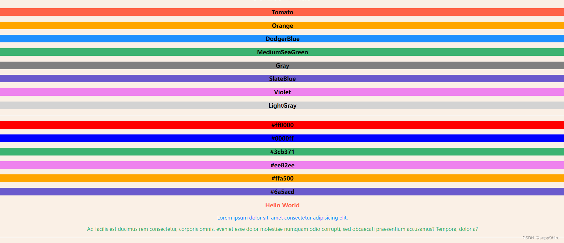
这里为了演示方便,采用了内联方式,但实际中不能这样做!
5、尺寸
可以用 height 和 width 设定元素内容占据的尺寸。
常见的尺寸单位有:像数 px,百分比 %等。
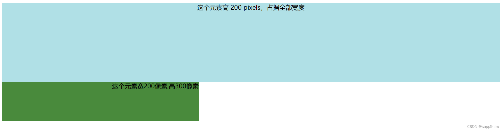
例如css:
.example-1 {
  width: 100%;
  height: 200px;
  background-color: powderblue;
  text-align: center;
}
.example-2 {
  height: 100px;
  width: 500px;
  background-color: rgb(73, 138, 60);
  text-align: right;
}
html:
<html>
  <head>
    <link rel="stylesheet" href="./mycss.css">
  </head>
  <body>
    <div class="example-1">
      这个元素高 200 pixels,占据全部宽度
    </div>
    <div class="example-2">
      这个元素宽200像素,高300像素
    </div>
  </body>
</html>
浏览器中显示如下:
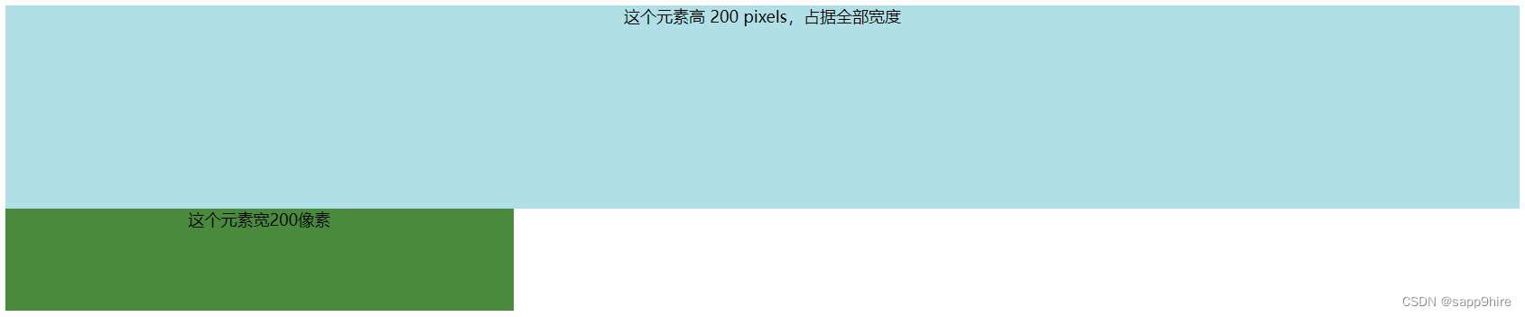
6、对齐 text-align
对于元素中的文本,我们可以简单的设置text-align属性为left, center, right即可(显然缺省的是左对齐);
如把上例example-2中的text-align设为center后:
7、盒子模型 div
盒子模型指的是一个HTML元素可以看作一个盒子。
从内到外,这个盒子是由内容 content, 内边距 padding, 边框 border, 外边距 margin构成的,如下图所示:
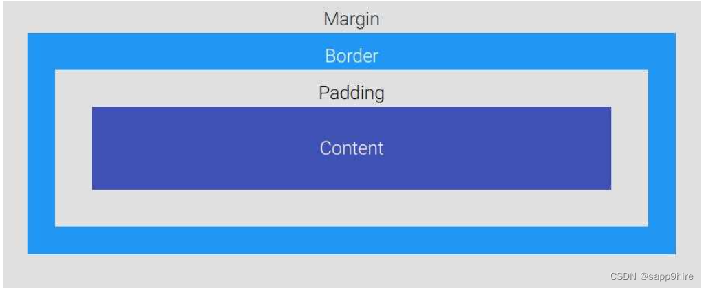
Content盒子的内容,如文本、图片等Padding填充,也叫内边距,即内容和边框之间的区域Border边框,默认不显示Margin外边距,边框以外与其它元素的区域
新建如下html文件:
<html>
<head>
<link rel="stylesheet" href="./mycss.css">
</head>
<body>
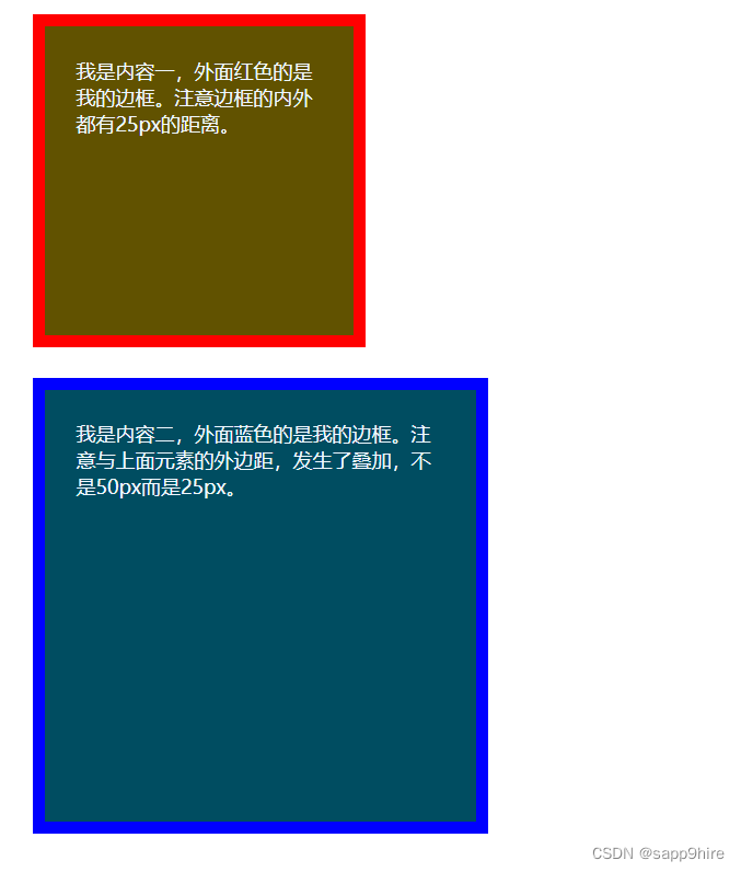
<div class="box1">我是内容一,外面红色的是我的边框。注意边框的内外都有25px的距离。</div>
<div class="box2">我是内容二,外面蓝色的是我的边框。注意与上面元素的外边距,发生了叠加,不是50px而是25px。</div>
</body>
</html>
css文件:
.box1 {
  height: 200px;
  width: 200px;
  background-color:#615200;
  color: aliceblue;
  border: 10px solid red;
  padding: 25px;
  margin: 25px;
}
.box2 {
  height: 300px;
  width: 300px;
  background-color:#004d61;
  color: aliceblue;
  border: 10px solid blue;
  padding: 25px;
  margin: 25px;
}
浏览器显示如下:
在页面上右击选择检查,可以看到如下控制页面:
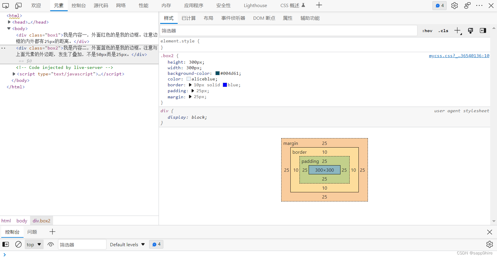
其中右下角的图可以看出,一个元素真正占据的宽度应该是:
左外边距 + 左边框宽度 + 左内边距 + 内容宽度 + 右内边距 + 右边框宽度 + 右外边距
因此,我们在用width属性设置元素的宽度时,实际上只设置了
其 内容 的宽度。
8、边框与边距
无论边框、内边距还是外边距,它们都有上下左右四个方向。
a) 边框 border
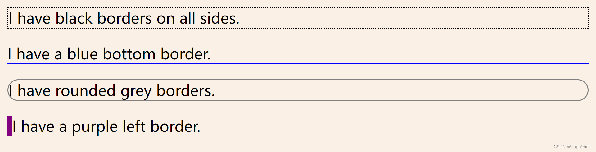
<p class="example-1">I have black borders on all sides.</p>
<p class="example-2">I have a blue bottom border.</p>
<p class="example-3">I have rounded grey borders.</p>
<p class="example-4">I have a purple left border.</p>
.example-1 {
  border: 1px dotted black; /* 上下左右都相同 */
}
.example-2 {
  border-bottom: 1px solid blue; /* 只设置底部边框 */
}
.example-3 {
  border: 1px solid grey;
  border-radius: 15px; /* 边框圆角 */
}
.example-4 {
  border-left: 5px solid purple;
}
b) 边距 padding
在上例的 .examp-3 中加入
padding: 20px; /* 上下左右都相同 */
可见第三行的内边距上下左右都变为一样了: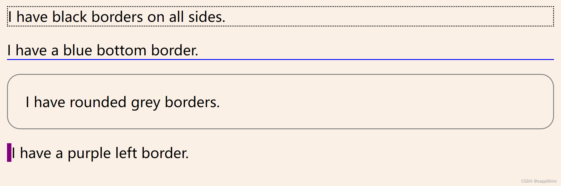
其他样式:
padding-top: 20px;
padding-bottom: 100px;
padding-right: 50px;
padding-left: 80px;
padding: 25px 50px 75px 100px; /* 简写形式,按上,右,下,左顺序设置 */
padding: 25px 10px; /* 简写形式,上下为25px,左右为10px */
外边距用法也相同,注意简写时的顺序为上,右,下,左,即为顺时针方向。
9、定位position
position属性用于对元素进行定位,属性状态值有:
static静态relative相对fixed固定absolute绝对
设置了元素的position属性后,才能使用
top, bottom, left, right属性,否则 定位无效。
a) static
position: static;
静态定位是元素的默认定位方式;
即:按照元素在 HTML出现的先后顺序从上到下,从左到右进行元素的安排。
b) relative
position: relative;
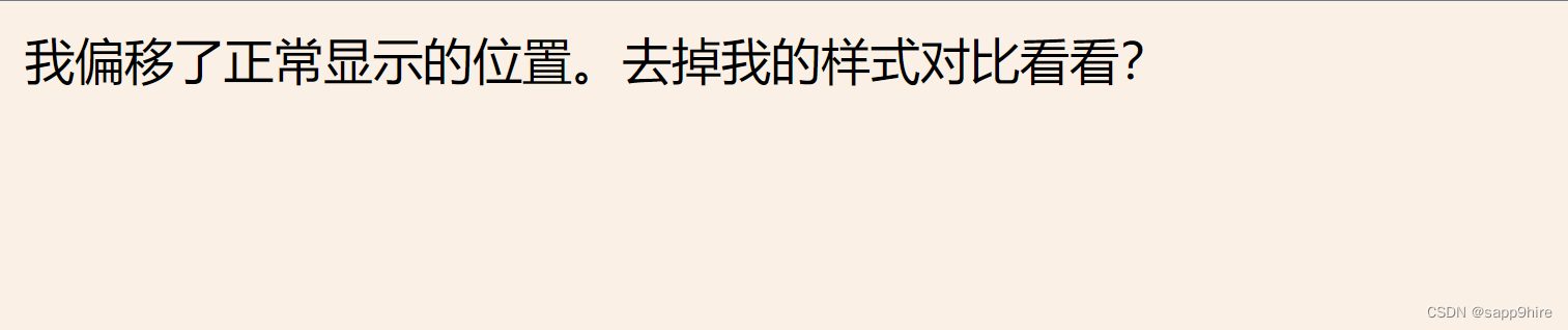
相对定位是把元素相对于他的静态(正常)位置进行偏移。
<!-- HTML -->
<div class="example-relative">我偏移了正常显示的位置。去掉我的样式对比看看?</div>
<!-- CSS -->
.example-relative {
  position: relative;
  left: 60px;
  top: 40px;
  background-color: rgb(173, 241, 241);
}
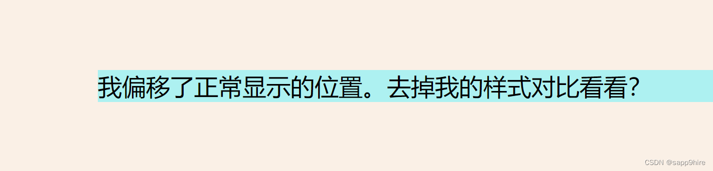
去掉css样式后:
c) fixed
position: fixed;
固定定位 使得元素固定不动,即使是上下左右拖动浏览器的滚动条;
此时元素固定的位置仍由top, bottom, left, right属性确定;
但相对的是视口(viewport,就是浏览器的屏幕可见区域)。
如下的代码将会在浏览器右下角固定放置一个按钮元素:
<!-- HTML -->
<div class="broad">占位区域。请将浏览器窗口改变大小,看看右下角的按钮发生了什么?</div>
<div class="example-fixed">这个按钮是固定的</div>
<!-- CSS -->
.example-fixed {
  position: fixed;
  bottom: 40px;
  right: 10px;
  padding: 6px 24px;
  border-radius: 4px;
  color: #fff;
  background-color: #9d0f0f;
  cursor: pointer;
  box-shadow: 0 3px 3px 0 rgba(0,0,0,0.3), 0 1px 5px 0 rgba(0,0,0,0.12), 0 3px 1px -2px rgba(0,0,0,0.2);
}
.broad {
  height: 5000px;
  width: 5000px;
  padding: 20px;
  background-color: darkkhaki;
}
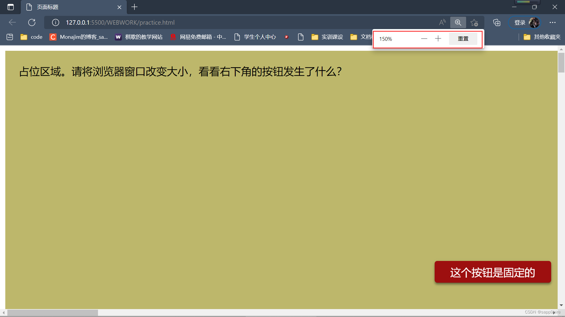
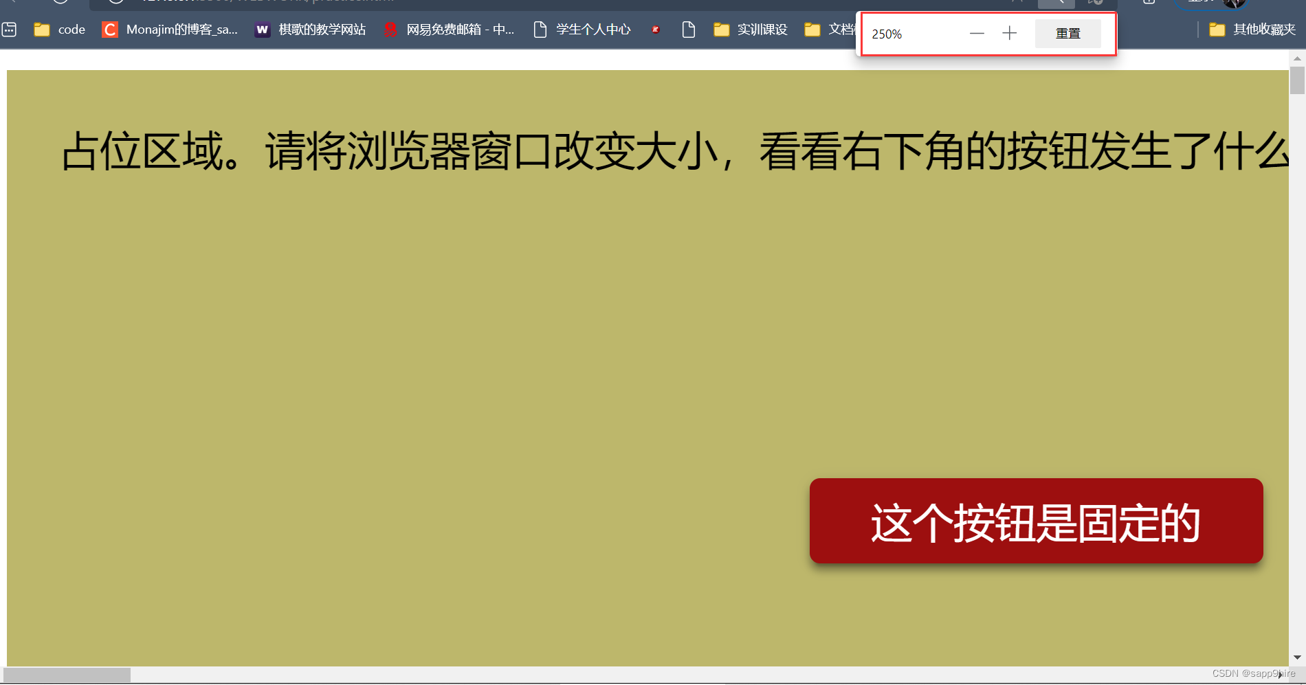
可见放大后按钮盒子的大小变化了,但位置不变。
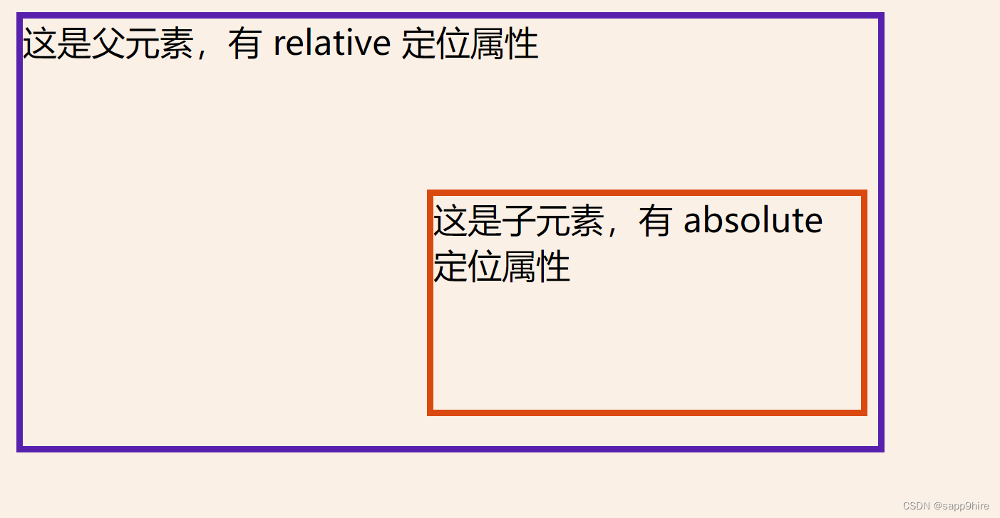
d) absolute
position: absolute;
绝对定位 将使元素相对于其最近的设置了定位属性(非static)的父元素进行偏移。
如果该元素的所有父元素都没有设置定位属性,那么就相对于这个父元素。
绝对定位是仍是相对的,不过是相对最近的父元素。
<!-- HTML -->
<div class="example-relative">这是父元素,有 relative 定位属性
  <div class="example-absolute">
    这是子元素,有 absolute 定位属性
  </div>
</div>
<!-- CSS -->
.example-relative {
  position: relative;
  width: 400px;
  height: 200px;
  border: 3px solid rgb(87, 33, 173);
}
.example-absolute {
  position: absolute;
  top: 80px;
  right: 5px;
  width: 200px;
  height: 100px;
  border: 3px solid rgb(218, 73, 16);
}
10、溢出 overflow
当元素内容超过其指定的区域时,我们通过溢出overflow属性来处理这些溢出的部分。
溢出属性有以下几个值:
visible默认值,溢出部分不被裁剪,在区域外面显示hidden裁剪溢出部分且不可见scroll裁剪溢出部分,但提供上下和左右滚动条供显示auto裁剪溢出部分,视情况提供滚动条
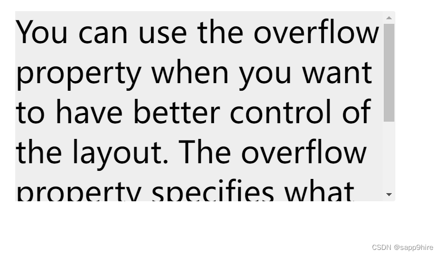
关于滚动,我们还可以单独对上下或左右方向进行,如下代码所示:
<!-- HTML -->
<div class="example-overflow-scroll-y">You can use the overflow property when you want to have better control of the
    layout. The overflow property specifies what happens if content overflows an element's box.
</div>
<!-- CSS -->
.example-overflow-scroll-y {
  width: 200px;
  height: 100px;
  background-color: #eee;
  overflow-y: scroll;
}
11、浮动 float
在一个区域或容器内,我们可以设置float属性让某元素水平方向上向左或右进行移动,其周围的元素也会重新排列。
我们常用这种样式来使图像和文本进行合理布局,如我们希望有以下的效果:
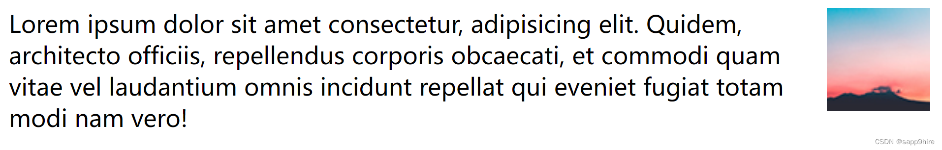
让图片向右浮动即可,代码如下:
<html>
<head>
  <style>
    .example-float-right {
      float: right;
    }
  </style>
</head>
<body>
  <img src="https://mdbootstrap.com/img/Photos/Others/placeholder1.jpg" class="example-float-right" alt="">
  <p>Lorem ipsum dolor sit amet consectetur, adipisicing elit. Quidem, architecto officiis, repellendus
  corporis obcaecati, et commodi quam vitae vel laudantium omnis incidunt repellat qui eveniet fugiat totam
  modi nam vero!</p>
</body>
</html>
一个浮动元素会尽量向左或向右移动,直到它的外边缘碰到包含框或另一个浮动框的边框为止。浮动元素之后的元素将围绕它,或者说出现在这个浮动元素的左或右方。
如果希望浮动元素后面的元素在其下方显示,可使用clear: both样式来进行清除。
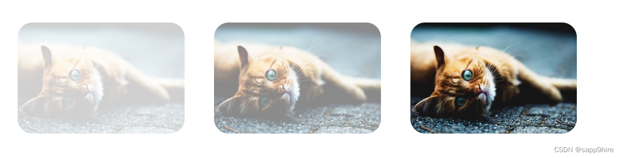
12、不透明度 opacity
我们可以用 opacity 对任何元素(常用于图片)设置不透明度。
值在 [0.0~1.0]之间,值越低,透明度越高。
<html>
<head>
  <style>
    img {
      width: 25%;
      border-radius: 10px;
      float: left;
      margin: 10px;
    }
    .opacity-2 {
      opacity: 0.2;
    }
    .opacity-5 {
      opacity: 0.5;
    }
    .opacity-10 {
      opacity: 1;
    }
  </style>
</head>
<body>
  <img class="opacity-2" src="https://mdbootstrap.com/img/Photos/Horizontal/Nature/4-col/img%20(87).jpg">
  <img class="opacity-5" src="https://mdbootstrap.com/img/Photos/Horizontal/Nature/4-col/img%20(87).jpg">
  <img class="opacity-10" src="https://mdbootstrap.com/img/Photos/Horizontal/Nature/4-col/img%20(87).jpg">
</body>
</html>
13、组合选择器
CSS有三种选择器:元素、id 和 class 。但也可以进行组合,以得到简洁精确的选择。这里介绍两种组合选择器。
a) 后代选择器
以空格作为分隔,所谓后代,就是一个元素包含在另一个元素里面,如:.haha p 代表在div元素内有.haha这种类的所有元素,不管是子元素还是孙元素。
<html>
<head>
  <style>
    .haha p {
      background-color: yellow;
    }
  </style>
</head>
<body>
  <div class="haha">
    <p>Paragraph 1 in the div .haha.</p>
    <p>Paragraph 2 in the div .haha.</p>
    <span>
        <p>Paragraph 3 in the div .haha.</p>
    </span>
  </div>
  <p>Paragraph 4. Not in a div .haha.</p>
  <p>Paragraph 5. Not in a div .haha.</p>
</body>
</html>
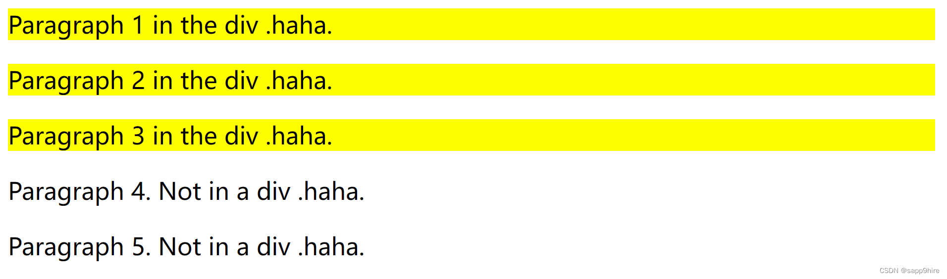
段落1、2、3都在**.haha** 类中,所以都将有黄色的背景,而段落4、5没有。
b) 子选择器
也称为直接后代选择器,孙辈以下的都不行,以>作为分隔,如:.haha > p 代表在有.haha类的元素内的直接<p>元素。
参见如下代码:
<html>
<head>
  <style>
    .haha > p {
      background-color: yellow;
    }
  </style>
</head>
<body>
  <div class="haha">
    <p>Paragraph 1 in the div .haha.</p>
    <p>Paragraph 2 in the div .haha.</p>
    <span>
        <p>Paragraph 3 in the div .haha - it is descendant but not immediate child.</p>
    </span> <!-- not Child but Descendant -->
  </div>
  <p>Paragraph 4. Not in a div .haha.</p>
  <p>Paragraph 5. Not in a div .haha.</p>
</body>
</html>
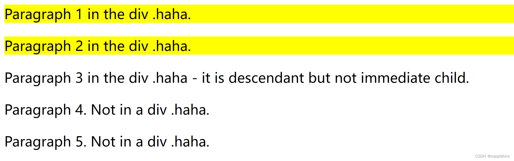
虽然段落3在.haha类中,但它的直接父元素是span,不是.haha的直接后代,所以不能选择。只有段落1、2有黄色背景。
14、伪类和伪元素
伪类(pseudo-class)或伪元素(pseudo-element)用于定义元素的某种特定的状态或位置等。
比如我们可能有这样的需求:
- 鼠标移到某元素上变换背景颜色
- 超链接访问前后访问后样式不同
- 离开必须填写的输入框时出现红色的外框进行警示
- 保证段落的第一行加粗,其它正常
语法如下:
/* 选择器后使用 : 号,再跟上某个伪类/伪元素 */
selector:pseudo-class/pseudo-element {
  property:value;
}
以下是常用的伪类/伪元素的简单使用:
a:link {color:#FF0000;}     /* 未访问的链接 */
a:visited {color:#00FF00;}  /* 已访问的链接 */
a:hover {color:#FF00FF;}    /* 鼠标划过链接 */
/* 鼠标移到段落则改变背景颜色 */
p:hover {background-color: rgb(226, 43, 144);}
p:first-line{color:blue;}   /* 段落的第一行显示蓝色 */
p:first-letter{font-size: xx-large;}   /* 段落的第一个字超大 */

h1:before { content:url(smiley.gif); } /* 在每个一级标题前插入该图片 */
h1:after { content:url(smiley.gif); } /* 在每个一级标题后插入该图片 */
实例:
<html>
<head>
<style>
.haha {
background-color: linen;
}
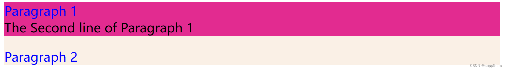
p:hover {background-color: rgb(226, 43, 144);}
p:first-line{color:blue;}
</style>
</head>
<body>
<div class="haha">
<p>Paragraph 1 <br> The Second line of Paragraph 1</p>
<p>Paragraph 2 </p>
</div>
</body>
</html>
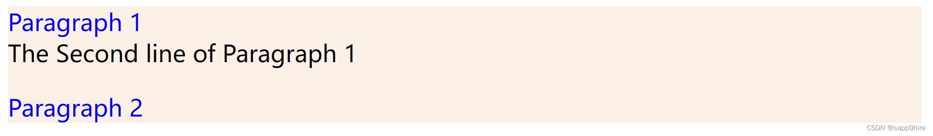
鼠标移至第一段时,显示背景颜色:
最后
以上就是耍酷皮卡丘最近收集整理的关于CSS — 网页的呈现样式1、CSS简介2、CSS如何生效3、CSS语法4、颜色 color5、尺寸6、对齐 text-align7、盒子模型 div8、边框与边距9、定位position10、溢出 overflow11、浮动 float12、不透明度 opacity13、组合选择器14、伪类和伪元素的全部内容,更多相关CSS内容请搜索靠谱客的其他文章。


发表评论 取消回复