数据分析汇总学习
https://blog.csdn.net/weixin_39778570/article/details/81157884
import numpy as np
import pandas as pd
import matplotlib.pyplot as plt
from pandas import Series, DataFrame
s = Series(np.random.randn(1000))
# 生成了两个array和一个图形对象,第一个array是在区间数的数量,第二个是区间范围
# hist画直方图,rwidth表示图形宽度
plt.hist(s, rwidth=0.9)
(array([ 6., 13., 56., 126., 208., 258., 181., 111., 24., 17.]),
array([-3.24627557, -2.64169276, -2.03710994, -1.43252712, -0.82794431,
-0.22336149, 0.38122132, 0.98580414, 1.59038695, 2.19496977,
2.79955259]),
<a list of 10 Patch objects>)
plt.show()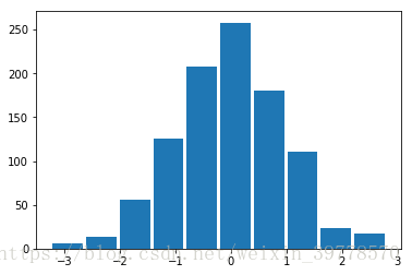
a = np.arange(10)
a
array([0, 1, 2, 3, 4, 5, 6, 7, 8, 9])
plt.hist(a, rwidth=0.9)
# bins默认10,分割区间,orientation修改为水平的,color修改颜色,
plt.hist(s, rwidth=0.9, bins=20, color='r', orientation='horizontal')
(array([ 3., 3., 2., 11., 27., 29., 52., 74., 90.,
118., 132., 126., 99., 82., 69., 42., 11., 13.,
8., 9.]),
array([-3.24627557, -2.94398416, -2.64169276, -2.33940135, -2.03710994,
-1.73481853, -1.43252712, -1.13023572, -0.82794431, -0.5256529 ,
-0.22336149, 0.07892992, 0.38122132, 0.68351273, 0.98580414,
1.28809555, 1.59038695, 1.89267836, 2.19496977, 2.49726118,
2.79955259]),
<a list of 20 Patch objects>)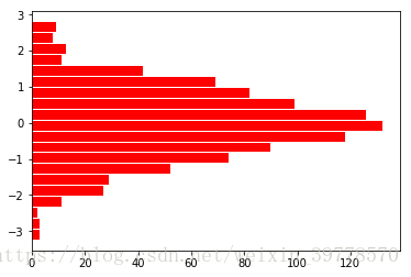
# kde画密度图
s.plot(kind='kde')
plt.show()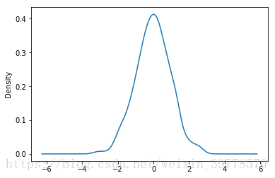
最后
以上就是友好御姐最近收集整理的关于Matplotlib简单画图(五) -- 直方图和密度图的全部内容,更多相关Matplotlib简单画图(五)内容请搜索靠谱客的其他文章。
本图文内容来源于网友提供,作为学习参考使用,或来自网络收集整理,版权属于原作者所有。


发表评论 取消回复