目录
语法
说明
示例
创建 2×2 布局
指定流式图块排列
调整布局间距
创建共享标题和轴标签
在面板中创建布局
对坐标区设置属性
创建占据多行和多列的坐标区
从特定编号的图块开始放置坐标区对象
显示极坐标图和地理图
重新配置上一个图块中的内容
重新配置跨图块坐标区
替换上一个图块中的内容
在单独图块中显示共享颜色栏
手动创建和配置坐标区
tiledlayout函数的功能是创建分块图布局。
语法
tiledlayout(m,n)
tiledlayout('flow')
tiledlayout(___,Name,Value)
tiledlayout(parent,___)
t = tiledlayout(___)
说明
tiledlayout(m,n) 创建分块图布局,用于显示当前图窗中的多个绘图。该布局有固定的 m×n 图块排列,最多可显示 m*n 个绘图。如果没有图窗,MATLAB® 会创建一个图窗并将布局放入其中。如果当前图窗包含一个现有坐标区或布局,MATLAB 会将其替换为新布局。
分块图布局包含覆盖整个图窗或父容器的不可见图块网格。每个图块可以包含一个用于显示绘图的坐标区。创建布局后,调用 nexttile 函数以将坐标区对象放置到布局中。然后调用绘图函数在该坐标区中绘图。
tiledlayout('flow') 指定布局的 'flow' 图块排列。最初,只有一个空图块填充整个布局。当您调用 nexttile 时,布局都会根据需要进行调整以适应新坐标区,同时保持所有图块的纵横比约为 4:3。
tiledlayout(___,Name,Value) 使用一个或多个名称-值对组参数指定布局的其他选项。请在所有其他输入参数之后指定这些选项。例如,tiledlayout(2,2,'TileSpacing','compact') 创建一个 2×2 布局,图块之间采用最小间距。有关属性列表,请参阅 TiledChartLayout 属性。
tiledlayout(parent,___) 在指定的父容器中而不是在当前图窗中创建布局。请在所有其他输入参数之前指定父容器。
t = tiledlayout(___) 返回 TiledChartLayout 对象。创建布局后,使用 t 配置布局的属性。
示例
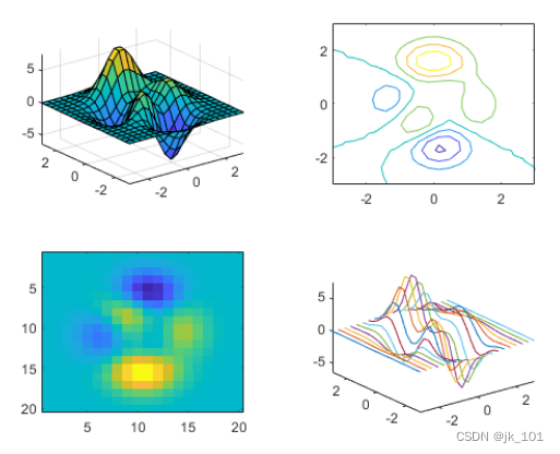
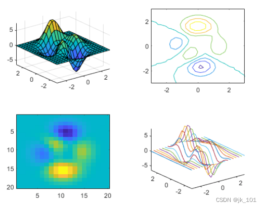
创建 2×2 布局
创建一个 2×2 分块图布局,并调用 peaks 函数以获取预定义曲面的坐标。通过调用 nexttile 函数,在第一个图块中创建一个坐标区对象。然后调用 surf 函数以在坐标区中绘图。对其他三个图块使用不同绘图函数重复该过程。
tiledlayout(2,2);
[X,Y,Z] = peaks(20);

% Tile 1
nexttile
surf(X,Y,Z)

% Tile 2
nexttile
contour(X,Y,Z)

% Tile 3
nexttile
imagesc(Z)

% Tile 4
nexttile
plot3(X,Y,Z)
如图所示:
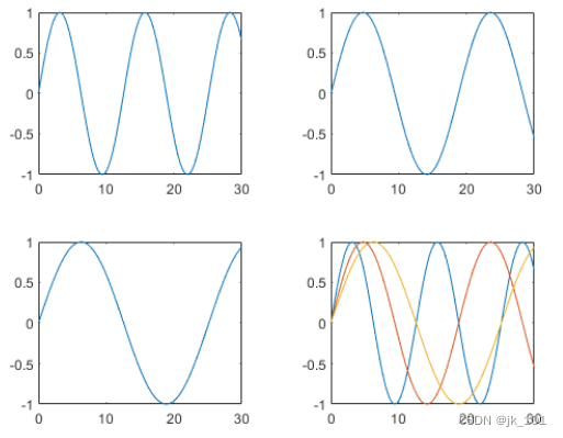
指定流式图块排列
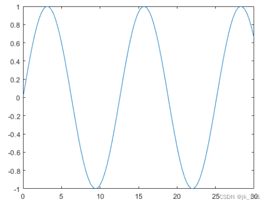
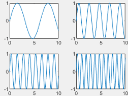
创建四个坐标向量:x、y1、y2 和 y3。用 'flow' 参数调用 tiledlayout 函数,以创建可容纳任意数量的坐标区的分块图布局。调用 nexttile 函数以创建第一个坐标区。然后在第一个图块中绘制 y1。第一个图填充整个布局。
x = linspace(0,30);
y1 = sin(x/2);
y2 = sin(x/3);
y3 = sin(x/4);

% Plot into first tile three times
tiledlayout('flow')
nexttile
plot(x,y1)
如图所示:
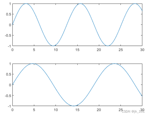
创建第二个图块和坐标区,并绘制到坐标区中。
nexttile
plot(x,y2)
如图所示:
重复该过程以创建第三个绘图。
nexttile
plot(x,y3)
如图所示:
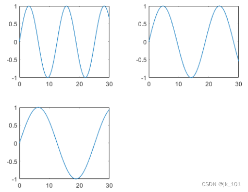
重复该过程以创建第四个绘图。这次,通过在绘制 y1 后调用 hold on 在同一坐标区中绘制全部三条线。
nexttile
plot(x,y1)
hold on
plot(x,y2)
plot(x,y3)
hold off
如图所示:
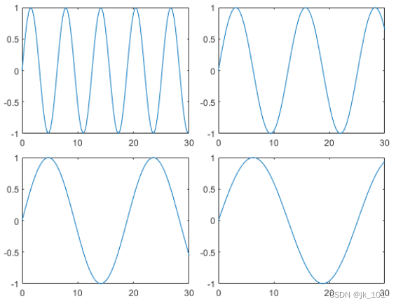
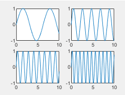
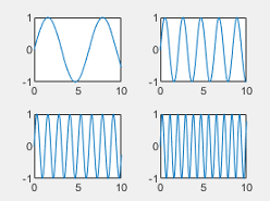
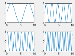
调整布局间距
创建五个坐标向量:x、y1、y2、y3 和 y4。然后调用 tiledlayout 函数来创建 2×2 布局,并指定返回参数来存储 TileChartLayout 对象。在调用 plot 函数之前,调用 nexttile 函数以在下一个空图块中创建坐标区对象。
x = linspace(0,30);
y1 = sin(x);
y2 = sin(x/2);
y3 = sin(x/3);
y4 = sin(x/4);
t = tiledlayout(2,2);

% Tile 1
nexttile
plot(x,y1)

% Tile 2
nexttile
plot(x,y2)

% Tile 3
nexttile
plot(x,y3)

% Tile 4
nexttile
plot(x,y4)
如图所示:
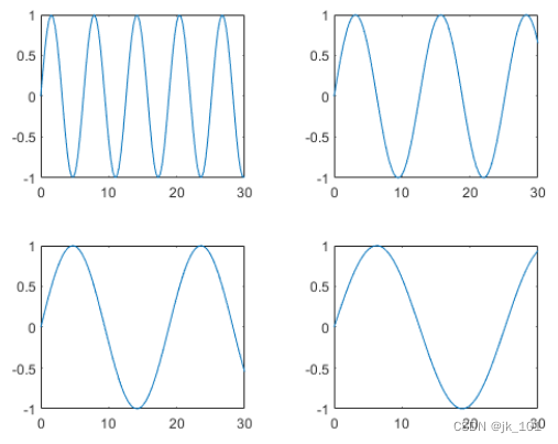
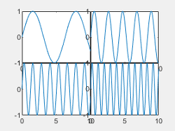
通过将 TileSpacing 属性设置为 'compact' 来减小图块的间距。然后通过将 Padding 属性设置为 'compact',减小布局边缘和图窗边缘之间的空间。
t.TileSpacing = 'compact';
t.Padding = 'compact';
如图所示:
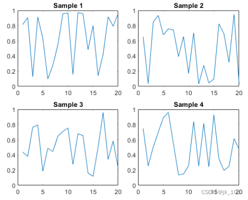
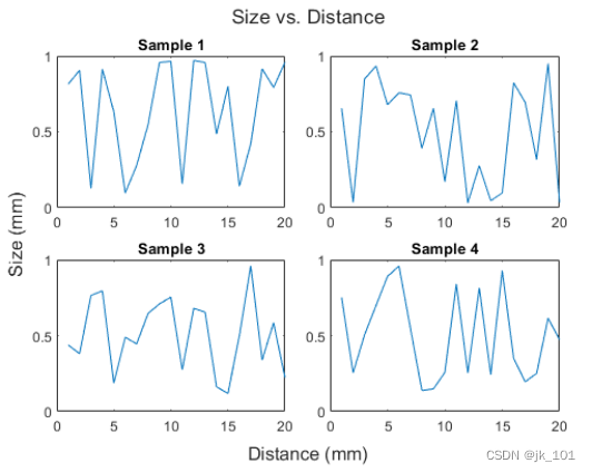
创建共享标题和轴标签
创建一个 2×2 分块图布局 t。指定 TileSpacing 名称-值对组参数,以最小化图块之间的空间。然后在每个图块中创建一个带标题的绘图。
t = tiledlayout(2,2,'TileSpacing','Compact');

% Tile 1
nexttile
plot(rand(1,20))
title('Sample 1')

% Tile 2
nexttile
plot(rand(1,20))
title('Sample 2')

% Tile 3
nexttile
plot(rand(1,20))
title('Sample 3')

% Tile 4
nexttile
plot(rand(1,20))
title('Sample 4')
如图所示:
通过将 t 传递给 title、xlabel 和 ylabel 函数,显示共享标题和轴标签。
title(t,'Size vs. Distance')
xlabel(t,'Distance (mm)')
ylabel(t,'Size (mm)')
如图所示:
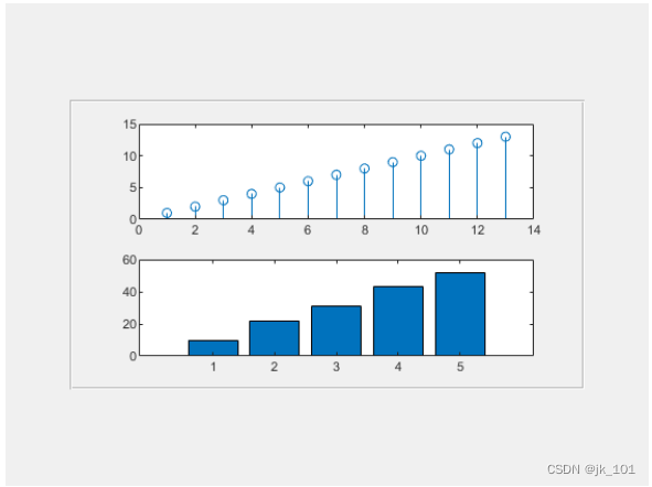
在面板中创建布局
在图窗中创建一个面板。然后通过将面板对象指定为 tiledlayout 函数的第一个参数,在面板中创建一个分块图布局。在每个图块中显示一个绘图。
p = uipanel('Position',[.1 .2 .8 .6]);
t = tiledlayout(p,2,1);

% Tile 1
nexttile(t)
stem(1:13)

% Tile 2
nexttile(t)
bar([10 22 31 43 52])
如图所示:
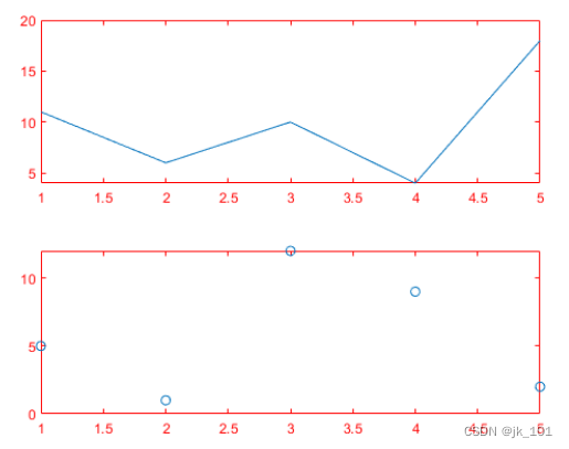
对坐标区设置属性
调用 tiledlayout 函数以创建 2×1 分块图布局。带一个输出参数调用 nexttile 函数以存储坐标区。然后绘制到坐标区中,并将 x 和 y 轴的颜色设置为红色。在第二个图块中重复该过程。
t = tiledlayout(2,1);

% First tile
ax1 = nexttile;
plot([1 2 3 4 5],[11 6 10 4 18]);
ax1.XColor = [1 0 0];
ax1.YColor = [1 0 0];

% Second tile
ax2 = nexttile;
plot([1 2 3 4 5],[5 1 12 9 2],'o');
ax2.XColor = [1 0 0];
ax2.YColor = [1 0 0];
如图所示:
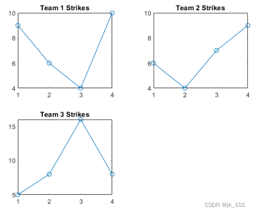
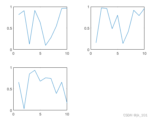
创建占据多行和多列的坐标区
将 scores 和 strikes 定义为包含四场保龄球联赛数据的向量。然后创建一个分块图布局,并显示三个图块,分别显示每个团队的击球数量。
scores = [444 460 380
          387 366 500
          365 451 611
          548 412 452];

strikes = [9  6  5
           6  4  8
           4  7  16
           10 9  8];

t = tiledlayout('flow');

% Team 1
nexttile
plot([1 2 3 4],strikes(:,1),'-o')
title('Team 1 Strikes')

% Team 2
nexttile
plot([1 2 3 4],strikes(:,2),'-o')
title('Team 2 Strikes')

% Team 3
nexttile
plot([1 2 3 4],strikes(:,3),'-o')
title('Team 3 Strikes')
如图所示:
调用 nexttile 函数以创建占据两行三列的坐标区对象。然后在此坐标区中显示一个带图例的条形图,并配置轴刻度值和标签。调用 title 函数以向布局中添加一个图块。
nexttile([2 3]);
bar([1 2 3 4],scores)
legend('Team 1','Team 2','Team 3','Location','northwest')

% Configure ticks and axis labels
xticks([1 2 3 4])
xlabel('Game')
ylabel('Score')

% Add layout title
title(t,'April Bowling League Data')
如图所示:
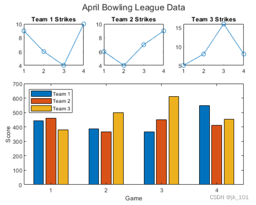
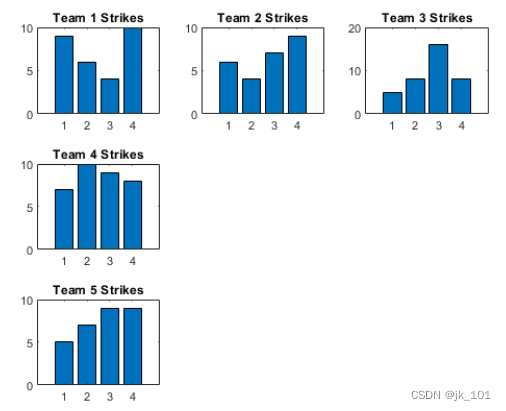
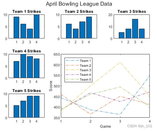
从特定编号的图块开始放置坐标区对象
要从特定位置开始放置坐标区对象,请指定图块编号和跨度值。将 scores 和 strikes 定义为包含四场保龄球联赛数据的向量。然后创建一个 3×3 分块图布局,并显示五个条形图,其中显示每个团队的击球次数。
scores = [444 460 380 388 389
          387 366 500 467 460
          365 451 611 426 495
          548 412 452 471 402];

strikes = [9  6  5  7  5
           6  4  8 10  7
           4  7 16  9  9
           10  9  8  8  9];

t = tiledlayout(3,3);

% Team 1
nexttile
bar([1 2 3 4],strikes(:,1))
title('Team 1 Strikes')

% Team 2
nexttile
bar([1 2 3 4],strikes(:,2))
title('Team 2 Strikes')

% Team 3
nexttile
bar([1 2 3 4],strikes(:,3))
title('Team 3 Strikes')

% Team 4
nexttile
bar([1 2 3 4],strikes(:,4))
title('Team 4 Strikes')

% Team 5
nexttile(7)
bar([1 2 3 4],strikes(:,5))
title('Team 5 Strikes')
如图所示:
显示一个带有图例的较大绘图。调用 nexttile 函数以将坐标区的左上角放在第五个图块中,并使坐标区占据图块的两行和两列。绘制所有团队的分数。将 x 轴配置为显示四个刻度,并为每个轴添加标签。然后在布局顶部添加一个共享标题。
nexttile(5,[2 2]);
plot([1 2 3 4],scores,'-.')
labels = {'Team 1','Team 2','Team 3','Team 4','Team 5'};
legend(labels,'Location','northwest')

% Configure ticks and axis labels
xticks([1 2 3 4])
xlabel('Game')
ylabel('Score')

% Add layout title
title(t,'April Bowling League Data')
如图所示:
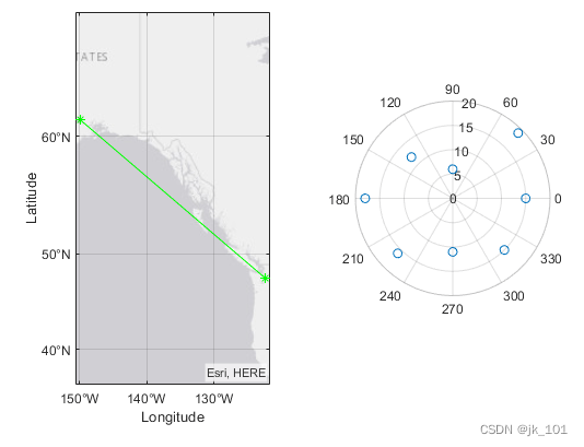
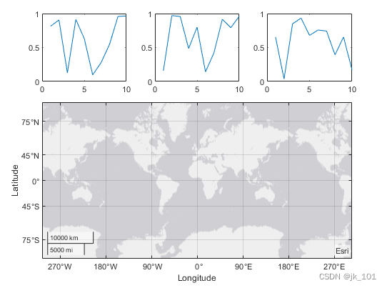
显示极坐标图和地理图
创建 1×2 分块图布局。在第一个图块中,显示包含连接地图上两个城市的线的地理图。在第二个图块中,在极坐标中创建一个散点图。
tiledlayout(1,2)

% Display geographic plot
nexttile
geoplot([47.62 61.20],[-122.33 -149.90],'g-*')

% Display polar plot
nexttile
theta = pi/4:pi/4:2*pi;
rho = [19 6 12 18 16 11 15 15];
polarscatter(theta,rho)
如图所示:
重新配置上一个图块中的内容
nexttile 输出参数的一个有用的用途体现在您想调整前一个图块中的内容时。例如,您可能决定要重新配置先前绘图中使用的颜色图。
创建一个 2×2 分块图布局。调用 peaks 函数以获取预定义曲面的坐标。然后在每个图块中创建一个不同的曲面图。
tiledlayout(2,2);
[X,Y,Z] = peaks(20);

% Tile 1
nexttile
surf(X,Y,Z)

% Tile 2
nexttile
contour(X,Y,Z)

% Tile 3
nexttile
imagesc(Z)

% Tile 4
nexttile
plot3(X,Y,Z)
如图所示:
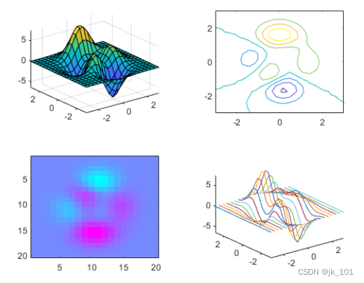
要更改第三个图块中的颜色图,请获取该图块中的坐标区。通过指定图块编号调用 nexttile 函数,并返回坐标区输出参数。然后将坐标区传递给 colormap 函数。
ax = nexttile(3);
colormap(ax,cool)
如图所示:
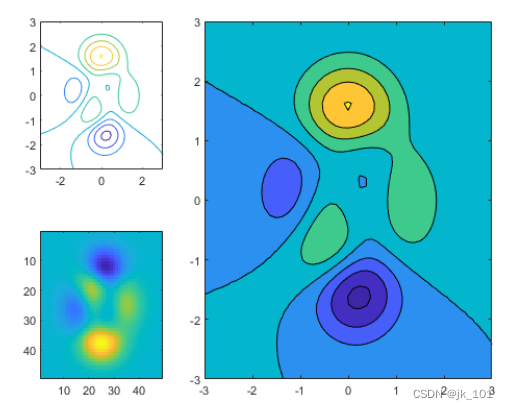
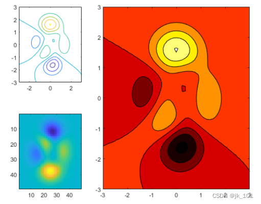
重新配置跨图块坐标区
创建一个 2×3 分块图布局,其中包含两个分别位于单独图块中的图,以及一个跨两行两列的图。
t = tiledlayout(2,3);
[X,Y,Z] = peaks;

% Tile 1
nexttile
contour(X,Y,Z)

% Span across two rows and columns
nexttile([2 2])
contourf(X,Y,Z)

% Last tile
nexttile
imagesc(Z)
如图所示:
要更改跨图块坐标区的颜色图,请将图块位置标识为坐标区左上角图块所在的位置。在本例中,左上角在第二个图块中。使用 2 作为图块位置调用 nexttile 函数,并指定输出参数以返回该位置的坐标区对象。然后将坐标区传递给 colormap 函数。
ax = nexttile(2);
colormap(ax,hot)
如图所示:
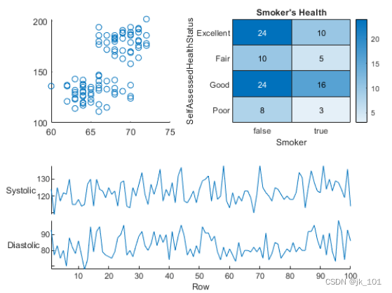
替换上一个图块中的内容
加载 patients 数据集,并基于变量子集创建一个表。然后创建一个 2×2 分块图布局。在第一个图块中显示散点图,在第二个图块中显示热图,并显示跨底部两个图块的堆叠图。
load patients
tbl = table(Diastolic,Smoker,Systolic,Height,Weight,SelfAssessedHealthStatus);
tiledlayout(2,2)

% Scatter plot
nexttile
scatter(tbl.Height,tbl.Weight)

% Heatmap
nexttile
heatmap(tbl,'Smoker','SelfAssessedHealthStatus','Title','Smoker''s Health');

% Stacked plot
nexttile([1 2])
stackedplot(tbl,{'Systolic','Diastolic'});
如图所示:
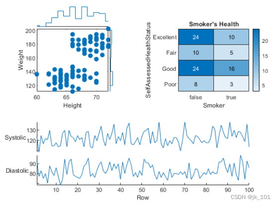
调用 nexttile,并将图块编号指定为 1 以使该图块中的坐标区成为当前坐标区。用散点直方图替换该图块的内容。
nexttile(1)
scatterhistogram(tbl,'Height','Weight');
如图所示:
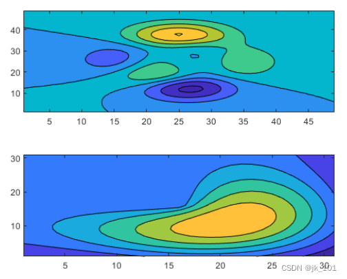
在单独图块中显示共享颜色栏
当要在两个或多个图之间共享颜色栏或图例时,可以将其放置在一个单独图块中。在分块图布局中创建 peaks 和 membrane 数据集的填充等高线图。
Z1 = peaks;
Z2 = membrane;
tiledlayout(2,1);
nexttile
contourf(Z1)
nexttile
contourf(Z2)
如图所示:
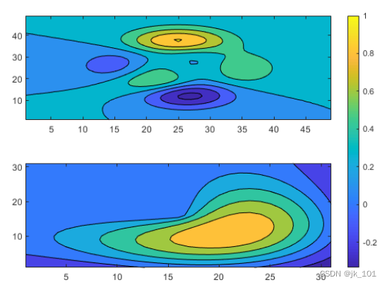
添加一个颜色栏,并将其移至 east 图块。
cb = colorbar;
cb.Layout.Tile = 'east';
如图所示:
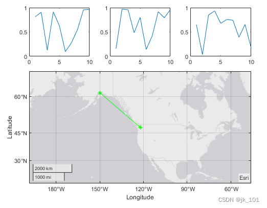
手动创建和配置坐标区
有时,可能需要在调用绘图函数之前手动创建坐标区。在创建坐标区时,请将 parent 参数指定为分块图布局。然后通过对坐标区设置 Layout 属性来定位坐标区。
创建分块图布局 t 并指定 'flow' 图块排列。在前三个图块中各显示一个绘图。
t = tiledlayout('flow');
nexttile
plot(rand(1,10));
nexttile
plot(rand(1,10));
nexttile
plot(rand(1,10));
如图所示:
通过调用 geoaxes 函数创建一个地理坐标区对象 gax,并将 t 指定为 parent 参数。默认情况下,坐标区进入第一个图块,因此通过将 gax.Layout.Tile 设置为 4 将其移至第四个图块。通过将 gax.Layout.TileSpan 设置为 [2 3],使坐标区占据图块的 2×3 区域。
gax = geoaxes(t);
gax.Layout.Tile = 4;
gax.Layout.TileSpan = [2 3];
如图所示:
调用 geoplot 函数。然后为坐标区配置地图中心和缩放级别。
geoplot(gax,[47.62 61.20],[-122.33 -149.90],'g-*')
gax.MapCenter = [47.62 -122.33];
gax.ZoomLevel = 2;
如图所示:
输入参数说明
m - 行数
行数,指定为正整数。
n - 列数
列数,指定为正整数。
parent - 父容器
父容器,指定为 Figure、Panel、Tab、TiledChartLayout 或 GridLayout 对象。
名称-值参数
示例: tiledlayout(2,2,'TileSpacing','compact') 创建 2×2 布局,各图块之间采用最小间距。
指定可选的、以逗号分隔的 Name,Value 对组参数。Name 为参数名称,Value 为对应的值。Name 必须放在引号中。
可采用任意顺序指定多个名称-值对组参数,如 Name1,Value1,...,NameN,ValueN 所示。
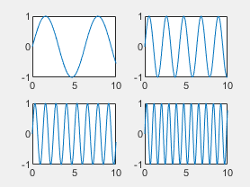
TileSpacing - 图块间距
图块间距,指定为 'loose'、'compact'、'tight' 或 'none'。使用此属性控制图块之间的间距。
下表显示每个值如何影响 2×2 布局的外观。
| 值 | 外观 |
|---|---|
| 'loose' |
|
| 'compact' |
|
| 'tight' |
|
| 'none' |
|

Padding - 布局周围的补白
布局周围的填充,指定为 'loose'、'compact' 或 'tight'。不管此属性使用哪个值,布局都会为所有装饰元素(如轴标签)提供空间。
下表显示每个值如何影响 2×2 布局的外观。
| 值 | 外观 |
|---|---|
| 'loose' |
|
| 'compact' |
|
| 'tight' |
|
最后
以上就是明亮银耳汤最近收集整理的关于MATLAB中tiledlayout函数使用的全部内容,更多相关MATLAB中tiledlayout函数使用内容请搜索靠谱客的其他文章。


发表评论 取消回复