本文实例为大家分享了flutter实现不规则底部导航栏的具体代码,供大家参考,具体内容如下
实现底部导航栏并点击切换页面可简述为有三种方式
- TabBar + TabBarView
- BottomNavigationBar + BottomNavigationBarItem
- 自定义 BottomAppBar
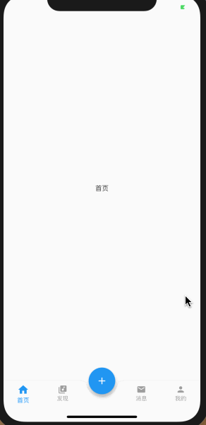
在这里 使用 BottomAppBar 来实现
/**
 * 有状态StatefulWidget
 * 继承于 StatefulWidget,通过 State 的 build 方法去构建控件
 */
class BotomeMenumBarPage extends StatefulWidget {
 ////通过构造方法传值
 BotomeMenumBarPage();

 //主要是负责创建state
 @override
 BotomeMenumBarPageState createState() => BotomeMenumBarPageState();
}

/**
 * 在 State 中,可以动态改变数据
 * 在 setState 之后,改变的数据会触发 Widget 重新构建刷新
 */
class BotomeMenumBarPageState extends State<BotomeMenumBarPage> {
 BotomeMenumBarPageState();

 @override
 void initState() {
  ///初始化,这个函数在生命周期中只调用一次
  super.initState();
 }

 @override
 Widget build(BuildContext context) {
  //构建页面
  return buildBottomTabScaffold();
 }

 //当前显示页面的
 int currentIndex = 0;
 //点击导航项是要显示的页面
 final pages = [
  ChildItemView("首页"),
  ChildItemView("发现"),
  ChildItemView("动态"),
  ChildItemView("我的")
 ];

 Widget buildBottomTabScaffold() {
  return SizedBox(
    height: 100,
    child: Scaffold(
     //对应的页面
     body: pages[currentIndex],
     //appBar: AppBar(title: const Text('Bottom App Bar')),
     //悬浮按钮的位置
     floatingActionButtonLocation:
       FloatingActionButtonLocation.centerDocked,
     //悬浮按钮
     floatingActionButton: FloatingActionButton(
      child: const Icon(Icons.add),
      onPressed: () {
       print("add press ");
      },
     ),
     //其他菜单栏
     bottomNavigationBar: BottomAppBar(
      //悬浮按钮 与其他菜单栏的结合方式
      shape: CircularNotchedRectangle(),
      // FloatingActionButton和BottomAppBar 之间的差距
      notchMargin: 6.0,
      color: Colors.white,
      child: Row(
       mainAxisSize: MainAxisSize.max,
       mainAxisAlignment: MainAxisAlignment.spaceAround,
       children: <Widget>[
        buildBotomItem(currentIndex, 0, Icons.home, "首页"),
        buildBotomItem(currentIndex, 1, Icons.library_music, "发现"),
        buildBotomItem(currentIndex, -1, null, "发现"),
        buildBotomItem(currentIndex, 2, Icons.email, "消息"),
        buildBotomItem(currentIndex, 3, Icons.person, "我的"),
       ],
      ),
     ),
    ));
 }


// ignore: slash_for_doc_comments
 /**
  * @param selectIndex 当前选中的页面
  * @param index 每个条目对应的角标
  * @param iconData 每个条目对就的图标
  * @param title 每个条目对应的标题
  */
 buildBotomItem(int selectIndex, int index, IconData iconData, String title) {
  //未选中状态的样式
  TextStyle textStyle = TextStyle(fontSize: 12.0,color: Colors.grey);
  MaterialColor iconColor = Colors.grey;
  double iconSize=20;
  EdgeInsetsGeometry padding = EdgeInsets.only(top: 8.0);

  if(selectIndex==index){
   //选中状态的文字样式
   textStyle = TextStyle(fontSize: 13.0,color: Colors.blue);
   //选中状态的按钮样式
   iconColor = Colors.blue;
   iconSize=25;
   padding = EdgeInsets.only(top: 6.0);
  }
  Widget padItem = SizedBox();
  if (iconData != null) {
   padItem = Padding(
    padding: padding,
    child: Container(
     color: Colors.white,
     child: Center(
      child: Column(
       children: <Widget>[
        Icon(
         iconData,
         color: iconColor,
         size: iconSize,
        ),
        Text(
         title,
         style: textStyle,
        )
       ],
      ),
     ),
    ),
   );
  }
  Widget item = Expanded(
   flex: 1,
   child: new GestureDetector(
    onTap: () {
     if (index != currentIndex) {
      setState(() {
       currentIndex = index;
      });
     }
    },
    child: SizedBox(
     height: 52,
     child: padItem,
    ),
   ),
  );
  return item;
 }
}
//子页面
class ChildItemView extends StatefulWidget {
 String _title;

 ChildItemView(this._title);

 @override
 _ChildItemViewState createState() => _ChildItemViewState();
}

class _ChildItemViewState extends State<ChildItemView> {
 @override
 Widget build(BuildContext context) {
  return Container(
   child: Center(child: Text(widget._title)),
  );
 }
}
以上就是本文的全部内容,希望对大家的学习有所帮助,也希望大家多多支持靠谱客。
最后
以上就是悦耳冰淇淋最近收集整理的关于flutter BottomAppBar实现不规则底部导航栏的全部内容,更多相关flutter内容请搜索靠谱客的其他文章。
本图文内容来源于网友提供,作为学习参考使用,或来自网络收集整理,版权属于原作者所有。


发表评论 取消回复