绘图要求

准备工作
import numpy as np
import pandas as pd
import plotly.graph_objects as go
from plotly.subplots import make_subplots #绘多幅图片
第一题
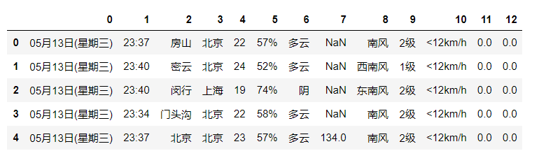
data = pd.read_csv('weatherdata2020-05-14.csv',header=None)
data.head()
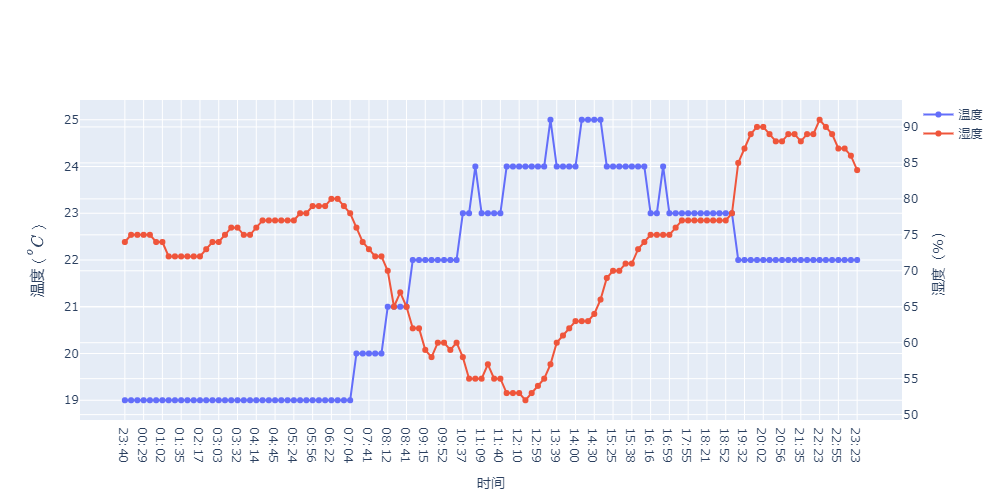
这段代码里包含了双y轴的操作
data_shanghai = data[(data[3]=='上海')&(data[2]=='闵行')]
layout = go.Layout(width=1000,height=500,yaxis1 = dict(title = '$温度(^oC)$'),yaxis2=dict(title = '湿度(%)',anchor='x', overlaying='y', side='right'),
                   xaxis = dict(title = '时间'))
data1 = go.Scatter(x=data_shanghai[1],y=data_shanghai[4],mode = 'lines+markers',name = '温度')
data2 = go.Scatter(x=data_shanghai[1],y=data_shanghai[5],mode = 'lines+markers',yaxis='y2',name = '湿度')
data = [data1,data2]
fig = go.Figure(data = data,layout=layout)
fig.show()
第二题
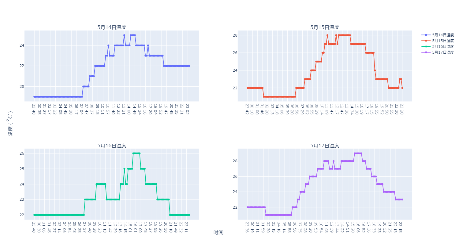
plotly多幅绘图操作
fig = make_subplots(rows=2,  # 将画布分为两行
                    cols=2,  # 将画布分为两列
                    subplot_titles=["5月14日温度",
                                    "5月15日温度",
                                    "5月16日温度",
                                    "5月17日温度"],  # 子图的标题
                    x_title="时间",
                    y_title="$温度(^oC)$"
                   )
for i in range(14,18):
    data = pd.read_csv('weatherdata2020-05-%d.csv'%i,header=None)
    temp = data[(data[3]=='上海')&(data[2]=='闵行')]
    trace = go.Scatter(x=temp[1], y=temp[4],mode = 'lines+markers',name = '5月%d日温度'%i)
    if i <=15:
        fig.append_trace(trace, 1, i-13)
    else:
        fig.append_trace(trace, 2, i-15)
#设置图片大小
fig.layout.width = 1500
fig.layout.height = 800
fig.show()
第三题
wendu = []
shidu = []
riqi = []
for i in range(14,29):
    data = pd.read_csv('weatherdata2020-05-%d.csv'%(i),header = None)
    data_shanghai = data[(data[3] == '福建') & (data[2] == '漳州')]
    wendu.append(round(np.mean(data_shanghai[4]),2))
    shidu.append(round(np.mean(data_shanghai[5].str.strip("%").astype(float)),2))
    riqi.append('2020-05-%d'%i)
layout = go.Layout(yaxis1 = dict(title = '$平均温度(^oC)$'),yaxis2=dict(title = '平均湿度(%)',anchor='x', overlaying='y', side='right'),
                   xaxis = dict(title = '时间'))
data1 = go.Scatter(x=riqi,y=wendu,mode = 'lines+markers',name = '温度')
data2 = go.Scatter(x=riqi,y=shidu,mode = 'lines+markers',yaxis='y2',name = '湿度')
data = [data1,data2]
fig = go.Figure(data = data,layout=layout)
fig.show()
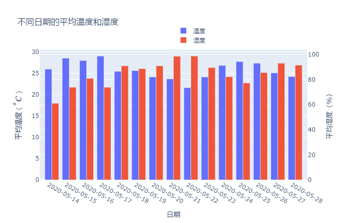
绘制柱状图
layout = go.Layout(title = '不同日期的平均温度和湿度',
    yaxis1 = dict(title = '$平均温度(^oC)$'),yaxis2=dict(title = '平均湿度(%)',anchor='x', overlaying='y', side='right'),
                   xaxis = dict(title = '日期',tickmode = 'array',tickvals = np.arange(1,16),ticktext=riqi),
                   legend=dict(x=0.5,y=1.2)) ##自己DIY X轴刻度标签
data1 = go.Bar(x=np.arange(1,16),y=wendu,name = '温度',width=0.4)
data2 = go.Bar(x=np.arange(1,16)+0.4,y=shidu,yaxis='y2',name = '湿度',width=0.4)
data = [data1,data2]
fig = go.Figure(data = data,layout=layout)
fig.show()
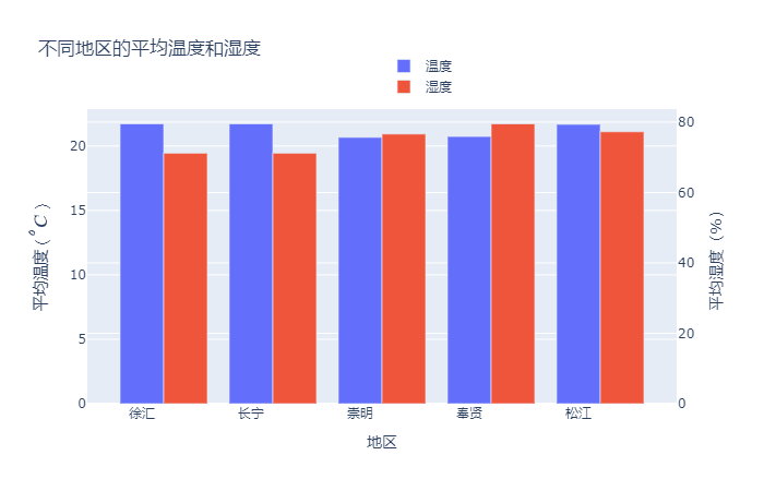
第四题
district = ['徐汇','长宁','崇明','奉贤','松江']
wendu =  []
shidu = []
data = pd.read_csv('weatherdata2020-05-14.csv',header=None)
for i in district:
    temp = data[(data[3]=='上海')&(data[2]==i)]
    wendu.append(round(np.mean(temp[4]),2))
    shidu.append(round(np.mean(temp[5].str.strip("%").astype(float)),2))
layout = go.Layout(title = '不同地区的平均温度和湿度',yaxis1 = dict(title = '$平均温度(^oC)$'),yaxis2=dict(title = '平均湿度(%)',anchor='x', overlaying='y', side='right'),
                   xaxis = dict(title = '地区',tickmode = 'array',tickvals = np.arange(1,6),ticktext=district),
                   legend=dict(x=0.5,y=1.2))
data1 = go.Bar(x=np.arange(1,6),y=wendu,name = '温度',width=0.4)
data2 = go.Bar(x=np.arange(1,6)+0.4,y=shidu,yaxis='y2',name = '湿度',width=0.4)
data = [data1,data2]
fig = go.Figure(data = data,layout=layout)
fig.show()
数据链接
数据链接:https://pan.baidu.com/s/1hR9CrzmKhRKyLvgI5c-4xg
提取码:87j6
最后
以上就是真实小伙最近收集整理的关于运用plotly画图的一个小项目的全部内容,更多相关运用plotly画图内容请搜索靠谱客的其他文章。
本图文内容来源于网友提供,作为学习参考使用,或来自网络收集整理,版权属于原作者所有。


发表评论 取消回复