介绍初学者采用的四种布局组件:TextView、EditView、Button、checkbox。
一、文本框TextView的功能和用法
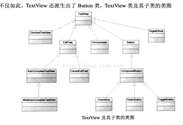
TextView直接继承了View,而且还是EditView 和Button两个ui组件类的父类。是一个文本编辑器,只是关闭了文章编辑功能,把其他功能给予其子类执行。其派生出的子类类图如下:
TextView的xml属性及相关方法介绍:
1、android:text ----设置文本框的的显示文字eg:
android:text="@string/hello_world" 会显示hello_world在strings.xml定义的文字
2、android:textSize ----设置文本文字的大小eg:
android:textSize="20dp" 会显示文字的大小为20dp
3、android:textColor ----设置文本框文字的颜色eg:
android:textColor="#ff0000" #ff0000为颜色代码,为红色。也可以在view中创建color.xml
4、android:lineSpacingMultiplier---设置文本行间距
android:lineSpacingMultiplier="2.0" 设置行间距为2.0
5、android:lines-- -设置文本行的行数
android:lines=“2” 设置为2行,即使文本没有二行也会占用二行
6、android:ellipsize --对文本超过TextView限度范围,进行处理
start :只打出开始部分 end: 只打出结尾部分 marquee:跑马灯必选项 none:不做处理
android:ellipsize="middle" 设置过长文本,中间为省略号
7、 android:autoLink---测试超链接
android:autoLink="email" 实现text文本中的email可超链接
8、android:shadowColor="#0110ff"--设置阴影颜色
android:shadowDx="15.0" --设置阴影在水平方向的偏移
android:shadowDy="20.0" -----设置阴影在垂直方向的偏移
android:shadowRadius="45.0" --设置阴影的角度
9、android:background ---设置文本的边框
android:background="@drawable/bg_border"设置文本的边框为图框bg_border
10、android:background ---设置带图片的文本
android:background="@drawable/test" 设置图片为drawable目录下的test图片
二:EditView
作为TextView的子类,EditView自然可以实现TextView的方法。但是也实现了文本的输入功能,是很常用的ui组件。其主要的方法如下,同父类的常用方法不在描叙。
1、android:hint ---显示输入框提示的文字
android:hint="请输入账号" --显示输入框的文字:请输入账号。最常用
2、android:digits --设置输入框输入的限定字符 , 有很多用法
android:digits="1234567890" 设置只能输入纯数字的文本
3、 android:inputType 设置文本模式:
android:inputType="none"android:inputType="text"android:inputType="textCapCharacters"//前3个输入普通字符android:inputType="textCapWords"//单词首字母大小
android:inputType="textCapSentences"//仅第一个字母大小
android:inputType="textAutoCorrect"android:inputType="textAutoComplete"//前两个自动完成
android:inputType="textMultiLine"//多行输入
android:inputType="textImeMultiLine"//输入法多行(不一定支持)
android:inputType="textNoSuggestions"//不提示
android:inputType="textUri"//URI格式
android:inputType="textEmailAddress"//电子邮件地址格式
android:inputType="textEmailSubject"//邮件主题格式
android:inputType="textShortMessage"//短消息格式
android:inputType="textLongMessage"android:inputType="textPersonName"//人名格式
android:inputType="textPostalAddress"//邮政格式
android:inputType="textPassword"//密码格式
android:inputType="textVisiblePassword"//密码可见格式
android:inputType="textWebEditText"//作为网页表单的文本格式
android:inputType="textFilter"//文本筛选格式
android:inputType="textPhonetic"//拼音输入格式
android:inputType="number"//数字格式
android:inputType="numberSigned"//有符号数字格式
android:inputType="numberDecimal"//可以带小数点的浮点格式
android:inputType="phone"//拨号键盘
android:inputType="datetime"android:inputType="date"//日期键盘
android:inputType="time"//时间键盘
eg: android:inputType="textPassword"- 将输入的文本以点点点 显示,既是输入密码的保护
也可以用其他方法设置密码:android:password="true"
4、android:typeface="monospace"----设置字型
字形有:normal, sans, serif,monospace
5、android:MinLines 设置输入行最小行数eg:
android:lines设置文本的行数,设置两行就显示两行,即使第二行没有数据。
android:MinLines =“2” 设置最小行数为2行
6、android:Maxlines 设置文本框最多占几行
7、android:capitalize设置英语字母大写类型
sentences仅第一个字母大写;
words每一个单词首字母大小,用空格区分单词;
characters每一个英文字母都大写
8、android:selectAllOnFous=“true”
如果文本框的内容可选择,设置当它获得焦点是否自动选择所有文本/true为选择
三、Button
Button继承了TextView,主要功能是在ui界面上生成一个按钮,该按钮可以用户单击,单击时会触发一个OnClick事件。
Button很多方法与TextView的方法一样。
1、android:background="@drawable/button"设置button的背景图片
2、android:background=“#000000”设置背景颜色为红色
3、android:background="#e0000000"设置背景为半透明
4、android:background="#00000000"设置背景为全透明
四、CheckBox
CheckBox与其他按钮不同的是,多了一个可选的功能,额外指定一个android:chenked属性,该属性指定初始是否被选中。
android:checked=“true”设置为选中。
大小和方向的属性(父类方法,都可以使用):
1、设置为true和false的
android:layout_centerHrizontal 水平居中
android:layout_centerVertical 垂直居中
android:layout_centerInparent 相对于父元素完全居中
android:layout_alignParentBottom 贴紧父元素的下边缘
android:layout_alignParentLeft 贴紧父元素的左边缘
android:layout_alignParentRight 贴紧父元素的右边缘
android:layout_alignParentTop 贴紧父元素的上边缘
2、设置为必须为相对的,即要设置:“@id/id-name”
android:layout_below 在某组件的下方
android:layout_above 在某组件的的上方
android:layout_toLeftOf 在某组件的左边
android:layout_toRightOf 在某组件的右边
android:layout_alignTop 本组件的上边缘和某组件的的上边缘对齐
android:layout_alignLeft 本组件的左边缘和某组件的的左边缘对齐android:layout_alignBottom 本元素的下边缘和某组件的的下边缘对齐
android:layout_alignRight 本组件的右边缘和某组件的的右边缘对齐
3、属性值为具体的单位值,如dp,pt,sp
android:layout_marginBottom 离某组件底边缘的距离
android:layout_marginLeft 离某组件左边缘的距离
android:layout_marginRight 离某组件右边缘的距离
android:layout_marginTop 离某组件上边缘的距离
android:width 设置文本框的宽度
android:textSize="20dp" 设置文本大小
4、其他设置形式
EditText的android:hint=“” 不设置为空时,为纯输入框
android:orientation="vertical" 设置为垂直方向填充
android:orientation="horizontal"设置为水平方向填充
android:layout_width="fill_parent"设置为填满父类宽度
android:layout_height="wrap_content" 设置为填满自身宽度
android:paddingBottom="@dimen/activity_vertical_margin"设置为离整体布局下部的预留距离
android:paddingLeft="@dimen/activity_horizontal_margin"设置为离整体布局左部的预留距离
android:paddingRight="@dimen/activity_horizontal_margin"设置为离整体布局右部的预留距离
android:paddingTop="@dimen/activity_vertical_margin"设置为离整体布局上部的预留距离
总结:学一个记住一个,不要都掌握。多学英语,认识单词就知道布局属性的意思了。
最后
以上就是自信镜子最近收集整理的关于android几种布局组件的常用属性的全部内容,更多相关android几种布局组件内容请搜索靠谱客的其他文章。


发表评论 取消回复