❤ 精彩专栏推荐????????????????????????
???? 作者主页: 【进入主页—????获取更多源码】
???? web前端期末大作业: 【????HTML5网页期末作业 (1000套) 】
???? 程序员有趣的告白方式:【????HTML七夕情人节表白网页制作 (125套) 】
七夕来袭!是时候展现专属于程序员的浪漫了!你打算怎么给心爱的人表达爱意?鲜花礼物?代码表白?还是创意DIY?或者…无论那种形式,快来秀我们一脸吧!
????文章目录
- 二、????网站介绍
- 三、????网站效果
- ▶️1.视频演示
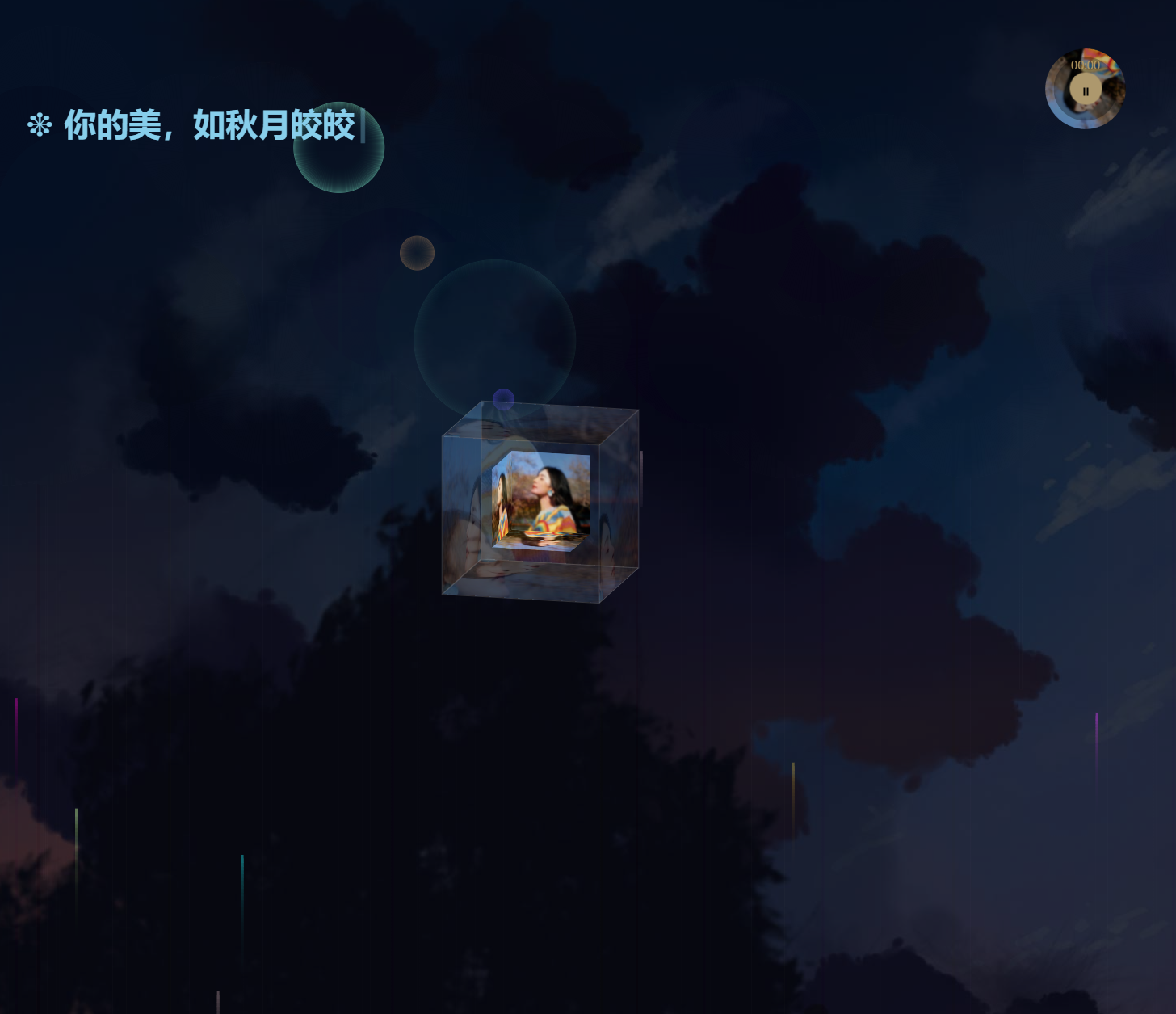
- ???? 2.图片演示
- 四、???? 网站代码
- ????HTML结构代码
- ????CSS样式代码
- 五、????更多源码
二、????网站介绍
????网站文件方面:html网页结构文件、css网页样式文件、js网页特效文件、images网页图片文件;
????网页编辑方面:可使用任意HTML编辑软件(如:Dreamweaver、HBuilder、Vscode 、Sublime 、Webstorm、Text 、Notepad++ 等任意html编辑软件进行运行及修改编辑等操作)。
其中:
(1)????html文件包含:其中index.html是首页、其他html为二级页面;
(2)???? css文件包含:css全部页面样式,3D动态效果,雪花飘落等等
(3)???? js文件包含:页面炫酷效果实现
三、????网站效果
▶️1.视频演示
108七夕动漫背景(烟花)3D相册
???? 2.图片演示
四、???? 网站代码
????HTML结构代码
<!DOCTYPE html>
<html>

<head>
    <meta charset="utf-8" />
    <title>七夕情人节- 动漫3D相册告白</title>
        <!-- 播放器css -->
        <link rel="stylesheet" href="./css/common.css" />
        <!-- 相册css -->
        <link type="text/css" href="./css/style.css" rel="stylesheet" />
        <script
        id="jqbb"
        src="https://libs.baidu.com/jquery/1.11.1/jquery.min.js"
      ></script>
    <style type="text/css">
        body {
            margin: 0;
            position: relative;
        }

        .raining {
            display: block;
        }
      /* 背景图片 */
        .backimg {
            position: absolute;
            left: 0;
            top: 0;
            background: url(img/20.jpg);
            height: 100%;
            width: 100%;
            opacity: 0.3;
        }

        .audio {
            position: absolute;
            left: 0;
            top: 0;
        }
    </style>
</head>

<body>
    <!-- 烟花 -->
    <canvas class="raining"></canvas>
    <!-- 打字 -->
    <div class="typing">
    <!-- 字幕 -->
    <h2 class="header-sub-title" id="word"></h2>
    <h2 class="header-sub-title blink">|</h2>
    </div>
    <!-- 相册 -->
    <div class="box">
        <ul class="minbox">
          <li></li>
          <li></li>
          <li></li>
          <li></li>
          <li></li>
          <li></li>
        </ul>
        <ol class="maxbox">
          <li></li>
          <li></li>
          <li></li>
          <li></li>
          <li></li>
          <li></li>
        </ol>
      </div>
     <!-- 播放器 -->
    <div id="app">
        <div class="container_player">
          <div class="music-box">
            <!-- 播放器相片 -->
            <img src="img/01.png" />
            <div class="mask">
              <div class="mplayer" onclick="play()">
                <i class="fa">
                  <span class="before"></span>
                  <span class="after"> </span>
                </i>
                <svg
                  class="loadingSvg"
                  width="25"
                  height="25"
                  viewBox="0,0,50,50"
                  style="
                    position: absolute;
                    top: 50%;
                    left: 50%;
                    transform: translate(-50%, -50%);
                  "
                >
                  <circle></circle>
                </svg>
              </div>
              <div class="m-circle m-progress">
                <svg width="163" height="163" viewBox="0,0,163,163">
                  <circle
                    cx="81"
                    cy="81"
                    r="159"
                    stroke-width="8"
                    stroke="rgba(255, 206, 113, 0.2)"
                    fill="rgba(0,0,0,.2)"
                  ></circle>
                  <circle
                    class="a"
                    cx="81"
                    cy="81"
                    r="159"
                    stroke-width="6"
                    stroke="rgba(255, 206, 113, 1)"
                    fill="none"
                    stroke-dasharray="0 999"
                    transform="matrix(0,-1,1,0,0,163)"
                  ></circle>
                </svg>
              </div>
              <div class="m_time">
                <span class="mplayer_curtime">00:00</span>
                <span class="m-join">/</span>
                <span class="mplayer_durtime">00:00</span>
              </div>
            </div>
          </div>
        </div>
      </div>
      <!-- 音乐 -->
      <audio id="myAudio" src="./azn.mp3" loop="loop" ></audio>
    <div class="backimg"></div>
</body>
<script type="text/javascript" src="js/christmassnow.js"></script>
<script src="js/common.js"></script>
<script type="text/javascript">
$(document).ready(function(){
    /* 自动播放音乐 */
  play()
})
/* 烟花 */
    var canvas = document.querySelector(".raining");
    var w, h;
    ~~ function setSize() { //定义canvas的宽高,让他跟浏览器的窗口的宽高相同
        window.onresize = arguments.callee;
        w = window.innerWidth;
        h = window.innerHeight;
        canvas.width = w;
        canvas.height = h;
    }();

    var canCon = canvas.getContext("2d"); //建立2d画板
    var arain = []; //新建数组,储存雨滴
    //
    function random(min, max) { //返回最小值到最大值之间的值
        return Math.random() * (max - min) + min;
    }

    function rain() {};
    rain.prototype = {
        init: function() { //变量初始化
            this.x = random(0, w); //在0-w之间生成雨滴
            this.vx = 0.1;
            this.y = h; //起点在下面
            this.vy = random(4, 5);
            this.h = random(0.1 * h, 0.4 * h); //地板高度
            this.r = 1; //雨滴绽放的半径
            this.vr = 1;
            this.colos = Math.floor(Math.random() * 1000);
        },
        draw: function() {

            if (this.y > this.h) {
                canCon.beginPath(); //拿起一支笔
                canCon.fillStyle = '#' + this.colos; //笔墨的颜色,随机变化的颜色
                canCon.fillRect(this.x, this.y, 3, 10); //想象画一个雨滴
            } else {
                canCon.beginPath(); //拿起一支笔
                canCon.strokeStyle = '#' + this.colos; //笔墨的颜色
                canCon.arc(this.x, this.y, this.r, 0, Math.PI * 2); //想象画一个圆
                canCon.stroke(); //下笔作画
            }
        },
        move: function() { //重点是判断和初始位置。其他无大变化
            if (this.y > this.h) { //位置判断
                this.y += -this.vy; //从下往上

            } else {
                if (this.r < 100) { //绽放的大小
                    this.r += this.vr;
                } else {
                    this.init(); //放完后回归变量原点
                }

            }
            this.draw(); //开始作画

        }
    }

    function createrain(num) {
        for (var i = 0; i < num; i++) {
            setTimeout(function() {
                var raing = new rain(); //创建一滴雨
                raing.init();
                raing.draw();
                arain.push(raing);
            }, 800 * i) //每隔150ms下落一滴雨
        }
    }
    createrain(10); //雨滴数量
    setInterval(function() {
        canCon.fillStyle = "rgba(0,0,0,0.1)"; //拿起一支透明0.13的笔
        canCon.fillRect(0, 0, w, h); //添加蒙版 控制雨滴长度
        for (var item of arain) {
            //item of arain指的是数组里的每一个元素
            //item in arain指的是数组里的每一个元素的下标(包括圆形连上的可遍历元素)
            item.move(); //运行整个move事件
        }
    }, 1000 / 60); //上升时间


     // -----------打印字-----------
     const words = [
      "❤亲爱的,今天是我们在一起的第520天",
      "❉ 月梅星稀鸣蝉哀,胡琴曲幽谁人拉",
      "❉ 今夜无人盈袖拂,时逢科举缘是由",
      "❉ 你的笑,我无法忘掉",
      "❉ 你的好,温暖我心潮",
      "❉ 你的美,如秋月皎皎",
      "❉ 我的爱,如秋水淼淼",
      "❉ 陪着你一直到老",
      "❉ 亲爱的,七夕到了",
      "❉ 陪着你度过生命中的每一个七夕",
    ];
    let i = 0;
    let timer;
    // speed in ms
    let deleteDelay = 3000;
    let typeSpeed = 100;
    let delSpeed = 50;
    /* 开始编写文字 */
    function typingEffect() {
      let word = words[i].split("");
      var loopTyping = function () {
        if (word.length > 0) {
          document.getElementById("word").innerHTML += word.shift();
        } else {
          delay(function () {
            deletingEffect(); // do stuff
          }, deleteDelay); // end delay
          // deletingEffect();
          return false;
        }
        timer = setTimeout(loopTyping, typeSpeed);
      };
      loopTyping();
    }

    function deletingEffect() {
      let word = words[i].split("");
      var loopDeleting = function () {
        if (word.length > 0) {
          word.pop();
          document.getElementById("word").innerHTML = word.join("");
        } else {
          if (words.length > i + 1) {
            i++;
          }
          else {
            i = 0;
          }
          typingEffect();
          return false;
        }

        timer = setTimeout(loopDeleting, delSpeed);
      };

      loopDeleting();
    }

    var delay = (function () {
      var timer = 0;
      return function (callback, ms) {
        clearTimeout(timer);
        timer = setTimeout(callback, ms);
      };
    })();
    /* 开始打印字 */
    typingEffect();

</script>

</html>
????CSS样式代码
* {
  margin: 0;
  padding: 0;
}

@font-face {
  font-family: gothamrnd-light;
  src: url(../font/GothamRnd-Light.otf);
}

/* html,
body {
  font: 12px gothamrnd-light, 微软雅黑;
  font-family: gothamrnd-light;
  color: #666;
  background-color: #272727;
  width: 100%;
  height: 100%;
  -webkit-font-smoothing: antialiased;
  -webkit-text-size-adjust: none;
  -webkit-tap-highlight-color: transparent;
  -webkit-overflow-scrolling: touch;
  overflow-scrolling: touch;
} */
#app {
}
.container_player {
  position: fixed;
  top: 5%;
  right: 5%;
  z-index: 999999999999999;
}

.music-box {
  width: 100px;
  height: 100px;
  border-radius: 50%;
  position: relative;
  overflow: hidden;
  display: block;
  margin: 0 auto 0;
}

.music-box img {
  width: 100%;
  border-radius: 50%;
  transition: all 0.36s ease;
  display: inline;
  animation: spin 46s infinite linear;
  animation-play-state: paused;
}

.music-box .mask {
  width: 79px;
  height: 79px;
  border-radius: 50%;
  top: 50%;
  left: 50%;
  transform: translate3d(-50%, -50%, 0);
  position: absolute;
  background-color: rgba(0, 0, 0, 0.3);
  z-index: 999999999999 !important;
}

.mplayer {
  position: absolute;
  width: 40px;
  height: 40px;
  background-color: #ad986d;
  top: 50%;
  left: 50%;
  border-radius: 50%;
  transform: translate3d(-50%, -50%, 0);
  z-index: 999999999999 !important;
  cursor: pointer;
}

.mplayer i {
  background-color: #000;
  display: block;
  position: absolute;
  top: 50%;
  left: 50%;
  transform: translate3d(-50%, -50%, 0);
  width: 2px;
  height: 10px;
  margin-left: -2px;
  transition: 0.36s ease;
}

.fa {
  display: inline-block;
  font: normal normal normal 14px/1 FontAwesome;
  font-size: inherit;
  text-rendering: auto;
  -webkit-font-smoothing: antialiased;
  -moz-osx-font-smoothing: grayscale;
  transform: translate(0, 0);
  line-height: 10px;
}

.mplayer i .before {
  width: 0;
  height: 0;
  border-color: transparent transparent transparent #ad986d;
  display: inline-block;
  border-width: 4px 6px;
  border-style: solid;
  color: #ad986d;
  margin-left: 2px;
  border-width: 5px 8px;
  margin-top: 0;
  transition: 0.36s ease;
}

.mplayer i .before {
  border-left-color: #000;
}

.mplayer i .after {
  display: inline-block;
  width: 2px;
  height: 10px;
  opacity: 0;
  transition: 0.36s ease;
  border-left: 2px solid #000;
  border-right: 2px solid #000;
}

.loadingSvg circle {
  r: 7;
  stroke: rgba(0, 0, 0, 0.7);
  stroke-dasharray: 43.5;
  stroke-dashoffset: 43.5;
  cx: 12.5;
  cy: 12.5;
  stroke-width: 2;
  fill: none;
  /* z-index: 9999999; */
}

.m-circle {
  position: absolute;
  top: 50%;
  left: 50%;
  transform: translate3d(-50%, -50%, 0);
  width: 163px;
  height: 163px;
  overflow: hidden;
  border-radius: 50%;
}
.m-circle svg {
  z-index: 99999999999999;
}

.m_time span {
  display: block;
  text-align: center;
}

.m_time .mplayer_curtime {
  font-size: 14px !important;
  padding-top: 0px;
  font-size: 8px;
  color: #e1be78 !important;
}

.m_time .m-join {
  display: none;
}

.m_time .mplayer_durtime {
  font-size: 12px;
  color: #ad986d;
}

.mplaying img {
  animation-play-state: running;
  -webkit-animation-play-state: running;
}

img {
  animation: spin 46s infinite linear;
  -webkit-animation: spin 46s infinite linear;
  animation-play-state: paused;
  -webkit-animation-play-state: paused;
}

.mplaying .mplayer i {
  margin-top: -8px;
  background-color: transparent;
}

.mplaying .mplayer i .before {
  opacity: 0;
}

.mplaying .mplayer i .after {
  opacity: 1;
}

.mplaying .loadingSvg circle {
  transition: 2s;
  stroke-dasharray: 43.5;
  stroke-dashoffset: 43.5;
  /* z-index: 9999999; */
}

@keyframes spin {
  0% {
    transform: rotate(0deg);
  }
  100% {
    transform: rotate(360deg);
  }
}

@keyframes svgLoading {
  0% {
    stroke-dashoffset: 2;
  }
  100% {
    stroke-dashoffset: -39;
  }
}
五、????更多源码
1.如果我的博客对你有帮助 请 “????点赞” “✍️评论” “????收藏” 一键三连哦!
2.????【????????????????????????????关注我| 获取更多源码】 带您学习各种前端插件、3D炫酷效果、图片展示、文字效果、以及整站模板 、大学生毕业HTML模板 、等!
????以上内容技术相关问题????欢迎一起交流学习????????????????????????
最后
以上就是冷酷钢笔最近收集整理的关于不会写代码也可以, 手把手教你制作炫酷生日祝福网页(程序员专属情人节表白网站)二、????网站介绍三、????网站效果四、???? 网站代码五、????更多源码的全部内容,更多相关不会写代码也可以,内容请搜索靠谱客的其他文章。


![[java练习]七、猜生日问题描述:解题思路:解决方案:](https://www.shuijiaxian.com/files_image/reation/bcimg27.png)


发表评论 取消回复