height属性值
这个属性定义元素内容区的高度,在内容区外面可以增加内边距、边框和外边距。
The height CSS property specifies the height of an element. By default, the property defines the height of the content area. If
box-sizingis set toborder-box, however, it instead determines the height of the border area.
From:https://developer.mozilla.org/en-US/docs/Web/CSS/height
| 值 | 描述 |
|---|---|
| auto | 默认。浏览器会计算出实际的高度。 |
| length | 使用 px、cm 等单位定义高度。 |
| % | 基于其包含块的百分比高度。 |
注意:
- 设置
html,body {height: 100%;},其高度为浏览器可视高度。 - 如果当前元素设置高度100%,其父级元素(包含块)未设置高度,则会受到子元素影响(前提,子元素未脱离文档流,后续说明)
值为100%
<!DOCTYPE html>
<html lang="en">
<head>
    <meta charset="UTF-8">
    <title>Height属性</title>
    <style>
        html,body {
            height: 100px;
            width: 100px;
            box-sizing: border-box;
        }
        html {
            background-color: white;
        }
        body {
            background-color: yellow;
            padding: 10px;
            border: 5px solid red;
        }
    </style>
</head>
<body>
    <div id="div1" style="height: 100%; box-sizing: border-box;">
        <div id="div2" style="height: 200px; width:200px; background-color: #333; opacity: 0.3;"></div>
    </div>
</body>
</html> 一个div块级元素没有为其设置宽度和高度,浏览器会为其分配可使用的最大宽度(比如全屏宽度),但是不负责分配高度,块级元素的高度是由子元素堆砌撑起来的。那么,html和body标签的高度也都是由子级元素堆砌撑起来的。
元素高度百分比需要向上遍历父标签要找到一个定值高度才能起作用,如果中途有个height为auto或是没有设置height属性,则高度百分比不起作用,此时的情况是父元素高度依赖子元素堆砌撑高,而子元素依赖父元素的定高起作用,互相依赖,却都无法依赖,死循环了。
设置html的height:100%,就是浏览器的可视高度!
注意:
body为100*100,div1为70*70,继承的是父级元素内容高度,不包括border和padding!当html标签无背景样式时,body的背景色其实不是body标签的背景色,而是浏览器的。一旦html标签含有背景色,则body的背景色变成了正常的body标签(一个实实在在,普普通通标签)的背景色,而此时的html标签最顶级,背景色被浏览器获取,成为浏览器的背景色
- div为块级元素,默认占据一行,可以通过设置
display: inline-block来使其受到子元素撑开!
绝对定位元素高度
- 设置
height:100%;,受其父级定位元素影响; - 不设置任何高度,默认为
height:auto;,受其子元素内容高度影响(前提,子元素未脱离文档流);
示例:absolute元素height=100%
<!DOCTYPE html>
<html lang="en">
<head>
    <meta charset="UTF-8">
    <title>position Height属性</title>
    <style>
        .box {
            height: 100px;
            width: 100px;
            border: 1px solid red;
            background-color: #00b3ee;
            box-sizing: border-box;
        }
    </style>
</head>
<body>
    <div id="div1" style="position: relative; height: 100px;">
        <div id="div2" style="position: absolute; height: 100%;">
            <div class="box"></div>
            <div class="box"></div>
            <div class="box"></div>
            <div class="box"></div>
            <div class="box"></div>
        </div>
    </div>
</body>
</html>div2的高度为100px,受到div1的高度影响;如果去掉div1的height: 100%;,则受到其子元素影响,高度为500px!
注意:绝对定位,元素相对于position值不为static的第一位祖先元素来定位(脱离文本流)
示例:父级定位元素高度100%,子元素absolute不设置高度,孙子元素也是absolute有指定高度
此时需要动态获取子元素高度!(见下述获取元素高度)
设置top、left、bottom、right
<div id="div1" style="position: relative; height: 100px;">
  <div id="div2" style="position: absolute; top: 0; right: 0; bottom: 0; left: 0;"></div>
</div> 如果未设置top: 0; right: 0; bottom: 0; left: 0;,div2的高度为0,设置后高度为100px,受到其父级定位元素影响!
注意:
- 这是定位元素受到父级定位元素高度影响的行之有效的方式!
- 绝对定位元素的父级高度与元素本身的大小无关,直到文档后面的元素都被处理完毕,才可能知道高度。
inhert
height:100%和height:inherit大部分情况下是一致的,只有当子元素为绝对定位元素,同时,父容器的position值为static的时候,会有一定的差异性!
<!DOCTYPE html>
<html lang="en">
<head>
    <meta charset="UTF-8">
    <title>Title</title>
    <style>
        .outer {
            display: inline-block;
            height: 200px;
            width: 40%;
            border: 5px solid #cd0000;
        }
        .height-100 {
            position: absolute;
            height: 100%;
            width: 200px;
            background-color: #beceeb;
        }
        .height-inherit {
            position: absolute;
            height: inherit;
            width: 200px;
            background-color: #beceeb;
        }

    </style>
</head>
<body>
    <div class="outer"><div class="height-100"></div></div>
    <div class="outer"><div class="height-inherit"></div></div>
</body>
</html>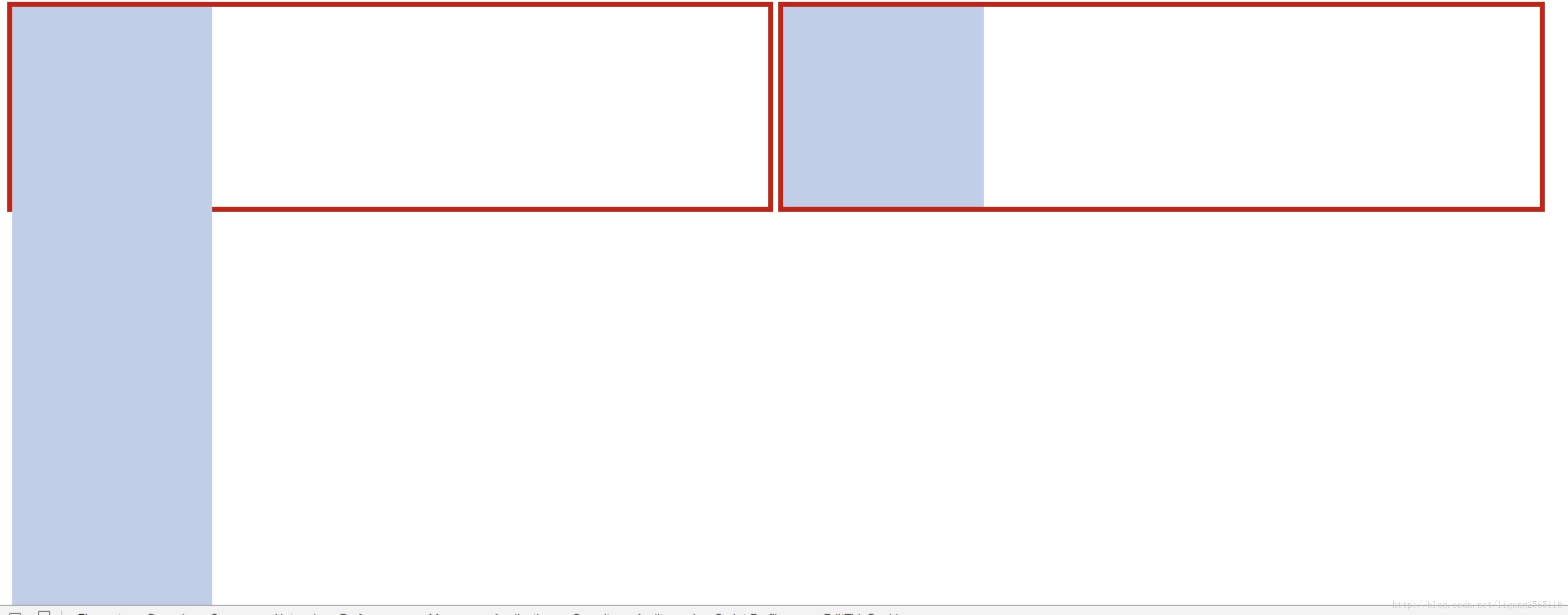
总之,这里,height:inherit的强大好用可见一斑。回头,容器高度变化了,里面的绝对定位元素依然高度自适应。这是很赞的特性,因为如果页面很复杂,避免使用position: relative会让你少去很多z-index混乱层级覆盖的麻烦。
获取元素高度
<!DOCTYPE html>
<html lang="en">
<head>
    <meta charset="UTF-8">
    <title>Title</title>

    <style>
        .box {
            position: absolute;
            height: 100px;
            width: 100px;
            background-color: #00b3ee;
        }
    </style>
</head>
<body style="height: 250px;">
    <div id="div1" style="position: relative; height: 100%; width: 100px">
        <div id="div2" style="position: absolute;">
            <div class="box"></div>
            <div class="box" style="transform: translate(0, 100px)"></div>
            <div class="box" style="transform: translate(0, 200px)"></div>
        </div>
    </div>
</body>
</html>
Element.scrollHeight 这个只读属性是一个元素内容高度的度量,包括由于溢出导致的视图中不可见内容。
document.querySelector('#div1').scrollHeight为300px;如果将body的height设置为350px,document.querySelector('#div1').scrollHeight为350px;
如果子元素高度大于元素设置高度,实际高度则会被撑开!
参考:【实例】调整区域大小&动态隐藏区域
参考地址
- http://blog.csdn.net/u012028371/article/details/52999230
- https://wenku.baidu.com/view/dedbe81b910ef12d2bf9e73a.html
- https://www.w3.org/TR/CSS2/visudet.html#propdef-height
- https://developer.mozilla.org/zh-CN/docs/Web/API/Element/scrollHeight
最后
以上就是友好黑米最近收集整理的关于css-height的全部内容,更多相关css-height内容请搜索靠谱客的其他文章。


![[CSS] height 属性height 属性](https://www.shuijiaxian.com/files_image/reation/bcimg27.png)

![[css] position的relative和absolute定位原点是哪里?[css] position的relative和absolute定位原点是哪里?个人简介主目录](https://www.shuijiaxian.com/files_image/reation/bcimg2.png)


发表评论 取消回复