- 最近学习css的样式,终于有时间把自己的心得写出来。用纯css样式实现简单的箭头和“<"">"例子,方法有两个,本质都差不多从一条边拉伸到另一个方向形成箭头。
- 平时网页编写中经常遇到箭头,我们除了图片外,用纯css实现下面效果
代码如下:
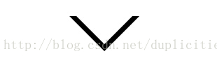
#a{
    width: 0;
    height: 0;
    border: 50px solid transparent;
    border-top-color: #000000;
    /*position: relative;*/
}
#b{
    width: 0;
    height: 0;
    border: 40px solid transparent;
    border-top-color: white;
   /* position: absolute;*/
    margin-top: -50px;
    margin-left: -40px;}
<div id="a">
    <div id="b"></div>
</div>- 实现箭头代码关键是设width和height为0;
代码如下:
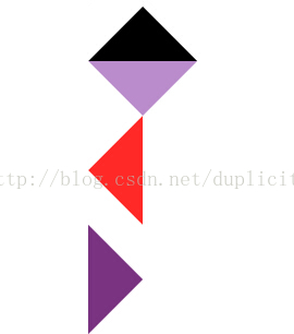
.up { width:0; height:0; border-left:50px solid transparent; border-right:50px solid transparent; border-bottom:50px solid #000000; } /*箭头向下*/ .down { width:0; height:0; border-left:50px solid transparent; border-right:50px solid transparent; border-top:50px solid #bb8ccc; } /*箭头向左*/ .left { width:0; height:0; border-top:50px solid transparent; border-bottom:50px solid transparent; border-right:50px solid #ff2a28; } /*箭头向右*/ .right { width:0; height:0; border-top:50px solid transparent; border-bottom: 50px solid transparent; border-left: 50px solid #793380; }<body>
<!--向上的三角-->
<div class="up"> </div>
<!--向下的三角-->
<div class="down"> </div>
<!--向左的三角-->
<div class="left"> </div>
<!--向右的三角-->
<div class="right"></div></body>
- 另一种实现如图
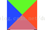
实现的代码如下:
#box{
    width: 0;
    height: 0;
    border: 50px solid transparent;
    border-top-color: #5ffa28;
    border-right-color: #ff4e24;
    border-bottom-color: #d26b7b;
    border-left-color: #2549ff;
}
<div id="box"></div>
最后
以上就是贪玩煎饼最近收集整理的关于纯css样式 箭头和三角形的全部内容,更多相关纯css样式内容请搜索靠谱客的其他文章。
本图文内容来源于网友提供,作为学习参考使用,或来自网络收集整理,版权属于原作者所有。


发表评论 取消回复