文章目录
- 前言
- 一、html代码
- 二、css代码
- 三、放上照片
- 在这里插入图片描述 `提示:照片和html、css文件放在一个文件夹。`
前言
例如:3D旋转魔方相册,表白神器!

3D旋转魔方效果图
提示:以下是本篇文章正文内容,下面案例可供参考
一、html代码
<!DOCTYPE html>
<html>
	<head lang="en">
		<meta charset="UTF-8">
		<link type="text/css" href="YoungerSister.css" rel="stylesheet ">
		<title>YoungerSister</title>
		<style>
			<pre name="code"class="css">* {
				padding: 0;
				margin: 0;
			}

			body {
				width: 100%;
				height: 100%;
				background: #333;
			}

			#react {
				width: 400px;
				height: 400px;
				margin: 400px auto;
				transform-style: preserve-3d;
				animation: rotate 20s infinite;
				animation-timing-function: linear;
			}

			#react div {
				position: absolute;
				transition: all .4s;
			}

			div .out_pic {
				width: 400px;
				height: 400px;
				opacity: 0.9;
			}

			div .in_pic {
				width: 200px;
				height: 200px;
			}

			#react span {
				display: block;
				position: absolute;
				width: 200px;
				height: 200px;
				top: 50px;
				left: 50px;
			}

			@keyframes rotate {
				from {
					transform: rotateX(0deg) rotateY(0deg);
				}

				to {
					transform: rotateX(360deg) rotateY(360deg);
				}
			}


			.out_front {
				transform: translateZ(200px);
			}

			.out_back {
				transform: translateZ(-200px);
			}

			.out_left {
				transform: rotateY(90deg) translateZ(200px);
			}

			.out_right {
				transform: rotateY(-90deg) translateZ(200px);
			}

			.out_top {
				transform: rotateX(90deg) translateZ(200px);
			}

			.out_bottom {
				transform: rotateX(-90deg) translateZ(200px);
			}

			.in_front {
				transform: translateZ(50px);
			}

			.in_back {
				transform: translateZ(-50px);
			}

			.in_left {
				transform: rotateY(90deg) translateZ(50px);
			}

			.in_right {
				transform: rotateY(-90deg) translateZ(50px);
			}

			.in_top {
				transform: rotateX(90deg) translateZ(50px);
			}

			.in_bottom {
				transform: rotateX(-90deg) translateZ(50px);
			}

			/*外面的图片散开*/
			#react:hover .out_front {
				transform: translateZ(400px);
			}

			#react:hover .out_back {
				transform: translateZ(-400px);
			}

			#react:hover .out_left {
				transform: rotateY(90deg) translateZ(400px);
			}

			#react:hover .out_right {
				transform: rotateY(-90deg) translateZ(400px);
			}

			#react:hover .out_top {
				transform: rotateX(90deg) translateZ(400px);
			}

			#react:hover .out_bottom {
				transform: rotateX(-90deg) translateZ(400px);
			}


			/*里面的图片散开*/
			#react:hover .in_front {
				transform: translateZ(200px);
			}

			#react:hover .in_back {
				transform: translateZ(-200px);
			}

			#react:hover .in_left {
				transform: rotateY(90deg) translateZ(200px);
			}

			#react:hover .in_right {
				transform: rotateY(-90deg) translateZ(200px);
			}

			#react:hover .in_top {
				transform: rotateX(90deg) translateZ(200px);
			}

			#react:hover .in_bottom {
				transform: rotateX(-90deg) translateZ(200px);
			}
		</style>
	</head>
	<body>
		<div id="react">
			<div class="out_front">
				<img src="001.jpg" class="out_pic">
			</div>
			<div class="out_back">
				<img src="002.jpg" class="out_pic">
			</div>
			<div class="out_left">
				<img src="003.jpg" class="out_pic">
			</div>
			<div class="out_right">
				<img src="004.jpg" class="out_pic">
			</div>
			<div class="out_top">
				<img src="005.jpg" class="out_pic">
			</div>
			<div class="out_bottom">
				<img src="006.jpg" class="out_pic">
			</div>
			<span class="in_front">
				<img src="007.jpg" class="in_pic">
			</span>
			<span class="in_back">
				<img src="008.jpg" class="in_pic">
			</span>
			<span class="in_left">
				<img src="009.jpg" class="in_pic">
			</span>
			<span class="in_right">
				<img src="010.jpg" class="in_pic">
			</span>
			<span class="in_top">
				<img src="011.jpg" class="in_pic">
			</span>
			<span class="in_bottom">
				<img src="012.jpg" class="in_pic">
			</span>
		</div>
	</body>
</html>
二、css代码
*{
    margin:0;
    padding: 0;
}

body{
    max-width: 100%;
    min-width: 100%;
    height: 100%;
    background-size: cover;
    background-repeat: no-repeat;
    background-attachment: fixed;
    background-size: 100% 100%;
    position: absolute;
    margin-left: auto;
    margin-right: auto;
    background-color: #57faff;

}
li{
    list-style: none;
}

.box{
    width: 200px;
    height: 200px;
    background-size: cover;
    background-repeat: no-repeat;
    background-attachment: fixed;
    background-size: 100% 100%;
    position: absolute;
    margin-left: 42%;
    margin-right: 22%;
    -webkit-transform-style:preserve-3d;
    -webkit-transform:rotateX(13deg);
    -webkit-animation:move 5s linear infinite;
}
.minbox{
    width: 100px;
    height: 100px;
    position: absolute;
    left:50px;
    top:30px;
    -webkit-transform-style:preserve-3d;

}
.minbox li{
    width: 100px;
    height: 100px;
    position: absolute;
    left: 0;
    top:0;
}
.minbox li:nth-child(1){
    background: url(../img/01.png) no-repeat 0 0;
    -webkit-transform:translateZ(50px);
}
.minbox li:nth-child(2){
    background: url(../img/02.png) no-repeat 0 0;
    -webkit-transform:rotateX(180deg) translateZ(50px);
}
.minbox li:nth-child(3){
    background: url(../img/03.png) no-repeat 0 0;
    -webkit-transform:rotateX(-90deg) translateZ(50px);
}
.minbox li:nth-child(4){
    background: url(../img/04.png) no-repeat 0 0;
    -webkit-transform:rotateX(90deg) translateZ(50px);
}
.minbox li:nth-child(5){
    background: url(../img/05.png) no-repeat 0 0;
    -webkit-transform:rotateY(-90deg) translateZ(50px);
}
.minbox li:nth-child(6){
    background: url(../img/06.png) no-repeat 0 0;
    -webkit-transform:rotateY(90deg) translateZ(50px);
}
.maxbox li:nth-child(1){
    background: url(../img/1.png) no-repeat 0 0;
    -webkit-transform:translateZ(50px);
}
.maxbox li:nth-child(2){
    background: url(../img/2.png) no-repeat 0 0;
    -webkit-transform:rotateX(180deg) translateZ(50px);
}
.maxbox li:nth-child(3){
    background: url(../img/3.png) no-repeat 0 0;
    -webkit-transform:rotateX(-90deg) translateZ(50px);
}
.maxbox li:nth-child(4){
    background: url(../img/4.png) no-repeat 0 0;
    -webkit-transform:rotateX(90deg) translateZ(50px);
}
.maxbox li:nth-child(5){
    background: url(../img/5.png) no-repeat 0 0;
    -webkit-transform:rotateY(-90deg) translateZ(50px);
}
.maxbox li:nth-child(6){
    background: url(../img/6.png) no-repeat 0 0;
    -webkit-transform:rotateY(90deg) translateZ(50px);
}
.maxbox{
    width: 800px;
    height: 400px;
    position: absolute;
    left: 0;
    top:-20px;
    -webkit-transform-style:preserve-3d;
}
.maxbox li{
    width: 200px;
    height: 200px;
    background: #fff;
    border: 1px solid #ccc;
    position: absolute;
    left: 0;
    top: 0;
    opacity: 0.2;
    -webkit-transition:all 1s ease;
}
.maxbox li:nth-child(1){
    -webkit-transform:translateZ(100px);
}
.maxbox li:nth-child(2){
    -webkit-transform:rotateX(180deg) translateZ(100px);
}
.maxbox li:nth-child(3){
    -webkit-transform:rotateX(-90deg) translateZ(100px);
}
.maxbox li:nth-child(4){
    -webkit-transform:rotateX(90deg) translateZ(100px);
}
.maxbox li:nth-child(5){
    -webkit-transform:rotateY(-90deg) translateZ(100px);
}
.maxbox li:nth-child(6){
    -webkit-transform:rotateY(90deg) translateZ(100px);
}
.box:hover ol li:nth-child(1){
    -webkit-transform:translateZ(300px);
    width: 400px;
    height: 400px;
    opacity: 0.8;
    left: -100px;
    top:-100px;
}
.box:hover ol li:nth-child(2){
    -webkit-transform:rotateX(180deg) translateZ(300px);
    width: 400px;
    height: 400px;
    opacity: 0.8;
    left: -100px;
    top:-100px;
}
.box:hover ol li:nth-child(3){
    -webkit-transform:rotateX(-90deg) translateZ(300px);
    width: 400px;
    height: 400px;
    opacity: 0.8;
    left: -100px;
    top:-100px;
}
.box:hover ol li:nth-child(4){
    -webkit-transform:rotateX(90deg) translateZ(300px);
    width: 400px;
    height: 400px;
    opacity: 0.8;
    left: -100px;
    top:-100px;
}
.box:hover ol li:nth-child(5){
    -webkit-transform:rotateY(-90deg) translateZ(300px);
    width: 400px;
    height: 400px;
    opacity: 0.8;
    left: -100px;
    top:-100px;
}
.box:hover ol li:nth-child(6){
    -webkit-transform:rotateY(90deg) translateZ(300px);
    width: 400px;
    height: 400px;
    opacity: 0.8;
    left: -100px;
    top:-100px;
}
@keyframes move{
    0%{
        -webkit-transform:rotateX(13deg) rotateY(0deg);
    }
    100%{
        -webkit-transform:rotateX(13deg) rotateY(360deg);
    }
}
三、放上照片
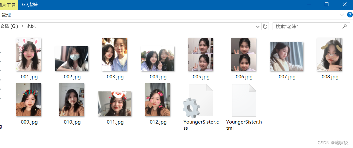
提示:照片和html、css文件放在一个文件夹。
最后
以上就是拉长水池最近收集整理的关于Web前端实现3D旋转魔方相册【超详细】前言一、html代码二、css代码三、放上照片的全部内容,更多相关Web前端实现3D旋转魔方相册【超详细】前言一、html代码二、css代码三、放上照片内容请搜索靠谱客的其他文章。
本图文内容来源于网友提供,作为学习参考使用,或来自网络收集整理,版权属于原作者所有。


发表评论 取消回复